I think it’s fun once in a while to talk about a design and how I put it together. When I teach classes, this is an exercise that we often do: deconstructing a design so you can understand how it goes together.
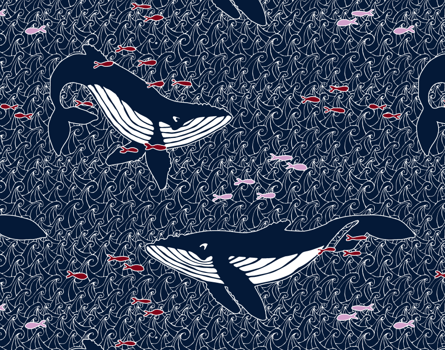
One of the recent design challenges at Spoonflower was a limited color palette design. There was no theme, just a set of colors to use in your design: navy, orchid pink, maroon and black or white. I am not sure where my humpback whales inspiration came from, but when I posted the challenge on Facebook many of you also had watery/nautical suggestions: lighthouses, coral, semaphore flags. So we were all on a similar wavelength. I didn’t actually love this color combination. I am not a real fan of red and I do not like that orchid pink at all. So I knew I had to do a design that was primarily navy.
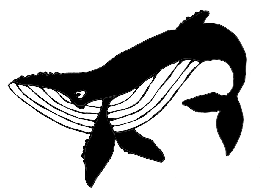
I decided to draw the whales by hand. I like to draw on plain cardstock and for this I used a black rollerball pen. I drew each of the whales on a separate sheet and didn’t worry about what the repeat was going to look like yet. I only drew the outline and filled in the solid black part of each one in Photoshop. (It was easier to do it that way than color it in with a sharpie.) For inspiration, I did a google image search of humpback whales. I like to bring up a bunch of pictures, spend some time studying them and then go draw without the photos in front of me. Details I noticed about humpbacks were the distinct stripes on their bellies, bumps on their “nose” and fins, and the fact that I think they always look like they are smiling. I scanned the whales after I drew them.
For the background I looked up a repeating “zentangle” pattern on Pinterest and sort of followed the directions. I wanted the background to also be handdrawn to match the style of the whales. I drew it originally in black on white, but realized as I put this together that I needed it to be white lines on a dark background, so I ended up using the invert filter in Photoshop once I had it all done.
The most time consuming part of this was making that background pattern seamless and matching up all of the lines so you couldn’t see breaks or gaps. If you have done any experiments with seamless patterns, you have probably seen tutorials about cutting a piece of paper and taping it back together again to make a seamless pattern. I just watched a Facebook Live post by Spoonflower doing this same technique. That’s exactly what I did with this one, but I realized after I did it that it is nowhere near as easy as those tutorials make it look. (Spoiler alert: I am planning to make that the focus of my next online class: how to finish a design done that way and why it sometimes still doesn’t look seamless.)
When I layered these elements together (waves, whales, fish) I realized that the fish and whales needed to pop out from the background just a tiny bit more, so I added a white stroke (outline) around all of them.
I didn’t worry about arranging all of the pieces until I had the colors and layers all figured out. There’s a lot of math/planning to do when you are figuring out how to make layers work together. My waves background was drawn on an 8×10 rectangle, so the rest of my design also had to fit proportionally in an 8×10 rectangle. (I wouldn’t be able to make it a square without distorting the design or cropping, which would make it no longer seamless). I did a lot of tests to check the repeat on a much larger canvas to make sure I liked the way it was repeating and about midway through I drew a few more fish because with the very large whales and very small fish it wasn’t feeling balanced.
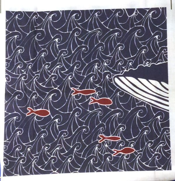
Here is the 8×8 inch swatch of fabric that I got to check out the design. You can see only a bit of a whale chin. I made this a large repeat, which seemed appropriate for whales so you can only see a bit when you only print a swatch. I think it will make really cute tote bags with just a whale or two on each side. I am planning to order some of this design on canvas later this week to try that out.


