I opened my first Etsy shop in August 2005 and I’ve been an active seller that entire time. I’ve seen every variation, iteration, experiment, and mistake that Etsy’s made in all of those years. That original shop has had a little bit of everything but for the most part it’s been focused on what I call “fiber art geekery”, kits and project bags for all kinds of fiber crafters.
One thing I’ve learned is that having a focus or niche for your shop is helpful. So in 2017, I opened a second shop so I could focus it on a specific line of work that I was making that was really different than my original shop. Everything in my “Pixelated by Becka Rahn” shop was made from fabrics I designed and printed at Spoonflower.
 Initially I didn’t have an online shop for this collection, I just sold them at in-person shows and events. I made scarves in a couple of different styles and clutch bags. I sold dozens at every in person show and made collections for some local shops including the Guthrie Theater gift shop. Over and over people asked me at those shows if I had an online shop. So I finally decided to get them all photographed and added to Etsy.
The disappointing part for me was that they were never successful in that Etsy shop. In the first year that shop was open, I sold 4 of those same scarves that I sold almost 150 of in person. Four sales spread out over a year is pretty discouraging. At that point I had been running my original Etsy shop for 13 years, so I knew all of the basics. So I tried all kinds of things to try and help out the new shop. I re-photographed everything twice, trying different ways of styling them on dress forms, on a person, or just flat.
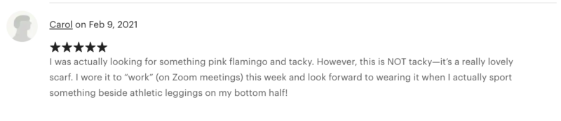
I re-wrote my descriptions and tags to put more emphasis on the designs and describing the fabrics, hoping that if shoppers were searching for things with flamingos or moon landing or wild violets that maybe that would be more successful in search. I know from reviews that customers left that this strategy was actually somewhat successful.
I knew that it takes some time to get momentum on any online shop, so I just kept trying things and hoping that it would pick up because I knew that people loved these items. I sold out of designs at shows. I had repeat customers. I had people who came looking for me to see what designs were new. I was confident that I would figure it out. But sales online never increased.
 In 2024, I put the shop on vacation because I was feeling really discouraged and I was planning to re-work everything once again. But you know how it is with projects that make you feel frustrated: they always work their way to the bottom of the to-do list. So it sat in limbo for an entire year.
When I sat down to make my goals and plans for 2025, I knew I had to do something about it and stop pushing it to the bottom of the list. So I started to make a list of what I knew from years of experience selling these items and what I could pull out from the shop stats and search info I had.
Here are some things I learned:
- People love scarves. But they are impulse buys, not something you actively shop for. Every other customer at an in-person show says to me “I have so many scarves but I just have to have this one because I love it.”
- No one searches online to buy a scarf. When I looked at my most favorited listing, in 6 years, only 11 people viewed it via search and only 18 clicks from Offsite Ads (which are based on search/keywords). Etsy used to have many different ways of discovering items that weren’t all based on search. That’s not true anymore so you have to be findable in search.
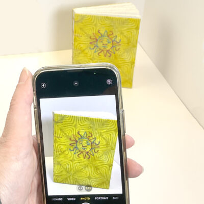
- Photo styling didn’t seem to matter. I had both a standard and a plus sized dress form, a live model and flatlay product shots. I used white, black and coordinating colored backgrounds. None of those brought in significantly different traffic than any of the others. I rephotographed the whole collection several times so I could make the whole shop look consistent each time I tried one of the different variations.
- I adjusted the prices several times as well, both raising and lowering them based on things I was seeing and hearing at in-person markets and similar items.
- When Etsy started pushing free shipping, I even switched this shop over to offer free shipping (no difference).
- Even though I had what I considered a successful product, I didn’t have a successful online product.
- The shows where I was selling these really successfully in person were victims of the pandemic. So I was even struggling to find where my in-person audiences were shopping.
To be absolutely honest, that list was hard to make and made me feel like a little bit of a failure. There are not a lot of wins there.
I’ve started setting a theme for the year when I put together my goals for the year. I use it as kind of a guiding principle when I am deciding what to add or take off of my list and helping me decide what new projects or opportunities to tackle. For 2024, that theme was “Use what you have. Do it better.”
When I was looking at what I wanted to do for 2025, I decided that I wanted to continue that theme, but add one more element. So this year’s theme is “Use what you have. Do it better. Bring more joy.”
So with that in mind, I decided that it was time for the “Pixelated by Becka Rahn” shop to retire. I was not doing it better and it was certainly not bringing me joy, which is a little heartbreaking because I LOVE that body of work and I think it’s some of the best I’ve done.
In the spirit of “Use what you have”, I started looking for a new shop name and decided I would re-brand the shop “Captain Labradork“.
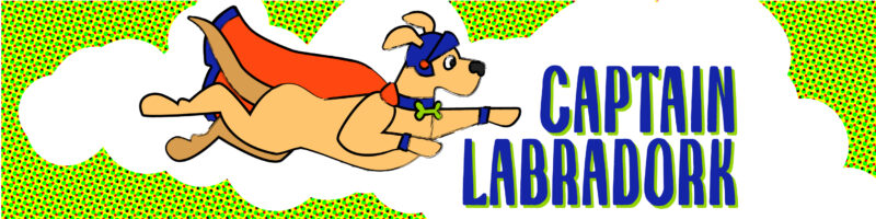
I decided that the shop already had some great reviews and some history which is super important to the Etsy search engine, so instead of starting over, I just decided to take the existing shop in a new direction. Some of the same items are still there, but I changed the focus to be dogs. If you’ve ever met me in person you’ve probably heard about my dogs. I have had several labradors and Stanley the yellow lab is the latest co-star on my Instagram feed. I make a lot of art with dogs. As I started to look at things that bring me joy, it’s my dogs. And not only them but the friends I’ve made because of them. The neighbors we walk with when we meet in the park. The students in Zoom classes that get excited when he shows up on camera.
 So Captain Labradork is all my dog art. There are still scarves and clutch bags but they are the ones with dog themed fabrics. I dug through my Spoonflower designs over the years and printed some that I’ve never printed before to make some zip bags. Dogs on roller skates. Folk Art dogs. Art Deco dogs. I made some postcards. I drew a new logo, inspired by Super Grover. The colors are a brighter/bolder variation of my normal brand colors. We call Stanley “Labradork” so that makes me laugh. It fits in with my 2025 theme perfectly.
I don’t know if it’s going to be more successful than the previous collection, but I do know that people love dogs. And maybe they’ll be searching for dog themed things more than they are searching for scarves. Time will tell.


 Talk to your partner.


 I found out about this from a follow artist friend and it happens to land on my Dad’s birthday. What better way to celebrate (since my dad is also an artist) than to share some art out in the world. And when I read the history of the project, the reason that the founder chose March 12 is because it was her dad’s birthday too.


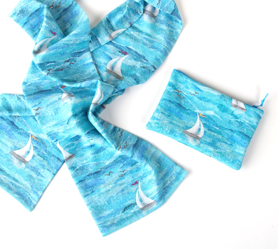
 Initially I didn’t have an online shop for this collection, I just sold them at in-person shows and events. I made scarves in a couple of different styles and clutch bags. I sold dozens at every in person show and made collections for some local shops including the Guthrie Theater gift shop. Over and over people asked me at those shows if I had an online shop. So I finally decided to get them all photographed and added to Etsy.