The Spoonflower design challenge theme for this week was “Designs for Good”. From the design spec, that is defined as “challenging you to create a repeating design inspired by a cause that is close to your heart. From raising autism awareness to creating food security in your local community, we want to know what inspires you every day.”
I decided to make my design about brains and if you follow any of my social media channels, you saw a little sneak peek of this design in a video I made for #GiveAtHomeMN to highlight some organizations that are trying really hard to figure out ways to help artists in this new world we are living in. In fact, I made the paper collage pieces for this design while I was listening and participating in an “Artists Town Hall” Zoom meeting.
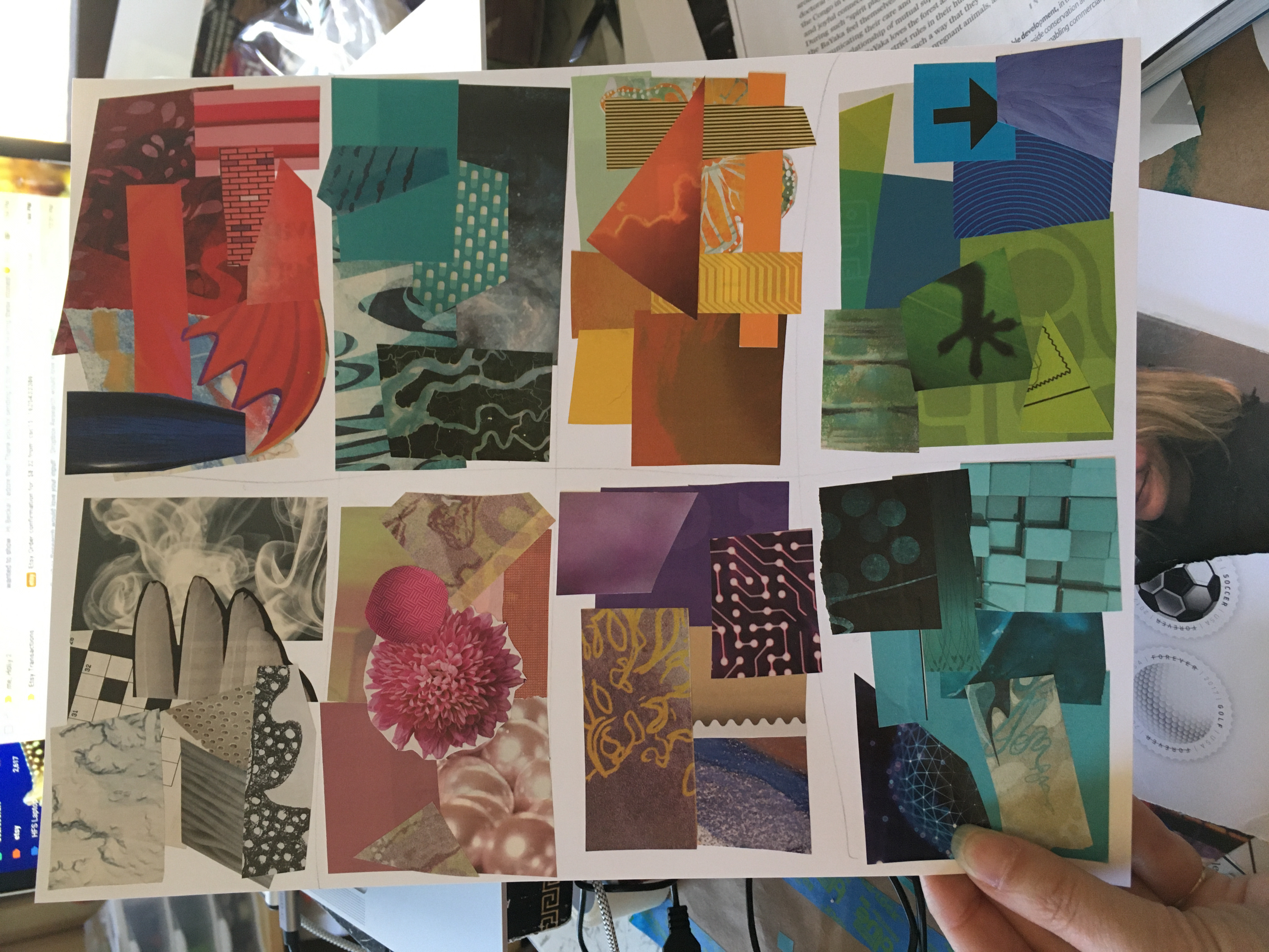
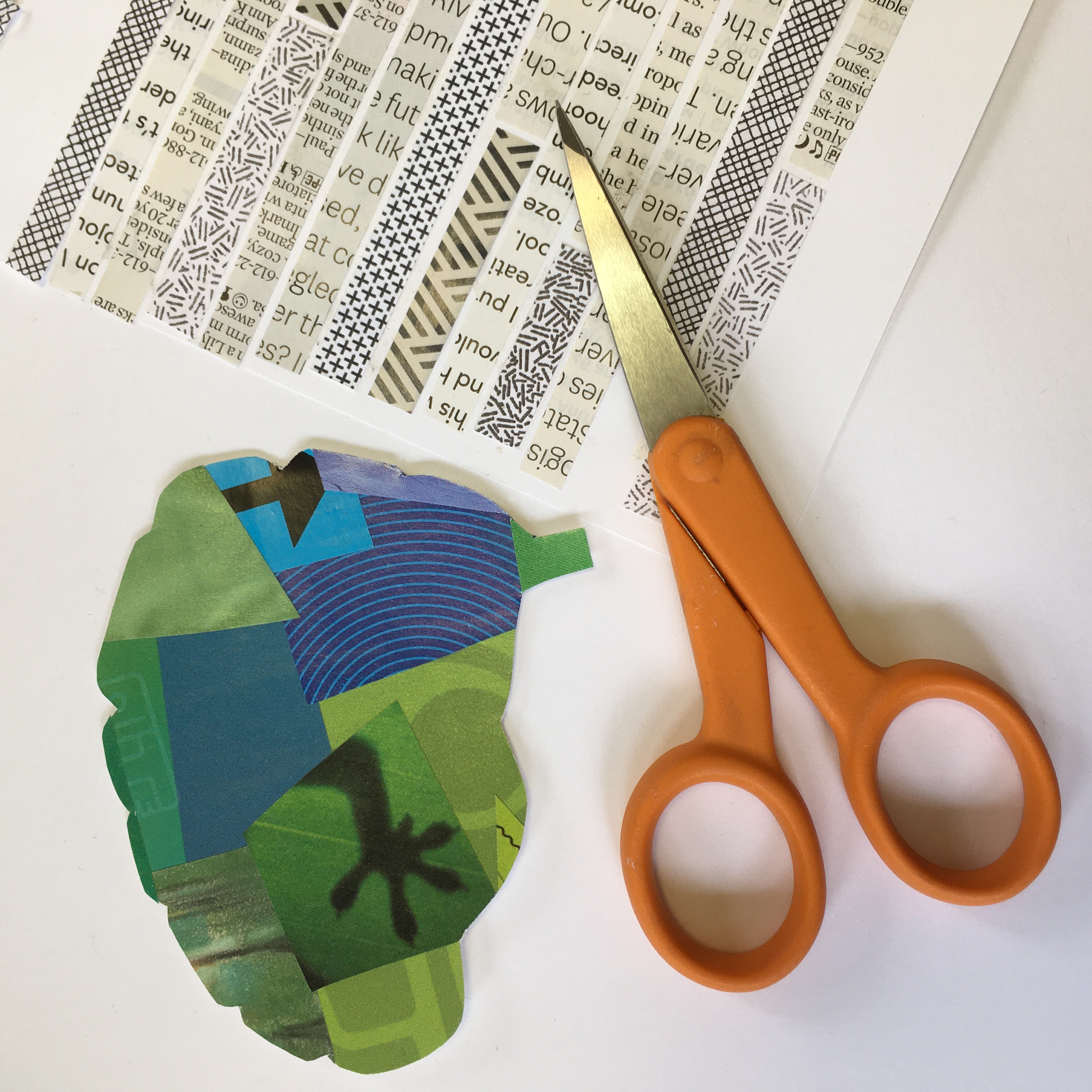
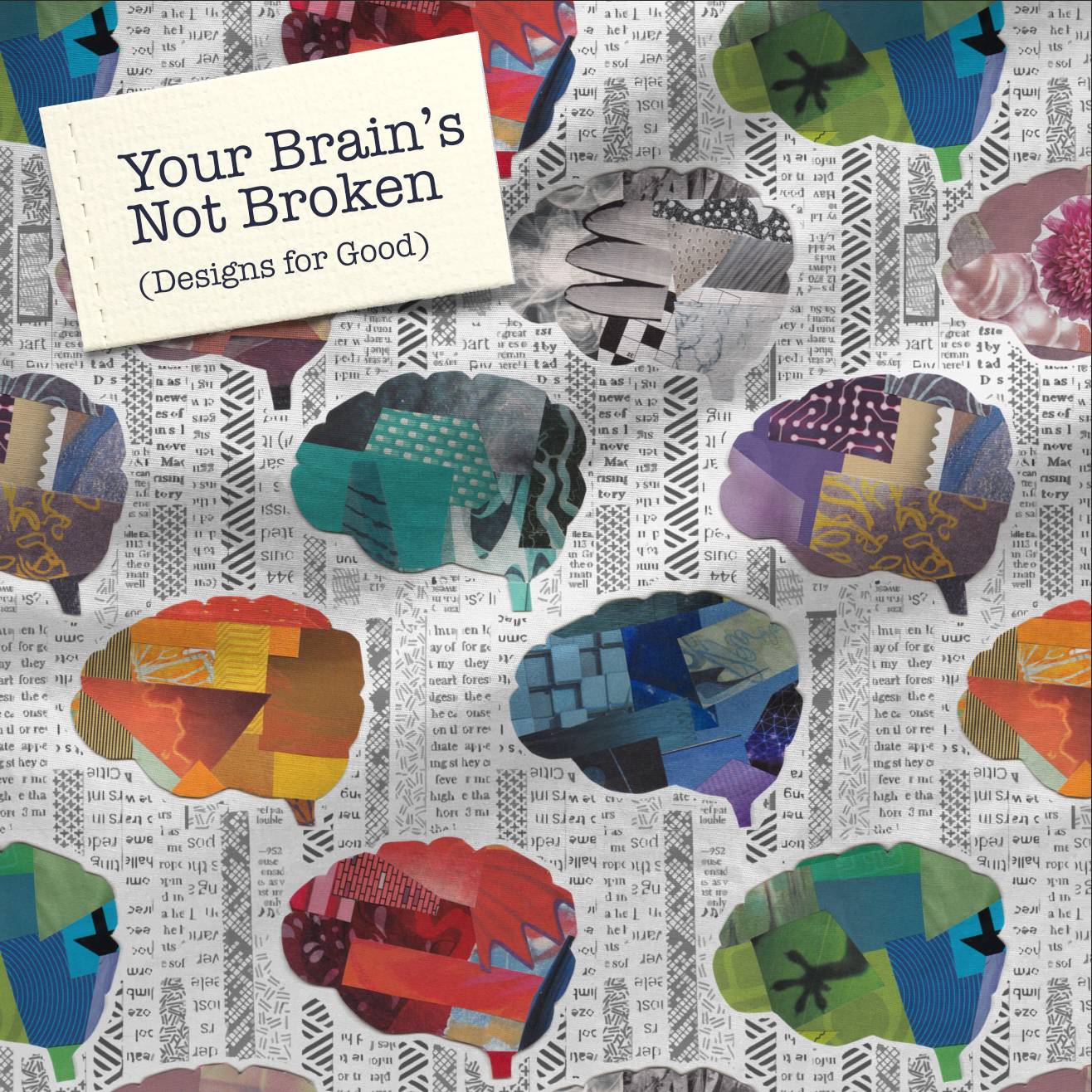
I call this design “Your Brain’s Not Broken”. It is made from recycled magazine pictures and I really looked for things that were bright colors and interesting textures. I grouped them generally by color to make rough rectangles and then cut each one into the shape of a brain.
For the background of the design, I cut stripes of black and white patterns: the text from magazine pages and safety paper envelopes. I scanned each of these components and assembled the design in two layers, creating a seamless repeating pattern of the black and white bars and then putting the bright colored brains over top.
Why brains? I wanted a way to represent mental health, and although that might seem like a pretty obvious choice, I liked that it was easy to understand. I like that it’s a little science-y. And it feels busy and vibrant. This design is about brains and about how brains are made up of different colors, textures, and patterns and no two are alike. We all have something beautiful and something wacky and something that frustrates. These are brains that are doing their thing in the best way they know how.
I don’t know about all of you, but I am pretty aware of my brain these days. We are all learning so many new things right now about how to do our jobs and our lives in different ways than we are used to. I never knew how exhausting video meetings were. I didn’t know how different it was to teach to a laptop screen instead of a group of students. I’m too tired to be creative some days. There’s so much information to wrap your head around about how to be safe and well and responsible to others. Some days are easier and some are really hard.
The funny thing about this design is that it really felt like *me*, more than many other things I’ve worked on the past few months. I love participating in the weekly design challenges from Spoonflower because as an artist it’s great to be pushed out of my comfort zone and challenged to go a different direction than I would choose, but I have struggled with the design challenges this spring. The themes and the colors felt more like a drag than a challenge for some reason. With one exception (my roller skating labrador for the roller rink nostalgia challenge), nothing has made it to the top 100 in the weekly contest voting and mostly I’ve finished somewhere around 50%. I don’t get too caught up in the voting part of the design challenges, but it is an interesting source of feedback to see how people are responding to what I am putting out there. And to go back to that theme of brains, it feels great to see a design do well and pretty discouraging to finish somewhere solidly in “meh, whatever” territory. And have your treacherous brain-voice tell you that you are kidding yourself and you should just quit and everyone is better than you are. It’s a lie, but we all hear it sometimes, right? So maybe this week’s design is a little about that too. I don’t think this one is going to be a top 10 design; I just don’t make things that follow that “look” that the top 10 usually have. But I think this one is going to resonate with some of you. At least I hope so.


