8 February, 2023

Comparing Spoonflower’s Celosia Velvet vs Renaissance Ribbons Velvet Borders

2023-02-08T14:00:55-06:00Everything Else|Comments Off on Comparing Spoonflower’s Celosia Velvet vs Renaissance Ribbons Velvet Borders

Edith from Renaissance Ribbons reached out to me a little bit ago with a question. She had read my post comparing Spoonflower’s Celosia & Performance Velvets and wondered if I would share my thoughts about the digitally printed velvet borders that Renaissance Ribbons makes. I thought it sounded like a great follow up to that post, so I asked her if I could share my thoughts here. Edith sent me a couple of samples the next day. (In the interest of transparency, other than providing those samples, this post was not sponsored in any way.)

First impression is that the Renaissance velvet borders are beautiful. Which is exactly what I would expect because their entire shop makes me feel like a kid in a candy shop. The color is rich and vibrant and the print quality is outstanding. There are very fine details in the two designs I saw and those are crisp and precise. The one thing for me that was unexpected was that the pieces were unfinished on the edges. Coming from a shop with ribbons in the name, I assumed that they would be like ribbon with a finished edge, but they are actually just cut pieces of velvet with a built in selvedge of extra color at the edge. I don’t think there’s anything wrong with this at all, I was just surprised and this wasn’t mentioned in the descriptions of the velvets that I saw on their site.

How do they compare to Celosia Velvet from Spoonflower?

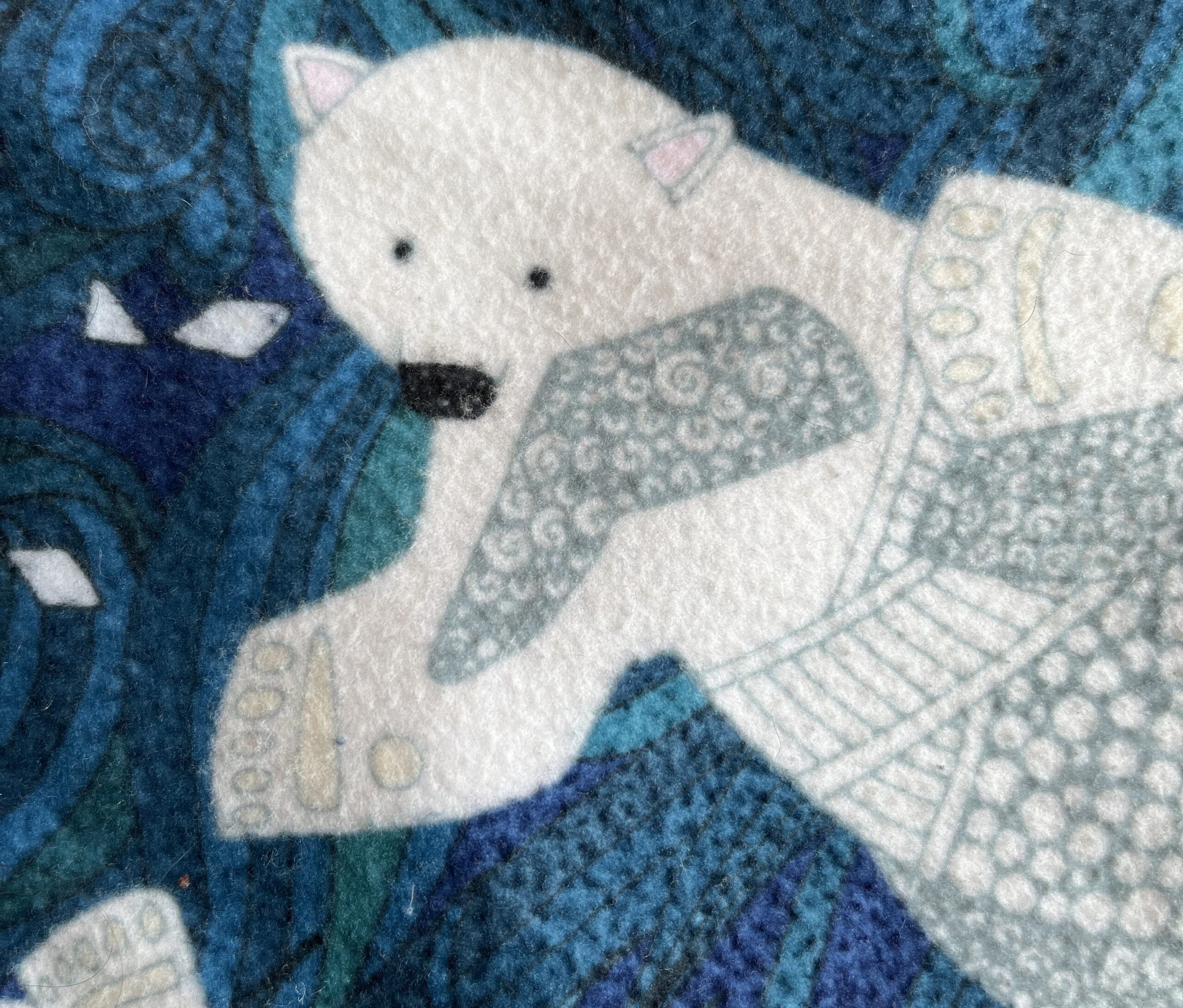
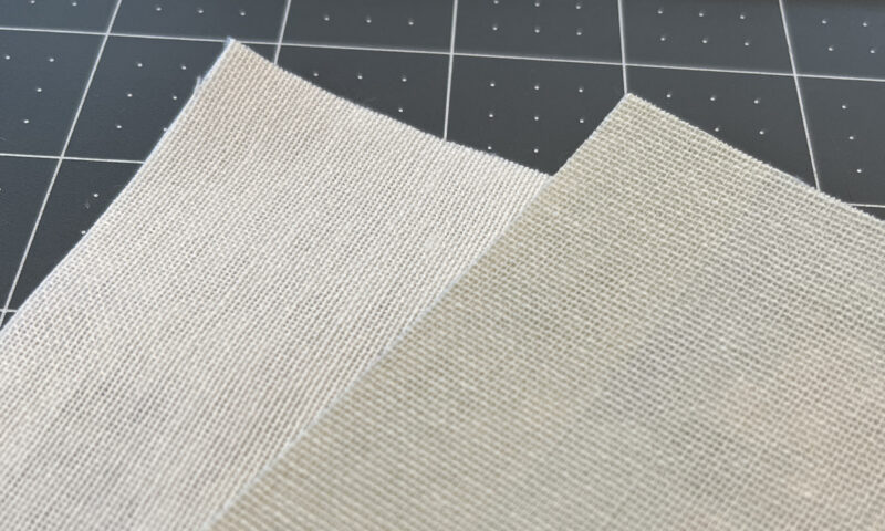
I started by laying out a piece of Renaissance Ribbons Border (top) next to a piece of Celosia velvet (bottom) that I had printed in one of my designs. The first thing I noticed was that the RR Border has a very matte finish compared to Celosia. At the bottom of this photo you can see a little of the sheen that my camera picks up in the Celosia. Other than that fabric finish, the colors are very comparable in the vibrance and saturation.
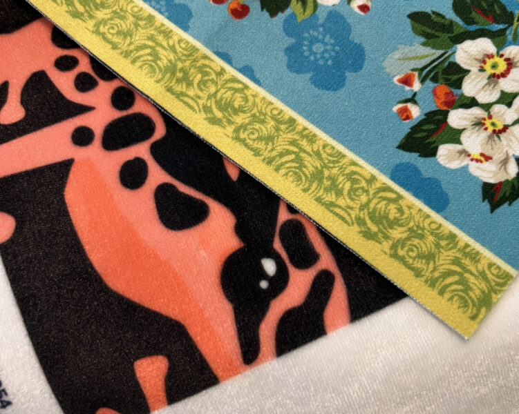
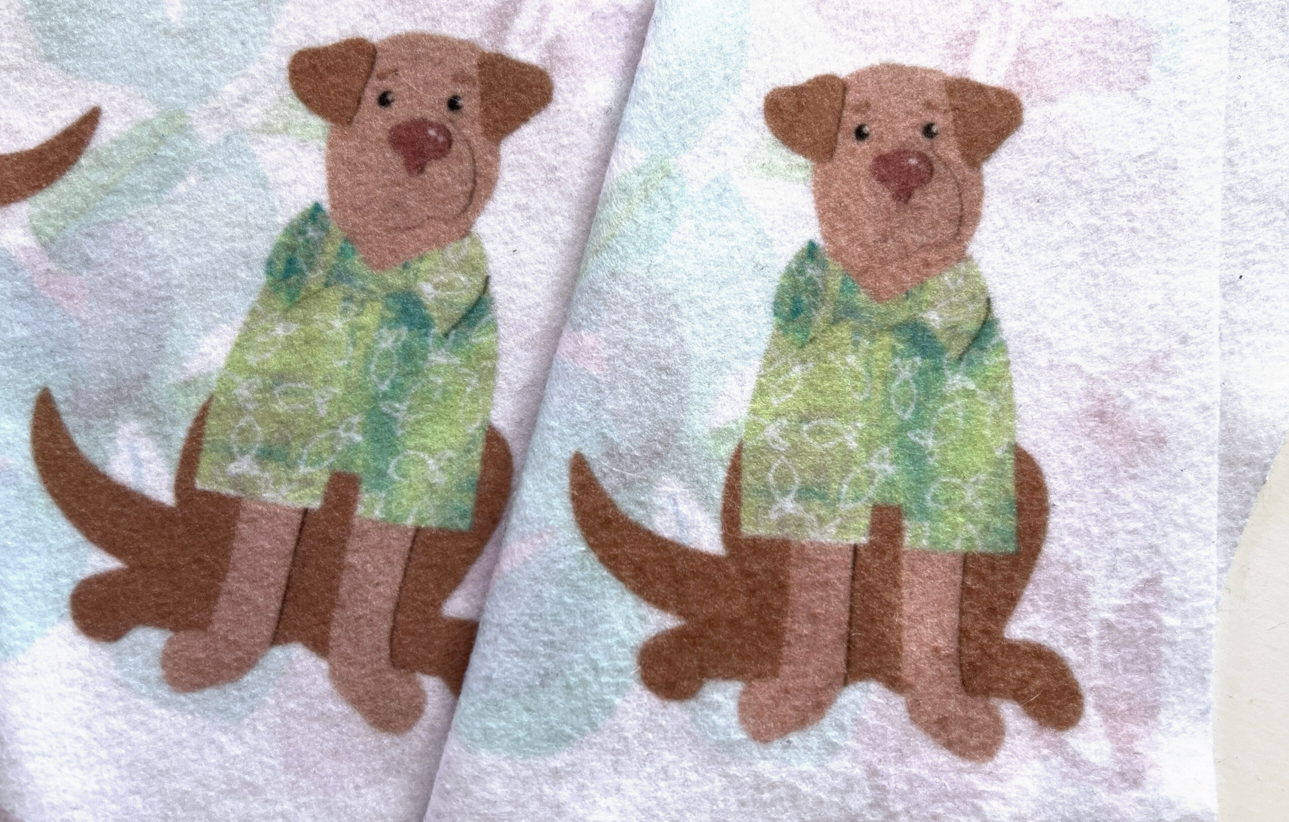
I flipped them over to take a peek at the back. They are both a woven fabric with a very similar look from the back side. The back of the RR Border is a deeper cream color, but the white parts of the design on the front are a nice crisp white. Unlike Spoonflower fabrics, which you can get in a variety of sizes, the Renaissance Ribbon borders come as a 5 inch strip, 1 meter long, which is ready for you to add into your project.
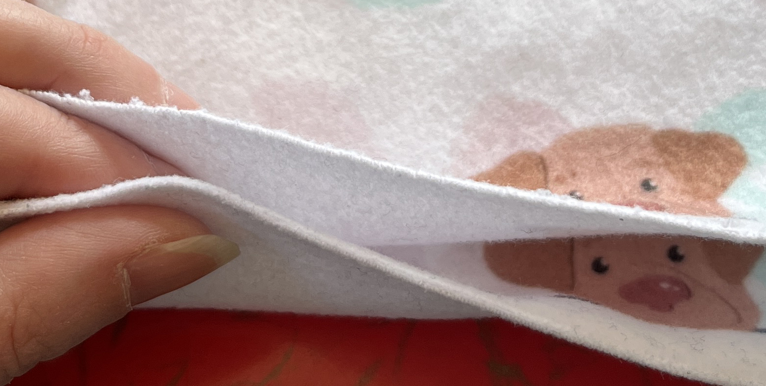
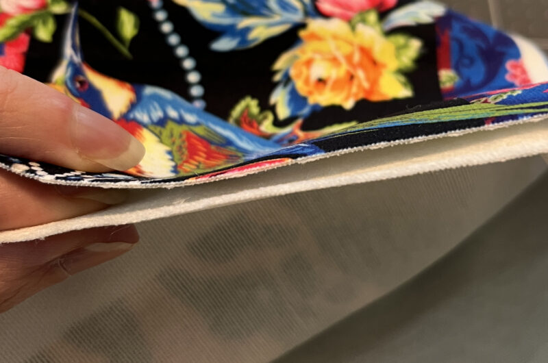
When I crumpled and played with the drape and hand of the fabrics, both were very soft. The RR Border has a little stiffer hand and has less drape than Celosia. I think this is a great feature in something designed to be a border. I would expect that to be pretty stable. Spoonflower says that the pile height on Celosia velvet is about .5mm and I would say that the RR Border is maybe half the thickness of that. I held the two up next to each other so you can see an edge on view. I also think a slightly thinner fabric is probably good for a border, which is designed to be sewn on to something else. Celosia is meant to be a little more like an upholstery weight fabric, so that makes sense that it needs a little more thickness.
Overall, I think these borders are a great idea and the two dozen or so designs they have on the site are all rich and decadent looking. You can’t design your own like you can on Spoonflower of course, but they have an impressive collection of guest designers (Kaffe Fasset, Tula Pink, Mary Engelbreit, Amy Butler) so there’s a lot to choose from in velvet or their other woven ribbons. It was fun for me to have an excuse to look at some digital prints from an entirely new source.

12 January, 2023

Construction Week 11: Floors & Windows

2023-01-12T13:21:33-06:00Construction, Everything Else|Comments Off on Construction Week 11: Floors & Windows

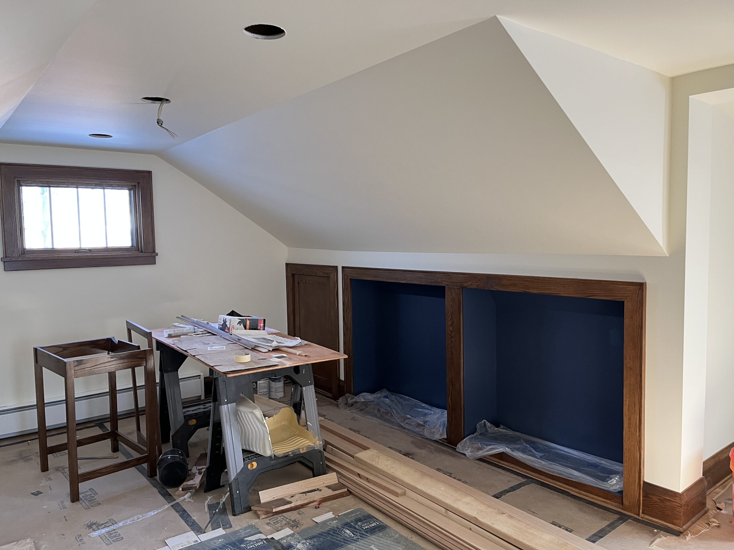
This past week has been all about floors and windows! The bathroom floor tile is almost complete and when I talked to our tile guy yesterday, he was nearly as excited about the window as I was. It makes the room so much brighter. You can see that this isn’t finished yet. Everything takes lots of steps. But three of the new windows are in and they make such a huge difference. You can see we matched the style of the windows downstairs with the three dividers in the top pane. These will be painted to match the woodwork everywhere else upstairs which is dark stained red oak, copying the style from downstairs.

We only have some of the windows still. Two of them are still on order. Since May. And sadly, these aren’t exactly right. Some of these windows are supposed to have tempered glass in them to meet code requirements and they didn’t do that. (Not sure whether it was a mistake in the order or the manufacturing). Fortunately there’s a solution: a film you can add to the glass to which is acceptable instead of tempering. So that still has to happen. And they also forgot to make this window with frosted glass. Since it’s basically floor to ceiling, you would get a very good view of anyone stepping out of the shower. So that’s really not going to work. Fortunately they make the film in a frosted version too. So our contractor is working on tracking that down. It’s always something!

Another new thing I learned is that there is an inspection for everything. Yesterday’s was the shower pan/drain inspection. A guy in a safety yellow vest showed up and went right upstairs, ran some water down the drain to make sure that all worked correctly, signed off on something official and got back in his car and drove away. We’ve had two plumbing inspections, electrical, framing, structural. Honestly, probably a few more I don’t even know about. They are very efficient.

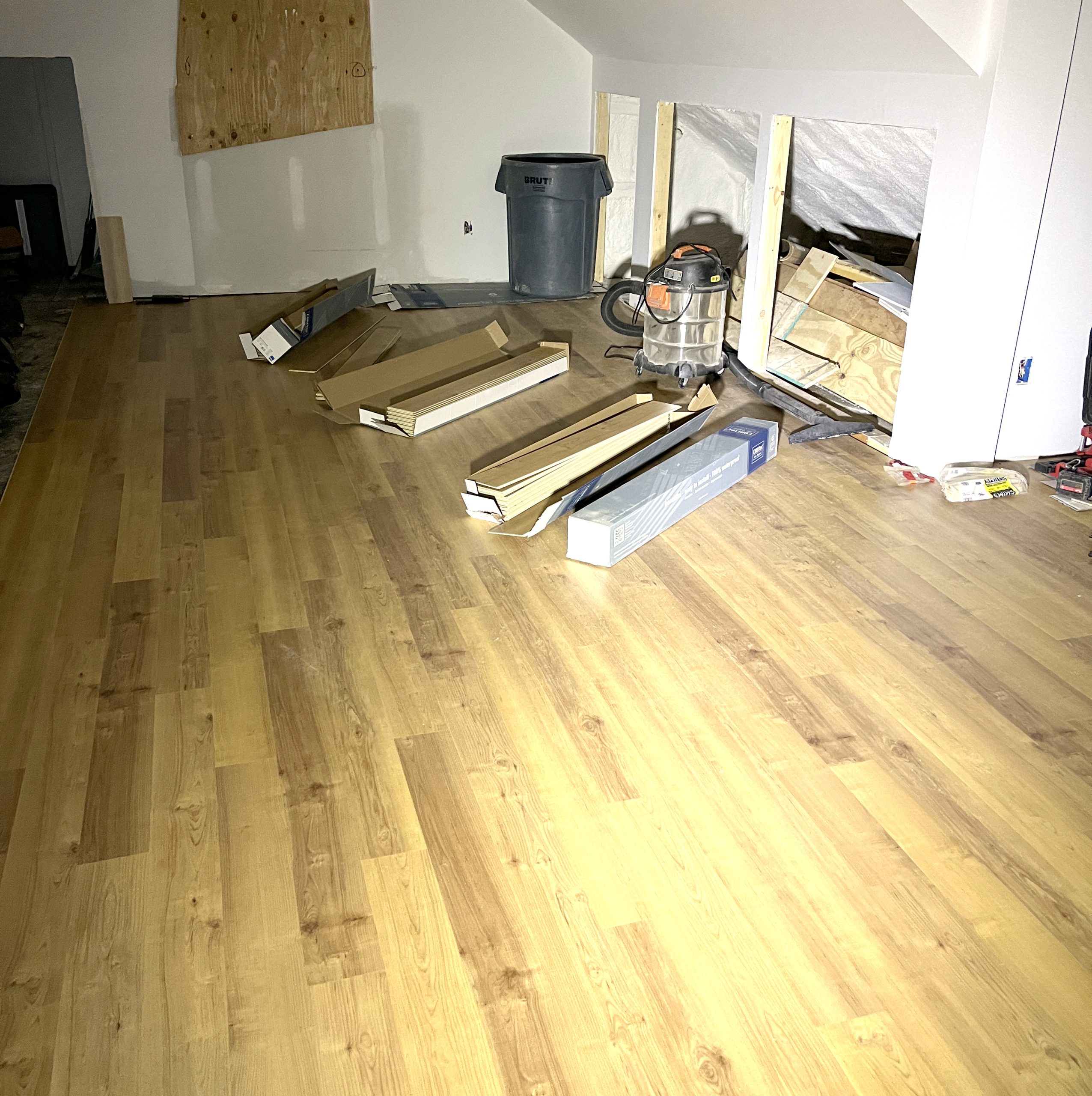
Right now you can’t see the beautiful floors in the rest of the room because as soon as they got them down, they quickly covered them up with heavy paper so they don’t get damaged while everything else is still happening. But I got a photo before that happened. We picked LVT or luxury vinyl tile that looks like wood. I picked one that was the closest match I could get to the original hardwood floors downstairs. Because I love the look of wood, but we really decided that real hardwood was probably not in our budget. We don’t have any carpet anywhere in our house. I just don’t like it and it’s impossible to keep clean when you also have a love for large labradors. I’ve started thinking about rugs, now that I have a better idea of what this new space looks like. If anyone has a place you love to get rugs, send me a link!
2 January, 2023

Construction Week 10: Drywall

2023-01-02T18:08:47-06:00Construction, Everything Else|Comments Off on Construction Week 10: Drywall

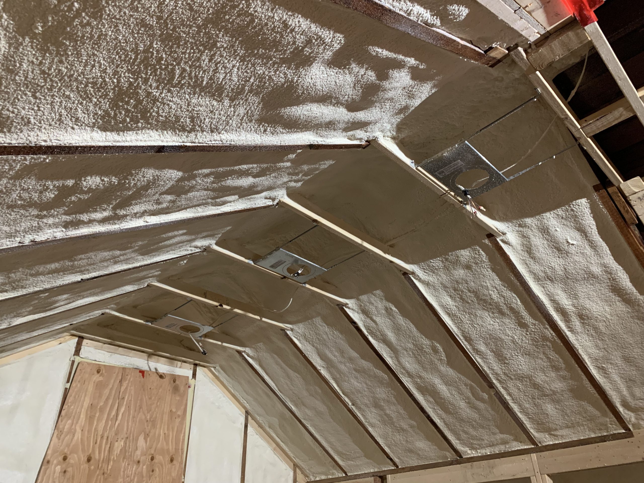
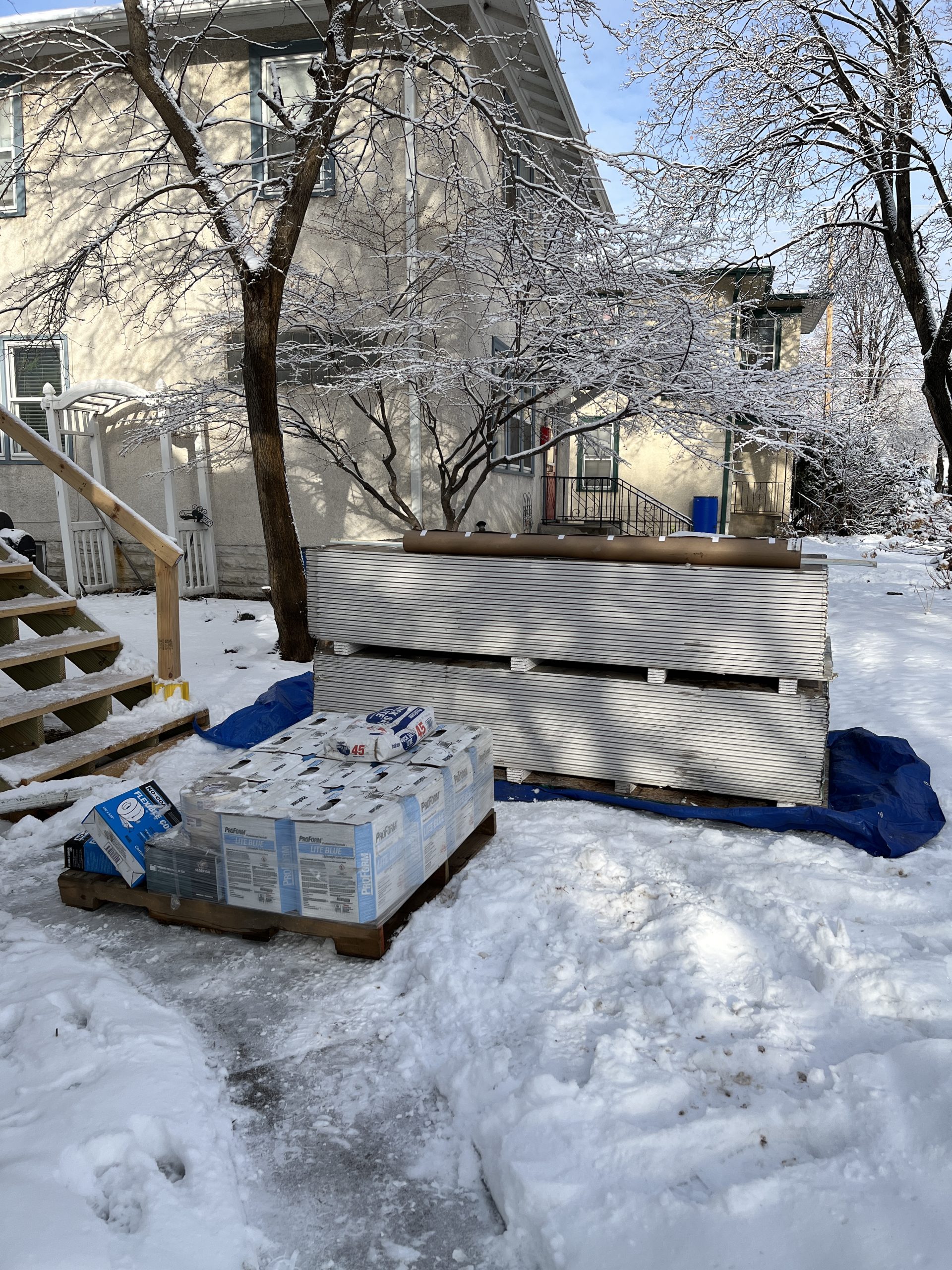
Week 10 means we have walls! This couple of weeks has been the messiest so far. It is amazing how much dust drywall generates! The space looks so so different at this point. Since I last posted, they finished all of the rough in for the plumbing and electrical. The roofers were finally able to get here and put a permanent roof on the dormer and do all of that roof finishing. The weather had been holding us up a little bit. We had a temporary roof of plywood with a giant tarp on top of it. We had a big snowstorm come through with crazy winds and the tarp blowing sounded just like thunder for 2 days. So I am really glad that’s finished. We also have insulation. Which is incredibly important in winter in Minnesota. The whole house feels a lot warmer. There’s still a draft because the windows are all covered in plywood, but it’s an improvement.

We had a tiny bit of drama with the drywall delivery. A huge crane truck pulled up in front of the house but the operator decided that our neighbor’s mulberry tree was in the way, so he told our contractor that he was just going to “trash it”. Our contractor looked at him like he was nuts and explained that trashing the neighbor’s property just really wasn’t an option. So they drove off in a huff with all of our drywall still on the truck. They simmered down a little while later, figured out a different option and our crew carried all of those drywall sheets up the outside stairs. I am again glad that was not my job.

My favorite part of this few weeks was getting to see the real shape of the space. I told my dad (who was our architect) that I think it almost looks faceted. Because it’s an attic, there are angles everywhere. There are really only a couple of walls that go floor to ceiling uninterrupted. Most of the others are divided up by a sloped ceiling or an angle. I was considering painting some bold colors upstairs but I am now thinking that with all of those angles it might just need to be one color. I can’t wait to see how the light plays across everything once the windows are in. We finally have some of our windows about 8 months after we ordered them. Two more are still in limbo; we aren’t sure when they will be ready.

Today they’ve started to lay down the floor in the main room and the tile guy is here working on the bathroom floor to get it prepped for the tile. I’m excited to see how much lighter the space is with the maple colored floor and light creamy tile.
1 November, 2022

Three Camera Tries: The Making of Our Halloween Love Note

2022-11-20T21:52:43-06:00Everything Else|Comments Off on Three Camera Tries: The Making of Our Halloween Love Note

If it’s too much of a spoiler to know how our Halloween photo is made, I don’t want to ruin the magic for you. This is your warning to skip this post. But shooting our photo this year was an interesting creative challenge and I thought it would be fun to talk about how we made it work and what we learned about our cameras.

We have an unfinished basement (which is awesome) and as an artist I have to take a LOT of photos of my work. So we have a corner that is the dedicated photo studio. It has a large roll of white paper and big lights and a tripod set up most of the time. I’ve learned just what I need to do to get great photos in that space. It’s where we usually do our Halloween photos. The previous owners of our house had built a little workbench under the basement stairs full of drawers that we affectionately call our “Prop Shop” which is where we store all of the Halloween props and costume bits as well as all of the backdrops and props to photograph things for my Etsy shop and dress forms for photographing garments. It’s a great setup. In my last blog post I talked about how we are starting construction on a house project this week. That means that everything that used to be on the second floor of our house had to move elsewhere. The furniture, our bed, our collection of board games, the exercise bike, boxes and bins all are now living in what was my photo studio. There is no way to take a photo there.

So instead of building a set, we decided that the Halloween photo needed to be something that was just our faces because that was going to be easier to do in some other part of our house. We had a couple of ideas, but we knew that the light was going to be the most challenging so we decided to go with spooky skeletons and deliberately make the light cast dark shadows on our faces.

Our rule about Halloween photos is that it should be about 80% “real” and 20% Photoshop, where we use Photoshop to just put in those details that make it awesome. This photo is a great example of that.

We took two photos. Photoshop helped make my hair blonde and change the tan windbreaker I found for Andy’s costume into flight suit orange. And we put the two photos together.

So we started this skeleton photo with two photos also. We wanted to use just our faces, so I bought a black spandex hood that we could put over our hair and we put on black shirts to make it easy to “erase” the rest of us from the photo.

Then I built a “set” out of two pieces of foam core and a black tablecloth and put it on the desk. Andy’s office has a nice big north facing window and on the Saturday morning we took these photos it had great light reflected off the house next door. So that was our light source. We wanted the light to cast some kind of dark shadows but it was too dark, so we each held up a big piece of white foam core to reflect the light back on the other side of our faces. We each took the photo of the other and because the light was exactly the same, they look like we are sitting side by side. We agreed on “dead” expressions and big wide open eyes.

Here’s where it got interesting: it took three cameras to get the shot. We started with a little Canon point-and-shoot that we got just a few months back. It’s a pretty good camera although I am still learning its quirks and we thought it would be the easiest. But when we pulled the photos off the camera they were terrible. Blurry and grainy. (I realized this morning I can’t show you because we deleted them all.) That dark “moody” lighting we were trying to get was not something this camera knew how to do.

Next we thought we’d try my iPhone. It’s a pretty new phone with a great camera too and again, we were going for easy. The photo on the left is the one from my phone. It has so many “make your photos look amazing” algorithms built into it that it basically took exactly the opposite photo from what we were going for. It took out all of the shadows and made everything bright and “perfect”.

So finally we pulled out our big old Canon DSLR. It’s more than 15 years old, but it’s the camera we usually use for Halloween. That’s the photo on the right. Although it is overall pretty dark because we were working with very little light, just look at those beautiful shadows and the sparkle in his eye. That one was a keeper. Both of these photos are straight off the cameras without any tweaking. What a difference, huh?

Now you might be wondering, where are the skeletons? That was our cheat. Someone on Facebook asked me how much was masks and how much was makeup and the answer is none of it. I bought a skeleton vector graphic on Etsy and we Photoshopped it. We layered the graphic over our faces and carefully tweaked and warped it so it fit our faces exactly, matching noses and eye brows and chins. The layer is transparent and uses some color blending to make it look like it’s painted onto our faces. We erased our eyes from the graphic so you could see them just a tiny bit brighter. I drew the hands (referring to another graphic I found) and then layered a grungy paint texture over top of them to make them match the faces.

Although we had newer and “better” tools, it turns out that when we went back to the one we knew the best we took the photos we needed on the first try. It was very satisfying, after a frustrating hour of photos that were just plain wrong, to go down and dig out the other camera and say “there it is” when we got it right.

20 October, 2022

The Construction Project: Before we start

2023-09-13T20:22:57-05:00Construction, Everything Else|2 Comments

A year ago in September, I was teaching a Zoom class and my husband heard a “whump” from the other room. He thought the dog had gotten into something upstairs, but when he went to investigate he found that a large section of our ceiling had fallen down. Our house was built in 1927 and is a beautiful Craftsman style bungalow, but the upstairs hadn’t been updated at all. So that nearly 100 year old fiber ceiling tile just gave up.

The downstairs is beautiful with all of the original oak woodwork and maple floors. Ours is very similar to this one with a little larger footprint and only a “half” story on the top level so the ceiling is only full height in some parts. Our upstairs is one big open room and was our bedroom and my husband’s work-at-home office during the pandemic. When we bought the house 20+ years ago, the people we bought it from (Harold and Olive) were in their 90s and were only the second people to own the house. They had “finished” the upstairs into what we figure must have been a family room with knotty pine paneling covering every wall and tons of closets and storage nooks. It was functional but certainly not pretty. We lived with it because (as any of you know who have lived in an old house), there was always something else more in desperate need of being fixed.

At first we stared at the piles of disintegrating ceiling tiles and dusty paper insulation and laughed. Because what else can you do? And then we tried to figure out how to fix it. We knew we couldn’t really do it ourselves, even though we are pretty experienced fixer-uppers. It’s an entire floor of the house. That’s more than a weekend project.

So we talked to friends and found a fantastic contractor. It took months to work into his schedule and talk about what we wanted to do. Then he was put on medical leave. So we had to get another contractor (also awesome) and work into his schedule. We pulled in my dad, who to our great good fortune is a retired architect with a love of old houses and creative problem solving.

Our “fix the ceiling and the insulation” project turned into a “what would happen if we cut open the roof and added a new dormer so we could have a second bathroom?” project. We had every intention of fixing up this space when we moved in so we had some money saved up (thank goodness) so that let us dream a little bigger than just fix it and we get to make it a new cool space.

Things I learned so far which I didn’t know:

  • You have to have a certain ratio of square footage of space to windows to provide light and ventilation to meet building code. We had not even close to enough. Because it’s one big room it has to have a lot of windows. Windows take 8 months to get right now. We ordered our windows in May and we are keeping our fingers crossed we will have them by the time we need them.
  • In 1927, walls of houses were insulated with newspapers sewn into booklets. We spent a lot of time crawling into the knee walls and rafters getting measurements so we could draw up plans and we pulled out fragments of December 1927 newspapers written in Norwegian (?).

  • You don’t want to have to figure out where to store the contents of an entire floor of your house for a year and a half. I just have one word for you about the state of my basement: yikes. Our basement is unfinished, so usually I have a “wet” studio for painting and a photo studio set up down there and it’s our space for working on projects like fixing computers or unpacking craft shows so things don’t have to be all over the dining room table. Next week I am rearranging, organizing and taking as many things as I can to goodwill to try and clear some space for the electrician and plumber to work. I can’t even tell you how nice it’s going to be to have the basement and upstairs usable again.

Asbestos abatement for those lovely floor tiles starts next week. Wish us luck!

8 June, 2022

Handmade pricing: Here’s why I don’t need to charge more for my art.

2022-09-28T11:07:16-05:00An Artist's Life, Everything Else|2 Comments

A few weeks ago, a colleague reached out to me and said “I’d love it if you wrote a blog post about how you price your classes and your art”. She was looking to change direction in her business and wanted some insights into making her art and classes more affordable. One thing she said really resonated with me: I want to create high priced art, but then that’s weird because I can’t afford that myself.

This is something I think about a lot. When I decided to make this art business of mine a full time adventure, I thought alot about how I wanted that to look. I come from many years of working in the non-profit arts sector and I could recite the mission statement of my organization from memory. Part of what you do in that non-profit world is always look at things as they relate to that mission. So I needed a mission statement. I decided that mine was really made up of a set of values.

Make more art.

The first value I settled on was the idea that my job meant I was making art. I define that idea of “art” pretty broadly so for me it means I am making things. That might be fabric designs or clothing or classes or websites. I am working with my hands and my brain and creating new things. The way my brain is wired, I need to be problem solving and innovating and creating to be happy.

Support the community.

The next value I came up with was that I really wanted what I was doing to help support other artists and creators. That means when I source supplies to make my art or to teach a class I start with other small businesses as resources. About 90% of what I use for classes comes from Etsy sellers and other small businesses. I get zippers from a shop in WI and my favorite felt comes from a shop in IL. I’ve been ordering all of my fabric from Spoonflower since they were a single printer in a repurposed sock factory. I partner with local non-profit organizations like the county library system to teach classes. I want to know a person at the businesses where I do business.

The past few weeks I’ve been sitting on a grant review panel for the regional arts council. A group of about 12-14 arts professionals evaluate all of the grant applications. I wrote about that process for a grant I have going on right now. I have gotten several grants like this and other panelists have reviewed my applications, so this is my way of making sure that community thrives by taking my turn as a panelist.

That’s also why I write posts like this. When I was first getting started I didn’t know anyone else who was just getting started and it was scary and lonely. I didn’t know if I could make it work and I didn’t want to quit my day job and then fall flat on my face. If you can take something from this post and use it in your business or art practice then I am delighted and I am giving you a virtual high-five.

Make it accessible.

The last value I settled on was to make things accessible. If you’ve worked at all in non-profit orgs, that word might make you cringe a little bit. It’s been a huge focus of missions and programming for decades and it gets talked about a lot. Often in the simplest sense it gets broken down into ADA compliance and ASL interpreters. But accessibility can be addressed in so many different ways. For me, affordability was a big accessibility barrier that I wanted to work on; I’ll come back to that in a bit.

I used to teach at a venue where the class prices were on the high side. I don’t think that org is doing their pricing wrong; everyone has overhead and expenses and many other factors that go in to determining their prices. But because the prices were at the level they were, they attracted a certain kind of student. In a very broad general sense, the only people who took classes from me there were wealthy and retired. Other people told me that classes were too expensive and they felt out of place. This bothered me, so I started to try and look for other places that I could teach that might be more accessible to more different kinds of people.

I was approached by Skillshare to teach classes for them many years ago, but it bothered me that there was a membership paywall that made those classes unavailable to a lot of students. That wasn’t the only factor that made it seem inaccessible to me. Skillshare also has a video based “formula” that they want classes to follow. From a teaching standpoint, I didn’t want to be limited to only teaching in a lecture/video format, which isn’t the best match for all learners.

The pandemic era boom of online classes was, in a way, a complete revolution. At the beginning, none of us knew what we were doing and how to work with the technology. But as we all got more experience, I realized that online classes can open up accessibility in so many more ways. By using captions and other video tools like speed control and ability to pause and review, they can be adaptable to different or preferred learning styles, visual and auditory abilities, or language barriers. Allowing students to learn in their own space can help with transportation and childcare needs, physical needs and mental needs like social anxiety. Online classes absolutely have drawbacks and inherent barriers as well, but I love that there is a more available and widely acceptable option for a lot of students. I love teaching online. There was no support for me to do that before 2020.

I also look at the materials and tools I am using in classes. I love to teach Adobe Illustrator for example, but time-after-time guilds and small fiber groups asked me if I could teach them how to design with Spoonflower but not using Photoshop or Illustrator because their members couldn’t afford it. Could I teach them using free software so more people could participate? So I did that and I learned a whole bunch of free and low cost apps that I could teach with. I’ll be honest and say that I struggled with that for a while. There’s a perception that the “experts” or “professionals” use Photoshop or Illustrator or Procreate and they charge $$$$ for it. I didn’t want to be seen as less expert or less professional by teaching using free apps and recycled materials, but this was what people were asking for and it’s something I’m good at. It took me a long time to really identify and embrace that as a niche I love.

So accessibility is a value that I try to think about in all of the things I do in my business and I look at many different ways I can define accessibility and try to make things more accessible so I can work with more different kinds of people. I can’t do everything and there’s always more to do, but I am always looking for ways that I can try to pay attention and try new things.

How do values equal action?

So it’s great to talk about what you aspire to do by stating business values, but how does that actually turn into something concrete? Here’s where I want to talk about pricing and affordability as one example of that. This is how I put that value into practice.

How do I set prices?

The easiest example I can think of to tell you about prices is to talk about my Etsy shop. I make all kinds of things from zipper bags to scarves and sell them both online and occasionally in-person. I have a very specific way that I set prices. First I have to design and figure out exactly what I am making. This prototype phase is about just working out the specifics: how much of what things do I need. I look at everything I can think of from fabric and zippers to copies of instructions and packaging bags for kits. After I have the design figured out then I move on to pricing and the details of making it.

For example,

  • Let’s say a yard of fabric to make zipper bags costs $30. I can make 18 zipper bags from that yard of fabric. That’s $1.67 each. Then I add on the cost of the rest of the materials I need to make that bag (lining, zipper, tag etc) and it comes out to about $2.50.
  • Then I literally get out a stopwatch and make a dozen of them. I time myself making them per piece from cutting out the fabric to trimming the threads at the end. I can make a zipper bag in under 7 minutes. It took me a while to get to that rate, but I have all kinds of systems and patterns I do now that speed up the process. Not only does it help me figure out a fair price, but I know exactly how long it will take me to get ready for a big show or do a special order for someone.
  • Then I multiply that time per piece by the hourly rate I want to get paid. It depends on what I am doing what rate I pay myself for the time. My “just basic sewing” rate is lower than my “designing a custom fabric” rate. So let’s say for this example that’s $3 per bag or about $20/hour. Before anyone says $20 per hour is too low, let’s keep in mind that it’s more than I was paid hourly at my last “office job” and more than my mom was paid for her 20+ years of experience as a highschool special ed teacher. I consider it a fair rate.
  • So we are now at around $5.50 for materials and time. I usually double that to account for overhead & profit. Overhead is everything from the amount I will have to pay the IRS to the time it took me to design the thing to the Etsy listing fees.
  • I look at all the math and then round up or down to come up with what looks like a sensible price (ie, not $9.47). For those zipper bags, that’s $10. I am paid for time and materials, I have covered overhead expenses and I have profit I can invest back in my business and save for retirement. I don’t make a lot of profit but I do make something on every piece.

Pricing classes works in much the same way. I look at hours invested in preparing and face-to-face teaching time. I add in overhead like my Zoom subscription and time it takes me to promote classes. I total up materials and postage if I am mailing kits to students. For a class where I take individual registrations, I divide that up on a per student basis. For a class I teach for a larger guild or group I have a flat rate. I am simplifying here naturally, but if you want to dig into that deeper, I have a class all about it. I don’t charge more for a class with more students because for me it’s the same to teach a room of 3 or 20. I am still giving you 100% of my preparation, effort and experience.

Are my class and product prices accessible for everyone? No, probably not. But I have tried to make them as fair and transparent and authentic as I can. That’s not a very retail or corporate approach, but it is aligned with my brand values.

“You should charge more.”

I get this comment a lot and I don’t think it’s true. I talked at the beginning of this essay about my friend who said “I want to create high priced art, but then that’s weird because I can’t afford that myself.” I occasionally help artists and small non-profits set up their websites and Etsy shops. If I charge a high rate for designing a website, for example, then I price myself out of working with exactly the people I want to help make their website. Just because the “designers” at Joe’s Website Shack charge $200 per hour to set up a website doesn’t mean I need to charge that much or that that’s the value of website set up. I am my own target customer (ie an artist who needs a website) and I couldn’t afford to have Joe’s do my website.

One of the ways I can make my prices less than Joe’s Website Shack is to keep my overhead down. I don’t have to pay for overseas call centers. But I also don’t have to pay for every monthly fee for every marketing or business service out there. I’ve watched a lot of seminars and classes about running a small business and almost without exception, someone recommends a monthly service: something that schedules posts for you, brainstorms your SEO, provides links to your Instagram posts or templates for your graphics or the premium Etsy shop template. If I subscribed to even half of those, I would be spending hundreds of dollars a month in overhead. I kind of feel the same way about single purpose kitchen gadgets. As much as I think a Millenium Falcon waffle maker would be cool, I really don’t need that taking up space in my tiny kitchen cupboards.

I think really carefully about the tools that are important to me. My email newsletter software is essential. My newsletter list is like gold. They are the people who really engage with what I do and I am grateful for them everyday. Do I upgrade that software to include all of the “trickle campaign” and automation emails services? Nope. Because those things make me nuts. I hate automated emails. I bet you hate them too. I was asked to participate in a study that my e-newsletter software company did and after the interview I felt a little weird about it, like I was small potatoes compared to the interview questions they were asking me. I didn’t use half of their stuff. I told a friend about this and she very wisely said, “Well sure you are small potatoes, but you have an open rate that’s like 5 times what the big potatoes do. That’s why they wanted to talk to you.” Luring people into signing up for the newsletter with free stuff and “onboarding” might be the marketing wisdom of the day, but the additional cost would raise my overhead.

I added a plugin to my website a few months ago that automatically delivers the Zoom link to students who sign up for my classes, so I don’t need to remember to email them and send it before class. This was an investment for me not only as a time saver, but after I nearly forgot to send the links out to a class, I decided it was also an accessibility upgrade in making sure that students had the information they needed to participate in a timely manner and a format that was easy to find. I need to try to recruit a few more people in to signing up for some classes to cover that additional cost, but I decided that it was a great investment. My Adobe subscription is another great example of this. I subscribe to the Adobe Suite and I use it for everything: creating art, marketing, website, graphic design, video etc. It’s one tool that can help me with many aspects of my business activities so it’s a great value for me.

Finally, I also look at all of the different things that I do and I look for synthesis. I am not just a retail business or a teacher or a website designer or an artist. I do ALL of those. The grant project I am working on right now has a big part of it that is paying me for my time to make the art. I will use it to complete the grant project, but that art is going to go on and be 15 more things once I get done. I’m illustrating a book, but those cut paper illustrations can also become fabric designs and postcards. I will have the books to sell in my shop. I will teach some classes about the art and the book. I love finding ways to “reuse” my art. That grant is going to subsidize a big body of other work so those future projects have less overhead. My Etsy sales have been really great in the last couple of years, which has allowed me to invest in time to make some new designs. When I make a kit for my shop, writing the instructions is the same as the majority of my class prep for teaching. So making a kit and a class at the same time is more economical than doing one or the other.

What about the free stuff?

Now you might be saying to yourself: “But Becka, there’s a lot of FREE stuff on your website. How does that work? How are you covering your costs if it’s free?” I don’t teach for free. But you can take a lot of my classes for free and it’s because of that synthesis I was just talking about. A couple of my classes are free because I put them in my marketing budget. Instead of buying an ad somewhere, I made a free class about Spoonflower so you can take a class from me and see if you like it and maybe come back for another class another time. That felt like a better investment than an ad in a magazine. The “free” classes I teach for the county library system are free for students, but I get paid to teach them from the library’s programming budget, funded by a state sales tax amendment. They are a win for everybody. Another set of free classes were something I was paid to do and “licensed” to a group for a certain period of time and when that time was up, I could put them up on my website as a class. I was already paid for the time to teach and develop those, so I can offer them free to students now.

Will you be able to run your business the same way I do? I can’t answer that for you. We all have different things that we have to factor in to what makes our art practice “successful” and what that means for each of us. I do hope that this post has given you an idea or made you think about how you can bring more of your values into what you do. I’d love to hear about what works for you.

Go to Top