22 January, 2019

Spoonflower Design Challenge: Moon Landing

2019-01-22T10:47:52-06:00Everything Else|1 Comment

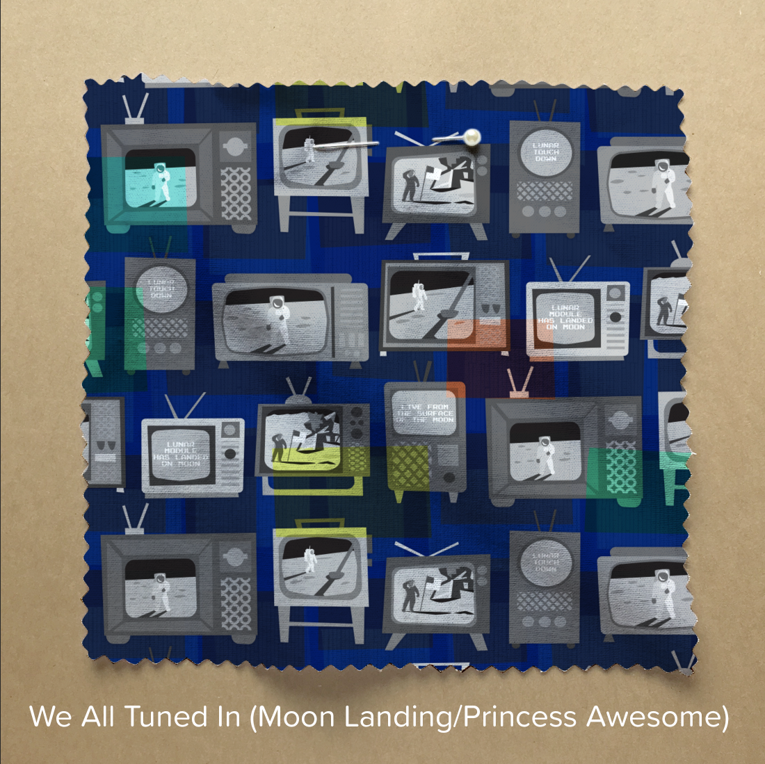
The design challenge theme this week was “Moon Landing”, celebrating the 50th anniversary of Neil Armstrong and Buzz Aldrin landing on the moon. It was a partnership with Princess Awesome, a company that designs science and technology themed clothes for girls. Many designers went with “girls in space” interpretations of the theme, but I wanted to celebrate the event itself.

I did some photo gathering online and looked at the way I would have experienced the moon landing: watching it on TV. I found lots of pictures of people gathered around television sets. I drew a collection of slightly wonky retro televisions from elements I saw in the photos and made illustrations of some of the iconic images from the broadcast with astronauts on the bright surface and deep shadows. On a few tv screens I put the captions that were on the broadcast. (This photo is from a friend of my mom’s who took a photo of his tv screen while he was watching.)

I wanted my televisions to be black-and-white, so I added a vibrant blue background to the design and then some transparent pops of color on top.

It was fun to work on and especially fun to do the photo research. You can see more moon landing designs at the contest page.

7 January, 2019

Spoonflower Design Challenge: Be My Valentine

2019-01-07T12:47:47-06:00Everything Else|1 Comment

In 2018, I participated in every one of the Spoonflower Weekly Design Challenges. Every week there is a topic posted and artists are challenged to design something to match the theme. Themes range from art elements (large scale black and white) to color limits (navy, orchid, maroon, white) to topics you can interpret anyway you like (sloths, four wheels, astrology). I wrote about how 2018 was for me and what I learned in a previous post and I realized that although I had shared all of those designs on all of my other social media channels, I talked about very few of them here. So for 2019, I am going to remedy that.

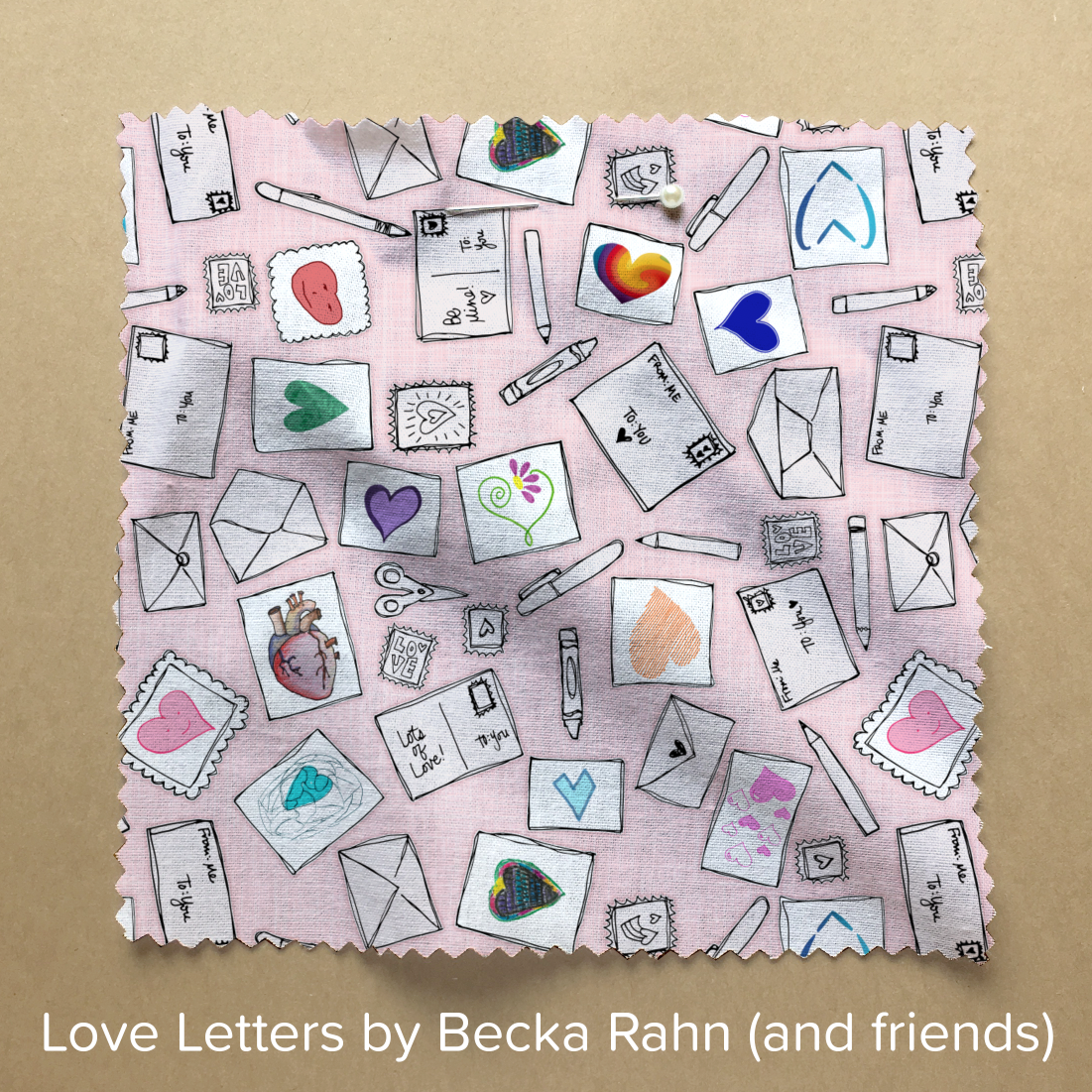
The theme for the first week of January was “Be My Valentine”. One of my strategies for coming up with a challenge design is to challenge myself. I first think about the immediate image that comes to mind when I look at the theme (red hearts, arrows, roses) and I throw that out. I try to never design the first thing I think of because often that’s the cliché. And for me, I like to think about what I want a design to be and what I want it not to be. When I was thinking about my Astrology theme design, I knew I wanted it to be fish (for Pisces), but not starry sky.

There is a legend in my family of the Valentine card that my dad made for my mom way back when they were 20somethings. My dad wrote her an irreverent poem and drew her a picture of a heart. A “real” anatomical heart. It wasn’t exactly what she was expecting at the time but it is one of my favorite stories of the two of them.

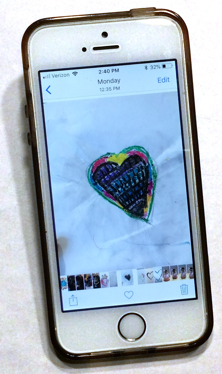
When I was thinking about my design challenge, I was thinking about how valentines are always a “you” and a “me” and I wanted to put that idea into the design. So I sent a text to my family and a few friends and said “Draw me a heart. Take a photo. Text it back to me.” And I didn’t explain anything else or give them any other rules about what I wanted. My family is pretty easy to talk in to playing along with things like this, so as the afternoon went on, my phone chirped with images of hearts. To my surprise, my brothers-in-law were talked in to participating. My niece and nephew added their artwork. Some gave me 2 or three ideas. (If you’ve been paying attention while reading this post, you will be able to spot my dad’s contribution to the finished design.)

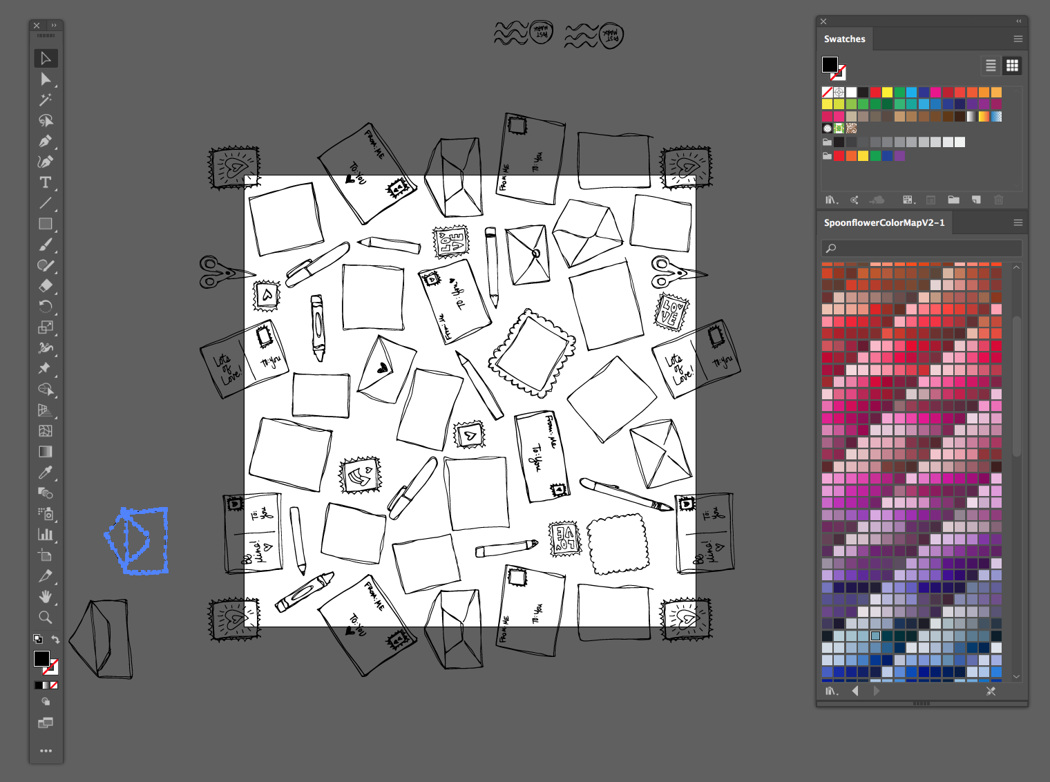
I didn’t know what they were going to send and in my head, I had a whole other way of putting it together originally. I thought about it for a little bit and then I sat down and drew a whole bunch of blank cards, envelopes, postage stamps and pens. I scanned and put those together into a large repeating pattern.

Then I added the hearts they had texted me, one for each card I had drawn. I edited their art as little as I needed to. I added a little color to some black and white versions because I wanted those hearts to be the main colors on the page and I made everything else a pale shade of pink/grey.

The finished design has 14 different artists who contributed to it. One of the friends who contributed commented when I posted the design “She also dreams up and does stuff that fosters creativity and community. That’s art, folks!” Exactly! I am going to talk about this design in a class I am teaching later today. Art is fun when you can share the art making. But more than that, the finished fabric isn’t just something “pretty” but it’s something with a story and the story makes it something you can connect with.

(If you love the design and want to vote in the contest, you can see all of the designs that were submitted for this week’s theme and vote here. I love the votes, of course, but I am more interested in the challenge than in the “winning the contest” part.)

1 January, 2019

Done is better than perfect.

2019-01-01T18:12:33-06:00Everything Else|4 Comments

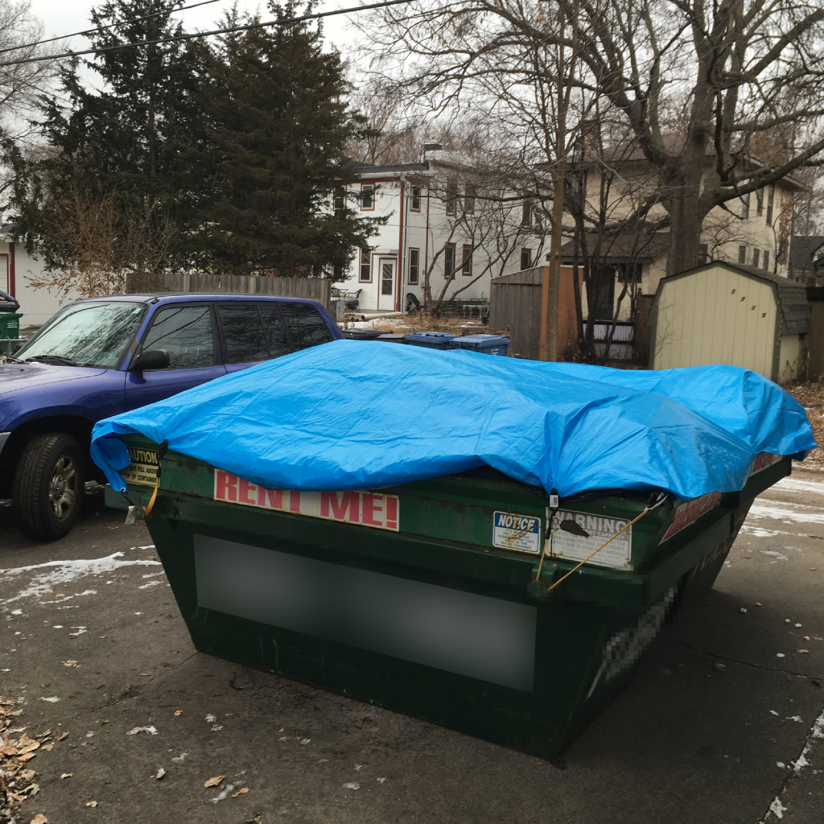
At first glance, you might think that the photo at the top of this post represents the metaphorical dumpster-fire that was 2018, but it actually might be one of my favorite things about the year.

As we were heading in to the end of 2018 and holiday season, we realized we didn’t have any plans. I don’t mean “no plans” as in “we only have a few family things and we might have a day to lounge around in our pajamas”; I mean nothing. We had scheduled alternate dates to celebrate Christmas with family, no one was visiting, and we were so busy with wrapping up year end at our various jobs that it didn’t occur to us to even make plans with friends. Two weeks with nowhere we had to be and nothing we had to do. No one to entertain, clean the house for, or cook for except ourselves.

It was glorious.

So we rented some dumpsters.

I know that might not sound like everyone’s ideal way to spend the holidays, but it was amazing. We moved in to our house almost 20 years ago. (I have no idea how that much time has gone by.) We came from a different state and a tiny condo so we had nothing when we got here and we just moved with everything we had. Turns out that the nothing multiplied into a LOT of junk. Things from college days. Hand-me-down furniture that people gave us because we had empty rooms in our house and no chairs. Things that we might get to “someday”, like a weaving loom I never use. More chairs. Old carpet left by the previous owners. And we put it in places and on shelves and in boxes and kind of forgot it was there. A sea of clutter.

At some point, I realized that we had created an elephant. A slightly overwhelming and mind-numbingly boring project with no easy way to solve it. Things that were too nice to just throw away so we wanted take them to the thrift store/goodwill. But we had to take the time to sort them first. Chairs and tables that were too big to haul in our cars. And 100 things that sounded like more fun than dealing with the clutter. The elephant in the room; the thing you keep ignoring because you can’t figure out how to deal with it.

So I looked at two weeks of time with nothing on the agenda and said to my husband “Do you want to rent a dumpster?”

I felt a little guilty. Just throwing things away is something I hate. I don’t like to make trash or toss things away just because I don’t like them anymore. I knew there was a lot that could be reused or go to another home. We did some research and found a place that says they recycle as much as they can of whatever you put in the dumpster. They bring it for a week, you fill it up, they haul it away. So, I just took a deep guilt-banishing breath and thought “Done is better than perfect.” (This is one of my favorite personal rules.)

The thing is, once we got going and really looked at things, we realized that most of the junk wasn’t as valuable as we had imagined it to be. Even if we took those pink velvet chairs to the thrift store, they were at least 30 years old and just plain worn out. Nobody wanted them. They really were trash.

We found some treasures while we were sorting. Postcards that my husband had written to me while we were dating. Two mysterious wrapped Christmas presents that we took upstairs and put under our tree. (Turns out we think they were from a white elephant party that got snowed out many years ago, but we had no memory of putting them on a shelf downstairs.) The more we looked carefully at things, the more we could let go and not feel guilty about doing it. We took photos of funny sentimental things (the luggage tag from my highschool band trip to Hawaii) and then let them go.

We laughed a lot. We laughed at ourselves for hanging on to things that seemed ridiculous now. We laughed at things that we had no memory of, but we had kept for some unknown reason. We laughed at the suitcoat my husband is never going to fit into again. We cheered as we tossed things into the dumpster to join the pink velvet chairs. We allowed ourselves to keep a few things that really had no earthly purpose except that they made us smile.

And then the nice guys came and hauled the dumpster away and everything felt a little lighter. There are empty shelves in the basement. The bedroom upstairs is a little echoey now that we got rid of that carpet. Everything feels a little disorganized and not quite done. And I think that feels like a great way to start off a new year.

4 December, 2018

Designing inspired by snark: The steampunk squid damask

2018-12-04T14:01:44-06:00Everything Else, Spoonflower & Fabric Design|Comments Off on Designing inspired by snark: The steampunk squid damask

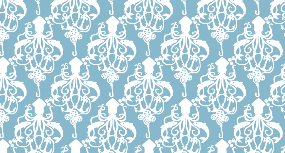
This design always makes me shake my head. It continues to be the most popular design in my Spoonflower shop and it was entirely inspired by snark.

I created it when I was working on the Spoonflower Handbook. One of the projects we wanted to do was a shower curtain and my co-authors and I had managed to convince our editors that the print should be something a little off the wall. We wanted something that wasn’t just Pinterest-worthy, but had a little of the amazing weirdness that can be found among Spoonflower designs. So we settled on octopi, which were a big trend at that time. (They are still pretty popular.)

But we couldn’t find a design that we all agreed on that would fit in to the curriculum in the book. We had a plan for the projects in the book to help you build different skills and teach techniques as you progressed through the book. We needed this design to help teach a particular skill. The trick was to find something that both taught what we needed it to teach and passed the thumbs up of the people in charge of the “look” of the book. (That wasn’t me.)

We tried something made with clip art, but that didn’t fit the design lesson (and licensing was tricky). We tried hand-drawing something inspired by that.

We tried using a vintage illustration from a 1918 encyclopedia.

I cut it out and repeated it, I made many different colorways, we scaled it to different sizes. I made and printed 27 versions of the “octopus design” and nothing could get the thumbs up from everyone who needed to approve it. It was too creepy, too grungy, too dark, too macabre, the wrong color, too weird.

I was frustrated.

So in a fit of snark, I decided I just needed to design something that was as trendy as I could make it. I put in every trend I could think of.

  • Two colors, to make it as modern and clean as I could.
  • A “cute” octopus, almost kawaii style.
  • Damask designs were a huge trend on Spoonflower right then because of a design contest theme. Everything was damask. So I decided to do a damask-like pattern. This was also intended for a home dec project, so damask seemed apropos.
  • Steampunk was also having a little trendy moment and octopi featured prominently in that.

So I drew a Steampunk Squid Damask. The original artwork is not pretty; I cut it out like a paper doll and then traced it with a purple marker on a piece of card stock and then scanned it to trace a vector design. (They asked to feature that original artwork in the book and I said you really don’t want to do that. I made a fake “pretty” original, but I don’t think we ended up using it anywhere.) Because I was feeling snarky, the “steampunk” part of the design was just the addition of some gears to the fishing line. Barely a nod to the theme.

To my complete shock, the whole team loved it at first glance. My original was navy and cream, but we ended up going with a pale blue and white for the finished project. I can’t look at the design without thinking of its 27 predecessors and the convoluted path it took to get to this one. It’s trending again right now on Spoonflower. I just did a couple of new colors and a smaller scale based on requests of some customers and that kicked off its own little trend again. Sometimes inspiration really does strike in the most unexpected of places.

20 September, 2018

I wanna be in the room where it happens.

2018-10-07T22:36:57-05:00Everything Else|Comments Off on I wanna be in the room where it happens.

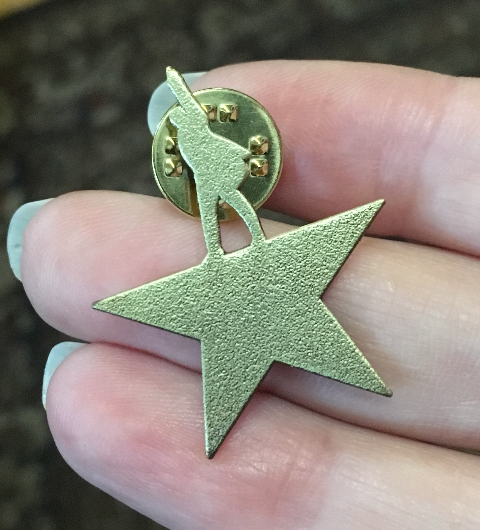
We saw it. It took signing up for a waiting list, winning a spot in a lottery, clicking through at just the right time and a whole lot of luck, but we scored tickets and saw Hamilton on Tuesday night.

I’ve been trying to stay away from knowing too much about the show because I wanted to experience it for the first time right there. I must be one of the only people on the planet who does not have the music memorized. I don’t even own the cast album. And I was a theater major and president of my high school Drama Club, so this was hard for me. But I know how amazing it is to see something live, with a room full of people who are excited to be there. I wanted that experience.

Hamilton is breathtaking. And I mean that in many ways. The first act literally never takes a breath. There are no scene changes to wait for, no transitions, no scenes full of dialog where you can sit back and relax. There is music and choreography and visual tableaus to take in from the very second the show starts until you feel like you can exhale at intermission. I have never seen a show that grabs you like this and doesn’t let you go. I will argue that Wicked has the very greatest act one closer ever, but Hamilton leaves you with a similar kind of rush.

Thinking about it, I am a little surprised that Hamilton is as popular as it is, honestly. It is an odd show. Maybe that’s what does it. It is more like an opera than a musical. There are about five minutes of the whole show that are spoken dialogue. Everything else is in song. And fast, complex, unhummable songs with complicated language. The chorus is very much like the tradition of a Greek chorus. They become the set. They are the special effects of bullet shots and explosions. They transform into characters and abstract images of the events going on behind the words. The original choreographer deserves as much credit as Lin-Manuel for making this crazy show work. (I just looked it up. The choreographer was Andy Blankenbuehler and he won a Tony for the choreography. As he should have.) The chorus must be flat out exhausted after a performance. They are moving non-stop through the entire show. The costuming was also adding to the chorus-like feel, with most of the cast in a pale cream “parchment” color that is a cross between a suit and a leotard; simultaneously a period costume and something more modern. A friend commented that he thought it was weird that they looked like they were in their underwear but then he saw the show and it all made sense. I totally agree. The costume geek in me also appreciated that the ladies costumes transitioned to a Regency silhouette by the end of the show, a tiny element that showed the passage of time.

I am thrilled that I got to see it live and without many spoilers. I look forward to listening to it again. I am a very visual person and I know that there are whole things I missed because I was caught up watching the lights and the visual story. It was a lot to take in all at once.

A special bit for me is that when I won the spot in the lottery to be able to buy tickets, they let me get four, which meant we got to take a couple of friends with us. We invited our friend E, a highschool theater geek, and her dad, a musician. My husband and I (also highschool theater geeks) agreed that we would have DIED to have the opportunity to see the hot popular musical of the day when we were in highschool (for us that was Phantom of the Opera or Les Mis). So I am delighted that we got to go with her. (And don’t bother to treat your inner 16 year old self to seeing Phantom of the Opera; it’s terrible.)

Go to Top