30 January, 2025

My favorite scissors for mixed media art

2025-01-30T15:57:57-06:00An Artist's Life, Fabric Reviews|Comments Off on My favorite scissors for mixed media art

I shared a photo of my studio table in my newsletter today while I was in the middle of a project and I noticed that all of my favorite cutting tools were on the table, so I thought I would talk about what they are and why I like them.

I work with both fabric and paper often in the same project, so I unlike many fiber artists, I don’t have a dedicated pair of fabric-only scissors. My cutting tools include scissors, thread snips, and a utility knife.

I have two pairs of Fiskars scissors. The large pair has a non-stick coating on the blades. I love this classic bent handle shape; I know you’ve seen ones like that before. The small pair are a style they call Microtips. If I had to have only one pair of scissors in my entire studio, it would be these microtips. I use them for everything and the very fine pointed tips make them especially good for cutting fine details in felt or paper. Both of these are nice and sharp, hold an edge well, and work equally well on fabric, paper, threads, or cardboard. The best part is that they are super affordable and you can find them nearly anywhere. When they get too dull for my art, I retire them to the garage and the kitchen where they still work great for those things.

The utility knife is one I found because I was looking for a sturdy handle that was easier on my hands when I was cutting things like bookboard, which is very dense and hard. This is a handle which holds standard box cutter/utility knife blades. It’s aluminum and folds up with a push button latch. The photo shows it folded closed, which also protects the blade. It is THE BEST. It’s comfortable in my hand and holds the blade really steady unlike some of the xacto handles I’ve used. And it comes in about 10 fun colors.

Finally, there is my favorite pair of thread snips. The thing I like the best about these is that they are so simple. I have several other pairs with fancy molded handles and loops and this pair is the one I love. They came from my local yarn shop but these look nearly identical to the ones I have.

8 January, 2025

Sheep Blossoms: Designing fabrics for Darn Knit Anyway

2025-01-08T10:46:46-06:00An Artist's Life, Spoonflower & Fabric Design|Comments Off on Sheep Blossoms: Designing fabrics for Darn Knit Anyway

One of my favorite projects from 2024 was designing a set of fabrics for my local yarn shop friends Aimee & Carly at Darn Knit Anyway. The shop celebrated its 15th birthday last year and I’ve known them since before the shop was even a twinkle in their eyes. I thought it would be fun to talk a little bit about the process that goes on behind the scenes to make these fabrics come to life.

We started by talking about what the fabric should be. I gave them a list of adjectives so that we could kind of choose the style they were going for and they came back with “branded, playful and maximalism”. Since they are primarily a yarn shop, they really wanted to incorporate sheep into the design somehow and I really wanted to do it in a way that it wasn’t just a design that screamed “we’re a yarn shop”. We also talked about what they wanted to do with the fabric after it was printed so I could get an idea of the scale. Designing for something that’s going to be curtains vs small project bags are two very different fabrics.

Branded to me meant that we needed to use their brand colors, which happens to be a palette that I LOVE. The challenging thing about this palette is that they are all a very similar value so there’s not a really strong variation in light and dark. But fortunately, sheep are really classic to make in black and white so I decided to try and balance the black and white with the colors.

You’ll notice my photo up above is paper, pen and pencil. I do not draw my designs on an iPad or use Procreate. I like to make paper art as the starting point. So these started as many sketches on paper. I don’t use a lot of special art tools. I drew these on copy paper and inked them with my favorite Uniball pen and a plain old sharpie. Why do I work this way? I really like the quality of the lines and the art better. As I watch videos of other artists drawing with tools like Procreate that “correct” your lines and “perfect” your circles as you go, I just looks boring to me. No shade to those of you that love drawing with those tools! It’s just not my style.

I decided that one way to make the design a little playful was to try to “hide” the sheep in the design. I didn’t literally hide them as they are a pretty prominent element, but I treated them like they were flowers in a lush floral design instead of making sheep in a field or something more realistic like that. I rarely design florals, but I liked the humor of the sheep as flowers and sitting on and swinging off of the vines. I added a few other little knitting bits into the florals: the flower buds look like yarn balls, the vines all have a knob at the end so they look a little like straight knitting needles.

Once I had the initial design done, I scanned the art and brought it into Photoshop. There was a lot of boring little clean up zoomed way in on the design: cleaning up stray marks, making sure the repeat matched, adjusting lines that were too thick or thin.

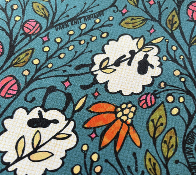
I spent a lot of time coloring and experimenting with placing the colors. I used a Photoshop brush with an impressionist painting effect so that it added some variation to the color as I painted, so nothing was just big blocks of color. I really love to add a lot of rich texture to my designs, so this has two layers of texture over top as well. The pale yellow grid broke up the white blobs of the fluffy sheep and added a linen-like texture to the background. And then there’s a very subtle spatter paint texture over top of the black outlines in the same color as the background. This softens up the lines and gives it a kind of weathered look. Both of those textures were also things I drew or painted and scanned; I have created a library of subtle textures like crinkles, spatters, and linen that that I use often in my work. I ended up using all of the colors from the brand palette because they just worked so well together and because the values were so similar, it makes a kind of unified background that was a great contrast for the sheep. As a last detail I added the words “Darn Knit Anyway” along the edges of the vines in three different places. I love this fun little message hidden in the leaves.

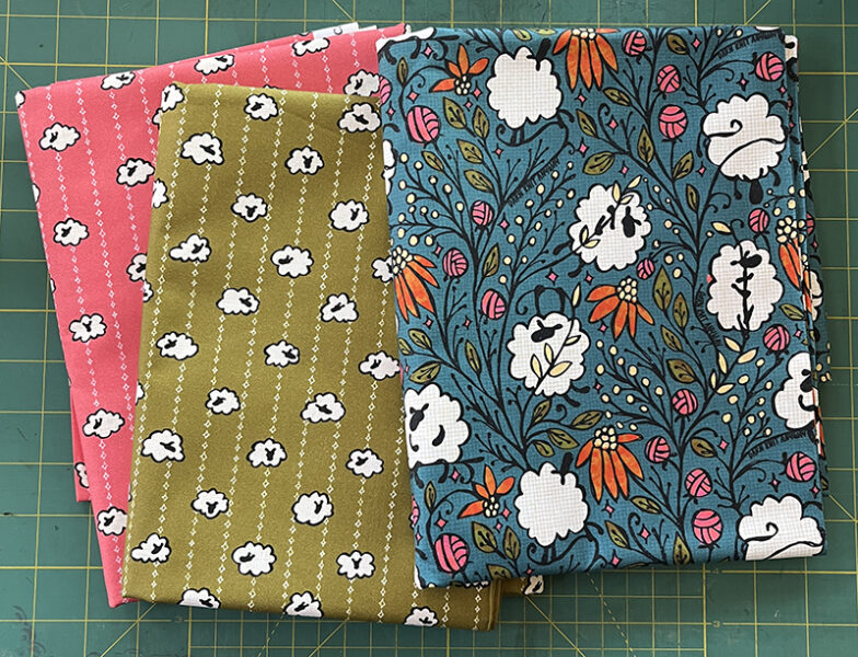
Because they wanted to make some little drawstring project bags with these prints, I also created a coordinating print for the lining. I wanted to do something reminiscent of a ticking stripe and pulled the little twinkle star shape from the main print. I drew more fluffy sheep but instead of swinging from things, I wanted these to look like they were napping and their feet were all tucked under their fluff. My husband said they looked like popcorn, which made me laugh and I think also adds to the playfulness and the whole theme-in-my-head of sheep pretending to be other things. I couldn’t decide which color I liked better so I designed two.

It was great fun to work on this collection and I hope it brings lots of smiles to the community at DKA.

18 June, 2024

Spoonflower Fabric Review: Seersucker

2024-06-24T09:03:56-05:00Fabric Reviews, Spoonflower & Fabric Design|Comments Off on Spoonflower Fabric Review: Seersucker

I was really excited to see Seersucker as one of the new fabrics that Spoonflower introduced recently. Seersucker is one of my favorite fabrics. I ordered a swatch printed in my Sea Stars design.

Print quality

The print quality looks great! This is a textured fabric, so I have a feeling that designs with very fine lines might not be as crisp as some other fabrics like sateen. This design printed great! The base fabric is a bright white, so the colors printed exactly as expected. I didn’t find the stripe texture to distract from the design, but that is definitely something to keep in mind when you choose a design to print. I suspect that a design with a strong narrow stripe in the design might fight a little with the woven texture of the fabric.

Fabric

Seersucker is a woven striped fabric, with the stripes running with the grain of the fabric. This is 100% cotton and prints 54 inches wide. The stripes are just about exactly 1/16 inch wide. They alternate with one stripe that is a tight weave and the next stripe is more open weave with a little space between the threads, so those stripes look slightly translucent. When you run your fingertips across the fabric, you can feel the texture of the stripes.

You can see that translucency a little in this photo. I put the fabric against my deep green cutting mat, but slipped a piece of white paper behind part of it.

Some seersuckers have a very pronounced rippled texture in the stripes, but this version is pretty smooth. I washed this swatch and it softened up slightly, but didn’t change texture or feel very much between washed and unwashed.

It is lightweight and has a nice drape. It feels very soft both on the printed and unprinted sides. It barely frayed at all on the cut edges when I washed it, which I like because it shows me that it’s a sturdy weave that should stitch up really nicely.

Shrinkage

I measured the swatch before and after washing. There was no shrinkage across the width of the fabric, but quite a bit lengthwise. My swatch was about 7 5/8 inches after washing, which is about 4-5%. That’s close to Spoonflower’s estimate on their fabric spec page.

Overall impression

I can’t wait to print some more and make some summer tops. This looks and feels like a really high quality fabric. The 54 inch width is a nice bonus because it means I can potentially do more with a single yard of fabric (vs a standard 42 inch quilting cotton). I think seersucker is best for light weight clothing. It could also make nice semi-sheer curtains or a shower curtain (with a liner behind).

9 April, 2024

A Review of Spoonflower’s Metallic Wallpapers

2024-04-17T12:11:36-05:00Spoonflower & Fabric Design|Comments Off on A Review of Spoonflower’s Metallic Wallpapers

Spoonflower just recently introduced two new metallic wallpapers in silver and gold. I ordered some swatches in two of my own designs so I could check them out. Before I jump in to talk about the papers I want to make a little disclaimer: I am not going to talk about using this as wallpaper and hanging it on a wall. I am not a decorator and I don’t use wallpaper in that way. I am a paper artist, so I am going to talk about it in that context as art paper. (So if you are looking for tips about hanging it or what type of paste to use, I am not your girl.)

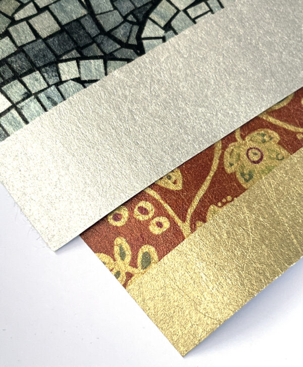
The new Silver and Gold wallpapers are basically identical except for color. Each paper has a base or background color of either silver or gold that your design is printed on top of. The color of the paper shows through any white areas of the design and gives the overall colors of the design a tinted shimmer. You can see the unprinted selvedges of the paper here to get an idea what that base color looks like.

The color of the paper does influence the color of the printed designs, so I picked a couple of my designs I thought would really compliment the silver and gold undertones. These printed beautifully. The colors are really crisp and sharp and the metallic makes them look very rich.

The paper has an irregular fibery texture. I’ve heard people describe it as leathery. I think it looks a little like a surface that has been gold leafed. It’s not smooth like copy paper, but it reminds me of a satin or brushed metal finish you see on jewelry. The surface is not plasticky which was a very pleasant surprise but it feels like paper.

The weight is about equivalent to a mid weight drawing paper. It takes a crease and curves around surfaces nicely without cracking. I made two coptic bound sketchbooks with my swatches (up above) and it wrapped easily around the corners and edges. The paper didn’t burnish or get marked when I used a bone folder to guide it around the corners.

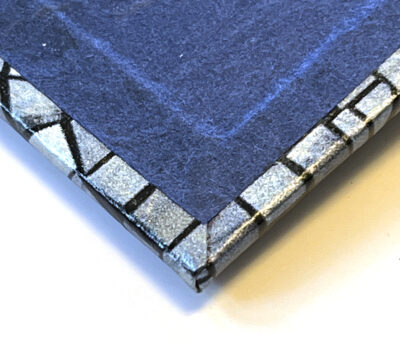
The back side of the paper is a plain white matte paper surface that feels a little like newsprint. Since it’s designed to have glue added to it, it soaked up the PVA I used for the book covers and glued to the cover boards as easy as anything.

I took a really short video so you could really get a sense of the shimmer of the metallic since that’s so difficult to capture in a still photo.

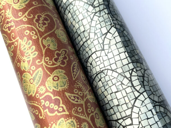
Overall, I can’t say enough good things about this paper! The first thing I did when I finished making these book covers and I was waiting for the glue to dry was order 4 more swatches with different designs. I am planning to make a covered box next.

It might also be amazing as a wall covering but I think it’s a really cool new art paper and I can’t wait to figure out more ways of incorporating it into my designs. I ordered swatches which are 24×12 inches, which gives me plenty to make several covered books and try some experiments.

20 November, 2023

Fabric Design Spotlight: Security Detail

2023-11-20T17:38:19-06:00Spoonflower & Fabric Design|2 Comments

One of my favorite materials to make fabric designs from is the humble security envelope. They are the ones with black and white patterns on the inside that your bank statements or rebate checks come in. They come in multitudes of patterns and I collect them every chance I get. I wanted to do a set of new patterns for the holiday season this year, so I decided to illustrate two dozen dogs and cats on security envelopes.

I drew them with a black pen, cut them out and used some scraps of magazine photos to make their colorful collars. Here are some of the dogs.

After I drew them, I temporarily attached them to a piece of cardstock so I could scan them all at once. Then I pulled them in to Photoshop and made a repeating tiles, so you had a continuous pattern of dogs. There’s not a lot a magic to doing a seamless repeat like this, it just takes a lot of patience to get everything lined up perfectly to match from one tile to the next.

Once I had finished a seamless pattern of both cats and dogs, I decided to reuse the same art and make a calendar tea towel. I love when I can use art multiple ways to make different designs. For the tea towel, I already had made the months for a different design three or four years ago using ransom note style letters and numbers cut out from magazine pages. I rearranged the numbers to match 2024 and created a new calendar design with a cat and a dog sitting next to each month. Here’s a screenshot of the calendar in progress.

Then, I decided to reuse the cats and dogs once again, but to make holiday ornaments! Once I have the original paper art scanned, I can do anything I want to with the originals. Sometimes I remake them into other things.

To make ornaments, I wrapped some scraps of bookboard with marbled paper that I made in a class. I covered the front side with handmade lokta paper in a solid color and then added one of the cats or dogs on top. I punched a hole in the top with an awl and threaded through some sparkly ribbon to make a hanger. Each one got a tiny initialed signature in the corner.

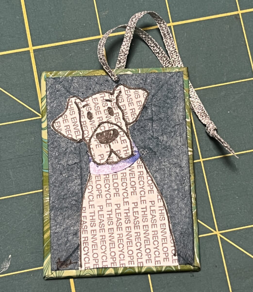
The rest of the ornaments went off to holiday shows at the Northrup King Building and North Suburban Center for the Arts, but I decided that I needed to keep this Stanley for myself. I love this particular security envelope design so much. If you look closely it says “PLEASE RECYCLE THIS ENVELOPE.”

I’m sold out of calendar tea towels but you can get them from my Spoonflower shop! 

Go to Top