14 July, 2016

Fabric Design Tutorial: Create a “Mini Photo Scrapbook” Fabric Design
2016-07-19T09:53:53-05:00Everything Else, Spoonflower & Fabric Design, Tutorials|Comments Off on Fabric Design Tutorial: Create a “Mini Photo Scrapbook” Fabric Design

Screen Shot 2016-07-13 at 11.48.36 AMI am going to call this tutorial the first in what I hope will be a series of “Suggestion Box Tutorials“.

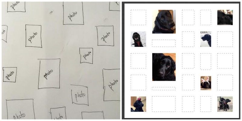
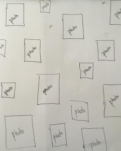
I got an email from a woman this morning asking for help designing a fabric to make a keepsake zipper bag. She and a collection of friends are meeting up this summer and she wanted a little something to give each of them to commemorate the occasion. She had a great idea for what she wanted the fabric to look like: a collection of photos and little graphics that were all significant to this group of friends. The photos should be scattered like postage stamps on a white background. She even sent me a sketch.

Her question was: did I know of anywhere there was a tutorial that could show her how to do this and how could she make sure that it was just the scale and size she wanted?

Could I think of anything? No. So, this seemed like the perfect tutorial for me to write.

What does your intention tell you about your design?

If you have had the chance to take a class from me, you know that one of my tips for creating really successful fabric designs is to design with intention. The intended use for your fabric can give you so many hints about how you need to set up your design files.

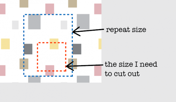
This fabric is intended to be a lining for a small zipper bag. So we know that will use pieces of fabric that are maybe 10-12″ square. If I create a repeating tile that is larger than 12″, I won’t see all of the photos that will be in the design because I will be just cutting out a piece. Maybe that’s ok. Or maybe you want to make sure that each bag has every photo visible. That’s a choice for you to make.

I also know that if my zipper bag is 10-12 inches, I probably need the photos to be pretty small in relation to that so that the scale makes sense. If the photos are each 6 inches, I will only be able to see a couple of them once I cut it out.

Screen Shot 2016-07-13 at 12.12.30 PM

Do the math.

So for this project, I am going to use that information to set up my design file (aka do the math). Why do I need to do that now? Can’t I just do the fun part (designing it) and worry about that math stuff later?

The number one thing I hear from new fabric designers is:

I uploaded my thing to Spoonflower and it was so awesome, but it was totally the wrong size! I thought it would be small but when I uploaded it, it was huge! I don’t know what happened. I was so surprised.

This is the step where you can make it turn out exactly the size you want it to be. It just involves a tiny bit of math.

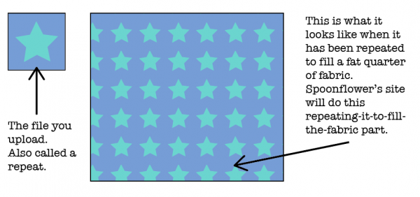
  1. Decide what size you want your repeat to be. By “repeat” I mean the file that you will upload to Spoonflower. Spoonflower computers will repeat that file it to fill as much fabric as you want to print. Yes, you repeat your repeat. English is weird.

Screen Shot 2016-07-13 at 12.25.24 PM

I decided that for this zipper bag lining, I want my repeat to be 12″ because I want to be able to see the whole thing with all of the little photos when I cut out my lining piece. That’s my design choice. You make your choice.

2. The magic number is 150.

The only thing you need to remember about resolution for this project is 150. Resolution is the number of dots (or pixels) per inch that the file needs in order to print at the size you want. Dots per inch = DPI.

Spoonflower’s printers use a resolution of 150 DPI. That’s why 150 is our magic number. That means if you set your file to 150 DPI, you will get exactly what you expect to get. That’s a rule. 150 uploaded = 150 printed. In otherwords, if I make a file that is 12 inches at 150DPI, I will get a printed design that is 12 inches. No more, no less. So how do I set up the file?

3. Figure out how many pixels that is.

Resolution is the number of pixels per inch. Since we know how many inches we need (12″) and we know how many pixels per inch (150 DPI) we can figure out how many total pixels that is. And we need to know the total number of pixels because that’s the number our graphics program will ask for.

inches x resolution = pixels

12 inches x 150 pixels per inch = 1800 pixels

That means if I want a file that will print exactly 12 inches wide, I need to make a file in my graphics program that is 1800 pixels wide.

Remember that number. 1800 pixels. Write it down on a scrap of paper.

Create a new blank file.

For this design, I am going to use a program called PicMonkey because I think it is the ideal tool for this design. It’s going to make it easy. You can use any program you want to to make your designs, but PicMonkey has some built in tools that I know will work really well for this. That’s why I picked it. It’s a free online graphics software that works right in your web browser. You don’t need to download anything.

Go to PicMonkey.com. At the top of the screen you will see a menu bar.

Screen Shot 2016-07-13 at 12.44.02 PM

Click on the option on the right that says Collage.

Set up the Layout.
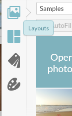
Screen Shot 2016-07-13 at 1.22.09 PMThe reason that PicMonkey is such a great tool for this project is because of this collage tool. Look at the left sidebar on your screen for the icon that looks like a grid. If you hover your mouse over it, it will say “Layouts”. Click the Layouts button.

Feel free to explore the options in this panel! These are all of the different ways that PicMonkey can layout a collage for you.

(There are some options that are marked with a crown – those are part of the upgraded “Royale” package that PicMonkey offers, which is an annual fee of $40/year. We will use a free layout option for this project but that $40 per year membership is totally worth it. Note: I don’t get anything from PicMonkey for telling you that; it’s just my personal opinion. I just love PicMonkey.)
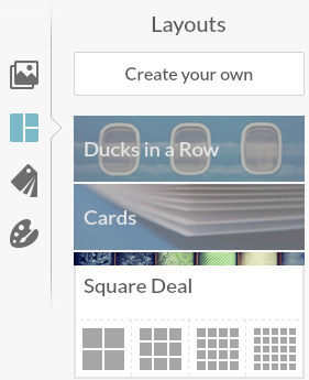
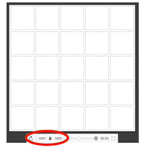
Screen Shot 2016-07-13 at 1.24.22 PMClick on the option called “Square Deal” out of that list and then pick the little icon at the very far right (a grid of 25 squares.)


Remember when I told you to write down “1800 pixels”. The very next thing you want to do is set this file to be 1800 pixels. Look at the bottom center of the screen and you will see where to type that in. I put in 1800 for both the width and the height, so I will have a 12 x 12 inch square as my file size. (See how easy that was!) Hint, if you click the Lock Icon after you do this, it will keep it at this size while you are doing the next steps and rearranging things.

Screen Shot 2016-07-13 at 1.32.25 PM

Add your photos.

The dotted lines in this layout represent the places I can drop in my photos and graphics to make up this design. But first I need to load them into Picmonkey.

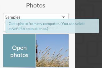
Screen Shot 2016-07-13 at 1.35.43 PMLook back again at the left sidebar. Choose the top icon that looks like a picture of mountains and is labeled “Images”. The very first thing in the panel of thumbnails will be a button (top left) that says “Open Photos”. Click that and it will pop up a window for you to find the files on your hard drive.Screen Shot 2016-07-13 at 1.36.58 PM

A hint: It’s super helpful if you collect everything you want to use for this design and put it all together in a folder on your Desktop (or somewhere else handy). Then you can select and upload them all at once instead of needing to hunt and peck all over your computer to find what you need. Load all of the photos you want to use right now. You can click that “Open Photos” button more than once to keep adding photos.
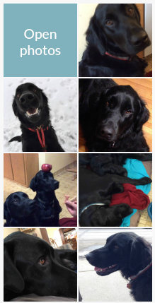
Screen Shot 2016-07-13 at 1.44.14 PMYou will see all of your photos pop up in the thumbnails along the left side of the screen. They don’t have to be photos. Anything in a .jpg format will work, like little graphics or screenshots. Just make sure you have permission to use them.

Now the photos are ready to use. I chose a bunch of photos of my dogs for this example.


Fill in the blanks.

You can now click and drag the photos from the left sidebar and drop them in the boxes in the template on the right. If I look back to the sketch my friend made, she has photos scattered all around the design, so I am not going to fill in every box in the template, but I will leave some spaces.
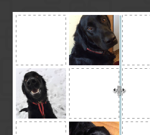
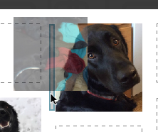
Screen Shot 2016-07-13 at 3.05.41 PMWant to vary the sizes of the boxes a little? You can click and drag to change the size and shape of the rows and columns. Hover with your mouse between a couple of boxes and you will see a double arrow pop up. You can drag with that double arrow to make the columns and rows bigger and smaller.

Screen Shot 2016-07-13 at 3.07.20 PM


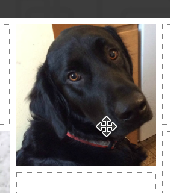
Recenter a photos? Hover over a picture and wait for your cursor to change to a 4-pointed arrow. Now you can move the photo around within the box (to recenter it).

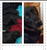
Want to add another photo and insert an extra box into the template? Grab a photo from the thumbnails, drag it over to where you want to add it and wait for a blue outlined box to pop up. When you drop the photo it will add a new box where that blue outline was. Now there are two photos in that space.

Screen Shot 2016-07-13 at 3.11.02 PMScreen Shot 2016-07-13 at 3.11.10 PM


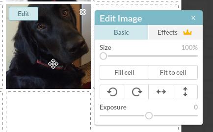
Zoom? Click any photo in the collage to see an Edit button (top left) or an “X” (top right). Click the “Edit” button and a menu will pop up that will let you zoom and rotate that photo you have selected. Click the “X” to remove the photo.

Screen Shot 2016-07-13 at 4.08.10 PM

How do you know if the photos you are using are going to work and not look pixellated? Pretty much it is what-you-see-is-what-you-get. I could help you do the math to check that you have enough pixels in each of these photos and so on, but honestly, if it looks blurry, or pixellated, or in any way yucky when you look at it in this step, it’s going to look that way when you print it. It’s pretty simple. Your best bet is: if it looks yucky, choose a different picture. You can’t fix blurry or pixellated.

(more…)

29 June, 2016

A teacher’s life: My week at Arrowmont School

2016-06-29T09:31:45-05:00An Artist's Life, Classes & Teaching, Gallery Exhibitions, Spoonflower & Fabric Design|Comments Off on A teacher’s life: My week at Arrowmont School

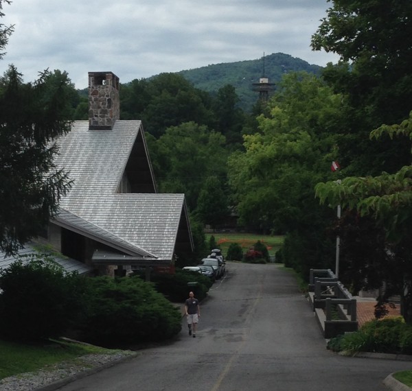
IMG_3597I just got back from teaching a week-long workshop at the Arrowmont School of Arts & Crafts in Gatlinburg TN. Arrowmont is like summer art camp for grownups in all the best and worst ways. Each class is an intensive week. Studios are open 7:30 am – 1:00 am nearly every day. Students and teachers stay in no-frills dorm-like rooms; meals are provided at the dining hall. There are evening slide talks and open studios. Above is a view of the main building as I am walking down from my cabin.

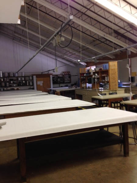
IMG_3530There was a little snafu with a late shuttle and some very bad communication when I first arrived, so my week started off a little rocky, but things smoothed out as the week went on. I was teaching in the textiles studio, which is set up like the most amazing dye lab you can imagine. Only we weren’t doing anything with dyes, because I was teaching a whole week about digital fabric design with Spoonflower. Having this lab full of computers and scanners is not exactly the norm for Arrowmont, but it worked out just fine. We got to try some things in class which I almost never have time to do, so it was fun for me to be able to teach the students some more complex techniques.

IMG_3622

Class started right away on Sunday evening and continued through Friday afternoon. There were 9 classes running during the week I was there. I had 6 amazing students in class; class sizes ranged between 3-15 people. Running parallel to us were classes in woodworking, paper, ceramics, mold-making, wire sculpture and mixed media jewelry. We had 37 hours of class time and we packed it full. We talked about color, patterns, making things seamless, effective repeats, scale, texture…

IMG_3651
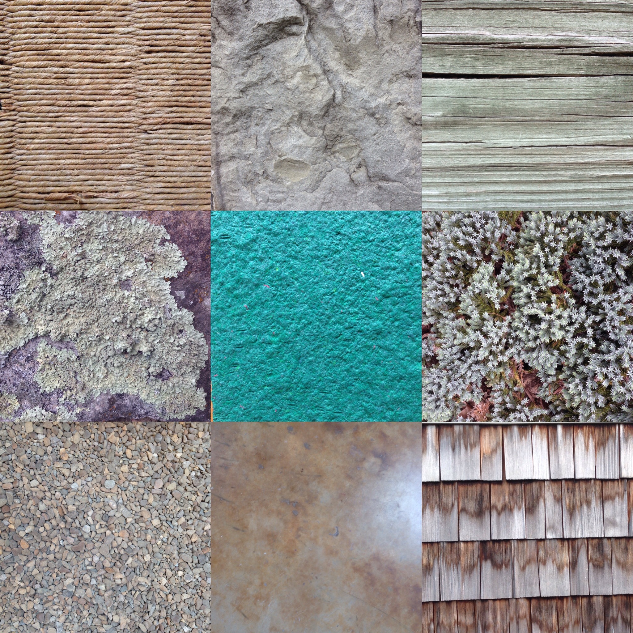
One afternoon we went for a photo walk around campus to collect photos of textures to use in our designs. We focused on work with Photoshop, but also explored a variety of other programs and tools that are really suited to fabric design. We made organic photographic patterns; we made geometric patterns from cut paper; we made faux batiks and digitally painted designs. Spoonflower worked with us to get fabrics shipped out lightning fast, so that we could create some designs on Monday and have the fabrics in our hands on Friday afternoon.

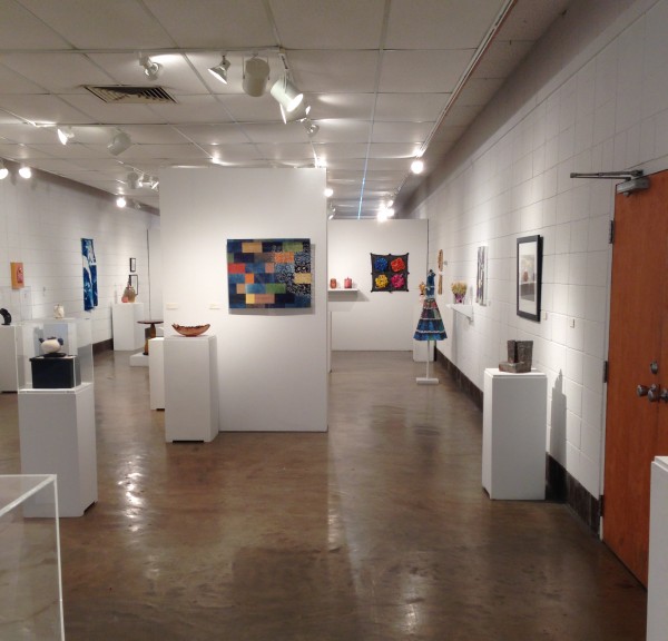
The gallery which was just outside of our classroom featured an exhibition of work by this year’s Arrowmont instructors. You can see my piece (my Wallflower dress) along the wall on the right. Arrowmont’s awesome gallery director came and filmed a little clip of me teaching to add to the interactive (QRcode) part of the gallery exhibition. I will post a little clip of that sometime soon.

IMG_3609

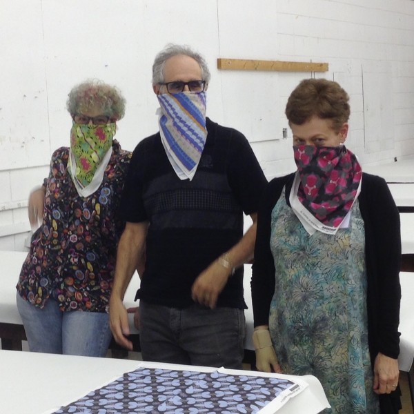
Our class worked really well together and I think everyone left totally fired up about designing some of their own fabrics. Below is a few of them goofing around with their freshly printed fat quarters on Friday afternoon. I was so proud of what they accomplished. And they blew me away with how much they learned. One student had me sit down on Friday with her and she talked through a step-by-step plan she had made for how to finish her “final project” design when she got home. She had come up with about 18 steps and knew exactly what to do at each step. SO proud!

IMG_3647

If you have ever wondered what this kind of workshop experience is like: intense, exhausting, focused. Part of the appeal is that you can come and have hours to use specialized equipment and facilities. With a digital class though, I had to be a little more on the ball. There were no special tools or equipment we needed to use; we all brought our own laptops. So the special and intense part of this class was having the one-on-one help and hands-on practice with the tools, with me to look over and remind you to check the checkmark or unlock the layer when suddenly something seemed to stop working.

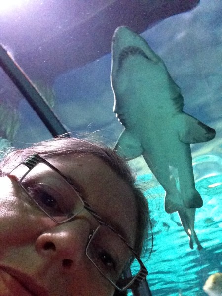
One of the funniest things about Arrowmont is that just a 5 minute walk away is the tourist trap town of Gatlinburg, which is full of t-shirt shops, ice cream, deep fried food and old time photos. (There’s also a Starbucks and a Walgreens, which I found the first night I was there.) Arrowmont feels like a magic bubble in the woods; they really are odd neighbors. There is a really nice aquarium in town, which I visited on Sunday morning since I didn’t have much classroom setup to do. I took a selfie with a shark.

IMG_3502

In our discussion about colorways, my class and I decided if you were going to walk down the street and then design a Gatlinburg fabric it would need to include these colors:

Screen Shot 2016-06-29 at 9.12.47 AM

(And if you are designing fabric for anyone under the age of 8, throw in some neon green.) I met some fascinating teachers, I had fantastic students to work with and I had some great conversations with the work-study students that were busy all over campus. Thanks to Arrowmont for a one-of-a-kind experience.

1 June, 2016

NEW Spoonflower Handbook Master Class in August 2016

2016-06-01T16:53:00-05:00Spoonflower & Fabric Design, UpcomingClasses|Comments Off on NEW Spoonflower Handbook Master Class in August 2016

Greenhouse-masterclass2-Register_BLOGThat’s right, we loved it so much, we are doing another one. It’s a summer session of the Spoonflower Handbook Master Class!  You can read all of the details here. This session will focus on working with Photoshop instead of Illustrator and I have a bunch of fun stuff planned for you. Registration is open and it is filling up. Let me know if you have questions and I hope to see YOU there.

31 May, 2016

Tutorial: Color schemes from photos & using Creative Cloud Libraries

2016-05-31T11:30:43-05:00Spoonflower & Fabric Design, Tutorials|Comments Off on Tutorial: Color schemes from photos & using Creative Cloud Libraries

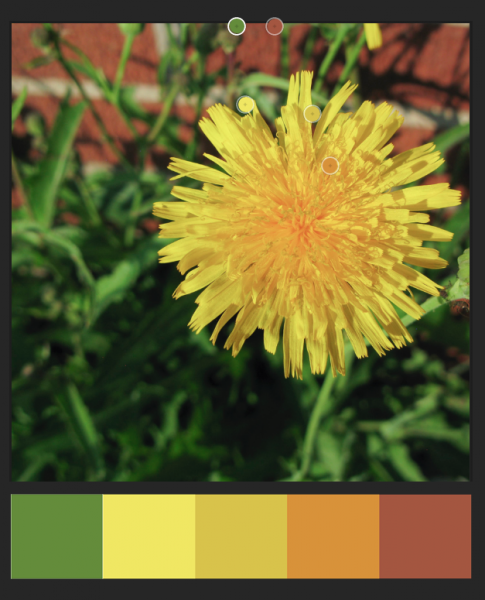
Screen Shot 2016-05-31 at 10.10.31 AMI write a newsletter for the MN chapter of the Surface Design Association and each month I include a color scheme for inspiration. I know color is a hard thing for a lot of people. I work very intuitively with color and I personally don’t put a lot of thought into color theory or color wheels; I just go with what feels right to me. But not everyone can work that way. So I like to provide a little jumping off point by pulling a set of colors from a photograph to use as color inspiration. Maybe you can use it as a jumping off point for a new design. Maybe it makes you look deeper at a photo to see the way colors work together. Maybe it makes you think about how there are unexpected colors in shadows. I think there is something for anyone to relate to.

As a dyer or surface designer that works with paints, dyes or pigments you can look at the palette and mix up your colors to work from there. As a digital designer, I can import these colors directly in to my graphics program. It doesn’t really matter if I am working with the exact colors from the photo for a single design, but where that is handy is when I want to make a set of coordinating designs where matching colors is important.

I start by pulling colors from the photo using a program called Adobe Color, which is also part of the Adobe Capture app, so you can use it in your web browser (Color) or on your phone/tablet (Capture).

Screen Shot 2016-05-31 at 10.14.35 AM

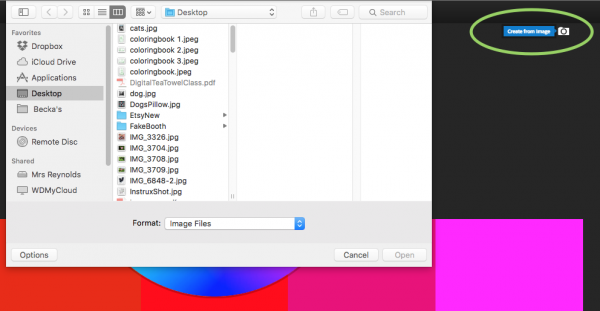
Go to Adobe Color and look for the camera icon that says Create from image (green circle) or click in the center of the screen. Choose the image you would like to use.

Screen Shot 2016-05-31 at 10.15.00 AM

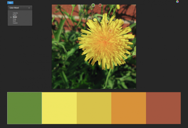
When it pops up the photo, it will automatically choose 5 colors, shown by little bubbles on the photo. You can click and move those bubbles around to adjust the colors. On the top left, there is also a palette marked Color Mood, which gives you options for “colorful”, “bright”, “muted” etc.

You’ll need to have an Adobe ID to save this color scheme. If you already have a subscription to Photoshop or any of the other Adobe software, you should use the same ID. Once you have a set of colors you are happy with, click the Save button.

A little note: No Adobe account? If you don’t want to have one more account name and password to remember, I totally get that. If that’s the case, just take a screenshot of this screen instead of saving. You can work from a screenshot almost as easily.

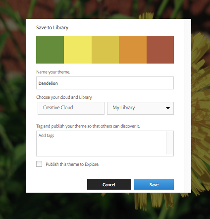
Screen Shot 2016-05-31 at 10.17.15 AMGive your color theme a name and choose where you want to save it. Creative Cloud is the subscription service that you get your Photoshop subscription from. (Because this is always a question I get asked when I talk about this in a class, it doesn’t have anything to do with “The Cloud” or saving things to “The Cloud”, Creative Cloud is your Adobe account. It’s just badly named.) By default, you have a Library named “My Library” but you can create a new one and give it a different name. You have the option of making this color scheme part of the public gallery if you choose “Publish this theme to Explore”. That’s up to you.

Why save it this way and not just on my hard drive? This is the cool part. Anything I save to My Library is available to me in any other Adobe program. So once I have captured this color scheme, I can switch over to Photoshop.

Screen Shot 2016-05-31 at 10.19.26 AM

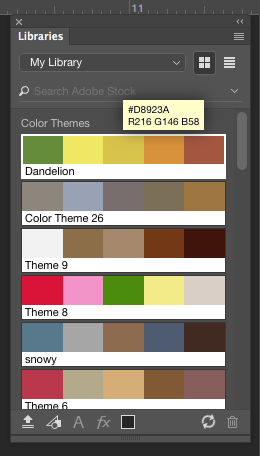
When I open the Libraries panel in Photoshop, there is my Dandelion color theme right at the top. I can click on those colors and use them just like the regular color palette. (If Libraries isn’t open look in the top menubar for Window -> Libraries and that will open it up.)

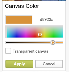
It works exactly the same way in Illustrator. If you mouse over one of those color chips, you will also get two more pieces of information. The top number (example above #D8923A) is the hex code for that color. The bottom number is the RGB values. You can type those numbers into any other graphics program and get the same color. Here’s what that looks like in PicMonkey.

Screen Shot 2016-05-31 at 11.00.12 AM

If that hexcode looks familiar to you, it’s because that system is also what is used on Spoonflower’s ColorMap.

If you didn’t save to Creative Cloud and are working from a screenshot, you can open the screenshot and use the eyedropper tool to get the same hexcode and RGB information.

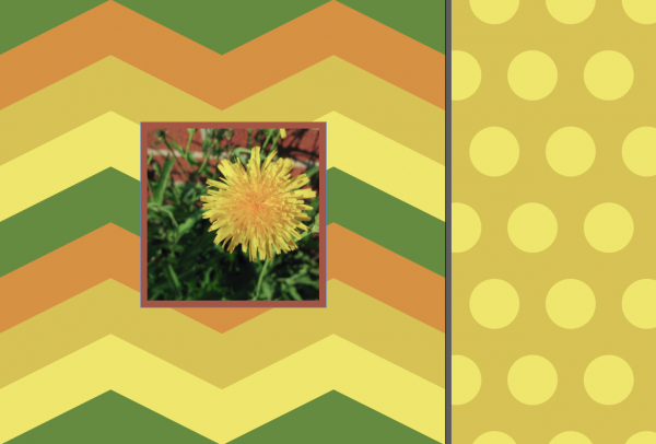
Want to see it in use? Here’s a very quick and simple example of patterns of chevrons and polkadots drawn in Illustrator, which use colors pulled from the photo. This could be the front and back of a pillow. Or the outside and lining of a totebag. Or some coordinating quilt prints.

Screen Shot 2016-05-31 at 11.11.41 AM

9 May, 2016

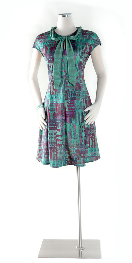
New Work: Shadows, Spoonflower & Davie

2016-05-09T19:29:07-05:00Everything Else, Gallery Exhibitions, Spoonflower & Fabric Design|1 Comment

shadows

Shadows

2016

Digitally printed polyester pique.

I had the photo studio set up for another big project shoot, and I realized that I hadn’t had a chance to talk about this dress that I made this spring. The pattern is a modified version of the Davie dress by Sewaholic. I love the way this one fits and I have made several versions of it. The fabric is Spoonflower’s performance pique.

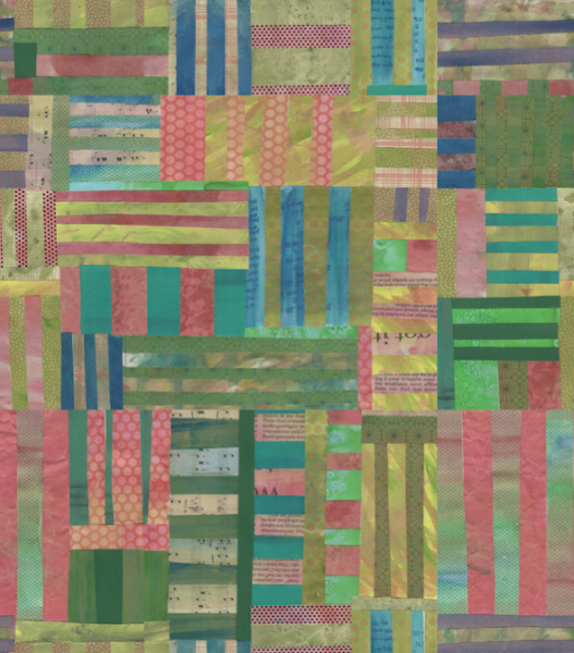
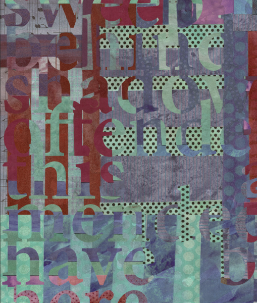
The design is a combination of cut painted paper and text. The paper design started out like this and I actually used it in a fabric collection of “Fish Market” designs that I have up at Spoonflower.

Screen Shot 2016-05-09 at 10.37.35 AM

I layered two copies of that cut paper together and then cut text from one layer. The text is the closing speech delivered by Puck from A Midsummer Night’s Dream:

“If we shadows have offended,
Think but this, and all is mended,
That you have but slumber’d here
While these visions did appear…”

Why that text? Because I like it. And Midsummer is my favorite Shakespeare play. I wanted to do a text based design, where it wasn’t something necessarily readable, but text was a design element.

I manipulated the colors, but you can still see all of the texture of the painted papers in the design. The tie is made from a small repeated section of that aqua with black polkadots pattern you see below.

Screen Shot 2016-05-09 at 11.01.47 AM

A little note about the fabric. It’s polyester, and I feel like I spend a lot of time defending things for being polyester. This is awesome polyester. Seriously. Comfy, soft, breathable, unwrinkleable, machine wash, amazing print quality. There’s nothing negative on that list. I understand that there are yucky polyesters. There are also horrific wools, nasty nylons and even some unwearable cottons. So this is a little bit of a soap box and a little bit encouragement to not judge a fabric by its label.

29 April, 2016

Book Plates for your Spoonflower Handbook

2016-04-29T16:02:58-05:00Spoonflower & Fabric Design|Comments Off on Book Plates for your Spoonflower Handbook

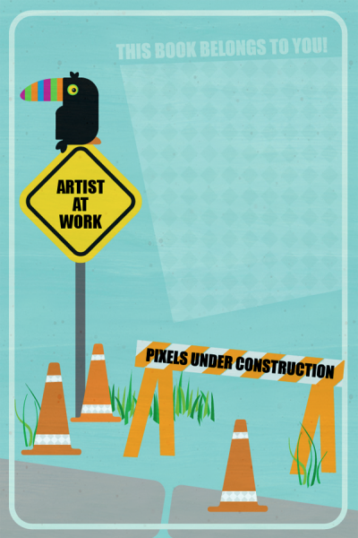
Screen Shot 2016-04-29 at 10.28.05 AMI have been busy traveling and teaching the last few weeks (hi NY and NC!) and I had so many people say “Oh, if I knew you were going to be here I would have brought my book for you to sign.” (Which is awesome and super flattering. Makes a girl feel loved.) Then I had a light-bulb-moment.  I could make bookplates to sign and then I could send them to you, no matter where you are (and you don’t have to remember to bring your book)! This little toucan made an appearance in our Spoonflower Handbook Master Class this weekend, so he seemed like the perfect character to star on this book plate.

If you have a Spoonflower Handbook and you would like a hand-signed bookplate, just send me an email (beckarahn at gmail dot com) and I will mail it to you. I will also bring them along to the events I have coming up (WMQFA University Days, Shepherd’s Harvest) and you can just ask me for one. They are printed on Spoonflower’s woven wallpaper, which is peel-and-stick, so you can stick it right in your book when you get it. I did a limited run of these, so they are first-come-first-served.

I have many things to tell you about classes and events near-and-far, but that will have to wait for another day.

Go to Top