An Interview & Collaboration with Three Tines
I met my friend Ann Marie several years ago working at Textile Center. She and I hit it off from the moment we met. She has recently launched a new business called Three Tines. From their website:
Welcome to Three Tines! We’d like to think we do things a little differently around here. We steadfastly believe that a business should be about more than just making a profit. As such, we create ethically produced, eco-conscious products like aprons and kitchen linens constructed from certified organic cotton and other sustainably raised crops.
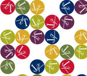
I think that’s a pretty great mission and so when Ann Marie approached me about designing a fabric featuring her logo, I thought it sounded like an awesome collaboration. We created a fun polkadot design which incorporates the colors of her other solid-colored fabrics and is printed on organic cotton sateen. You can see it here on one of the Oven Mitts.
Ann Marie interviewed me for the Three Tines blog and I thought it was such a great interview that I wanted to also post it here.
INTERVIEW WITH BECKA:
DESIGN
Three Tines (TT): Am I correct to describe you as “a digital fabric designer?” Tell us exactly what that means.
Becka Rahn (BR): That’s how I would describe myself. It means pretty literally that I design fabric and the digital part comes into play in two ways. I use digital tools to design, like my digital camera, a scanner and programs like Photoshop. I also use digital tools to print the fabrics. Everything I make is printed on a giant ink jet printer very similar to the one you have on your desk at home. But the printers I use are designed to print on big rolls of fabric.
TT: I know you work with “engineered and manipulated photographic prints.” This seems to be a unique process. How and why did you start creating fabric this way?
BR: It is a pretty unique process and I don’t really know any other fabric artists that do quite what I do. I have used Photoshop for many years and I have always been really interested in layering photos together. When I started designing fabrics, I started really traditionally with drawings and the kinds of prints you might find in a quilt store, but they didn’t really click for me. The first “aha” moment for me was making a skirt with a photo of a single pink waterlily, which filled most of the skirt. It was really eye catching and I realized that these were the fabrics I wanted – the kind of thing you would never find in a fabric store.

TT: We are so excited to incorporate the textile you created for us into our products. What do you create with the fabrics you design?
BR: I make mostly clothing. I love taking a 2-d design (flat fabric) and transforming it into something three-dimensional (a garment). There is nothing I love more than wearing one of the fabrics I designed.
TT: What is something you’d still like to accomplish as a designer/artist?
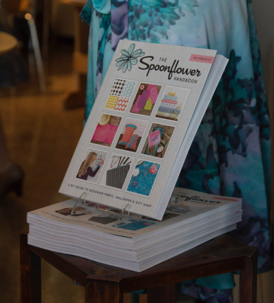
BR: It sounds kind of silly maybe, but I would love to get in the top 10 of one of Spoonflower’s design contests. Each week they post a design challenge that is a word or phrase and you are supposed to design a fabric based on that topic. Last week it was “post apocalyptic toile” (which was very challenging). Other topics have included cephalopods, lemonade, ditsy sheep, and afterschool snacks.
TT: Do you ever experience “creative block?” How do you come up with new and innovation ideas and designs?
BR: I am never at a loss for ideas of what to do. I usually have more ideas than I can possibly use. But I totally get stuck sometimes in the middle of a design, when I can tell that it is stalling and I don’t know where to go. The best remedy for me when that happens is to put it away and stop looking at it. If I go back and check on it again in a few days or a week and it’s still stuck, I usually just move on. But sometimes having a break from it will give me a new insight.
TT: My first experience with textiles was watching my mother and grandmother sew. What is your first memory
BR: I have a Christmas ornament on my tree that is a felt bird I helped my mom make when I was 2. I don’t remember making it, but it has been around and something I was proud of for longer than I can remember. I have a vivid memory of my grandma teaching me the lazy daisy embroidery stitch when I was 6 or 7. I learned to knit with a family friend when I was 11 and it was pure magic. She taught me smocking too, and I still have the smocked sundress I made for my tiny teddy bear. In fact I have more that a few memories of making wardrobes for that little bear from felt and fabric scraps.
TT: I have seem some of the fabric you’ve created using personal photos and artwork from your nieces and nephews. How fun is it to make something that helps preserves memories?
BR: For me, everything I design evokes memories. I love the look on the kids’ faces when they see their artwork in something. My youngest niece and nephew are half convinced that I am magic because I am their “fairy” godmother, so making their drawings into pillowcases is something they expect to happen. I only ever work from my own photos for designs, so it’s never a generic photo of a butterfly that I am using, but it’s the one that we saw on the sidewalk that Mia and I crawled around after on our trip to the zoo last summer. Whenever I am showing my work somewhere, I think that is the most fun story to tell: where the photos from that design came from and why I put it together. It makes talking to people about my work really fun.
TEACHING
TT: In addition to designing, you are also a teacher. What do you teach?
BR: Everything. That’s the short answer. The longer answer is that I love best to teach about art and technology and the ways they intersect. I teach digital fabric design, but also marketing yourself online, and opening an Etsy shop and basic photography. I teach about ways to use technology to make fiber art, like digital printing or laser cutting or using interactive elements combined with more traditional techniques. I also love to do hands-on surface design classes in dyeing fabric and yarn. And I can teach a beginner class in nearly anything: knitting, tatting, felting, sewing, embroidery….
TT: What is the best tip you can share with someone who is interested in creating his or her own fabric?
BR: Be bold. Just jump in and try something. I think a lot of people get caught up in worrying about whether they are doing it “right” and really there is no right way to design. If you love the finished fabric, it’s the right way. I know a couple of really talented designers who don’t know one end of Photoshop from the other and it totally works for them.
TT: What is your favorite design tool or software? Why?
BR: I am a Photoshop junkie. I work with photos a lot and Photoshop is designed for that. I have put a lot of time into learning Photoshop so it is easy for me. It takes a lot of time to learn to use your tools and I think there is a lot of buzz in the craft world with this tutorial and that tip for making things “quick and easy”. Not everything is quick and easy. Some things are hard and hard is GOOD. Photoshop was hard to learn and totally worth the investment. (And I still have a lot to learn.) The other tool I love is my scanner and I am using that more and more in my newer work. Sometimes scanning something is better than a photo.
MISSON/ADVOCACY
TT: We, at Three Tines, are big believers in giving back and supporting worthy organizations. I know you are an active arts advocate. Why?
BR: I think if you really believe in an organization and the mission and goals they are trying to accomplish, you need to put your money where your mouth is. And more than that, you need to participate. Those organizations can’t do their programs or events or education if there aren’t also people attending, buying, or talking about it. No organization, especially arts orgs, have enough staff, hours or money to everything they want to. I get a lot of personal satisfaction from taking the skills I have and using them to make a difference. It’s empowering being able to help change your little part of the world.
TT: We talk a lot about “kindness” at Three Tines. What is your definition of kindness?
BR: Kindness is putting yourself in someone else’s shoes. I hate to use a cliché but I think it’s really apt. The act of being kind is being able to look at a situation and say to yourself, “What could I do to make this better?” and then doing it. And I think that might be the most important part. It’s an act of kindness. Doing something about it.
PERSONAL
TT: Besides fabric design and sewing what other textile work do you do?
BR: Everything. Didn’t I say that already? I love to knit. I do a little weaving. I can crochet if I need to. I love to dye, but I don’t do it often. And I love Halloween, so there is a costume every year.
TT: What are your favorite colors?
BR: Green. Green. Turquoise. Orange. Green.
TT: When you are not designing, teaching, and exhibiting, what do you like to do?

TT: We can’t do a Three Tines interview without asking, “What is your favorite veggie and how do you like to prepare it?”
BR: Green beans. And I pretty much like them any way they are prepared. In the summer, I like to cook them until they are still slightly crispy, toss them in some olive oil and balsamic vinegar and keep them in the fridge to snack on. In the winter, I roast them with garlic.
TT: Please share one of your favorite quotes.
BR: I love quotes. And this is a longish one, but it’s the first one that came to mind when I read this question. It’s one of Neil Gaiman’s periodic New Year’s wishes that he has posted to his website and I love it a lot.
“I hope that in this year to come, you make mistakes. Because if you are making mistakes, then you are making new things, trying new things, learning, living, pushing yourself, changing yourself, changing your world. You’re doing things you’ve never done before, and more importantly, you’re Doing Something. So that’s my wish for you, and all of us, and my wish for myself. Make New Mistakes. Make glorious, amazing mistakes. Make mistakes nobody’s ever made before. Don’t freeze, don’t stop, don’t worry that it isn’t good enough, or it isn’t perfect, whatever it is: art, or love, or work or family or life. Whatever it is you’re scared of doing, Do it. Make your mistakes, next year and forever.”– Neil Gaiman


