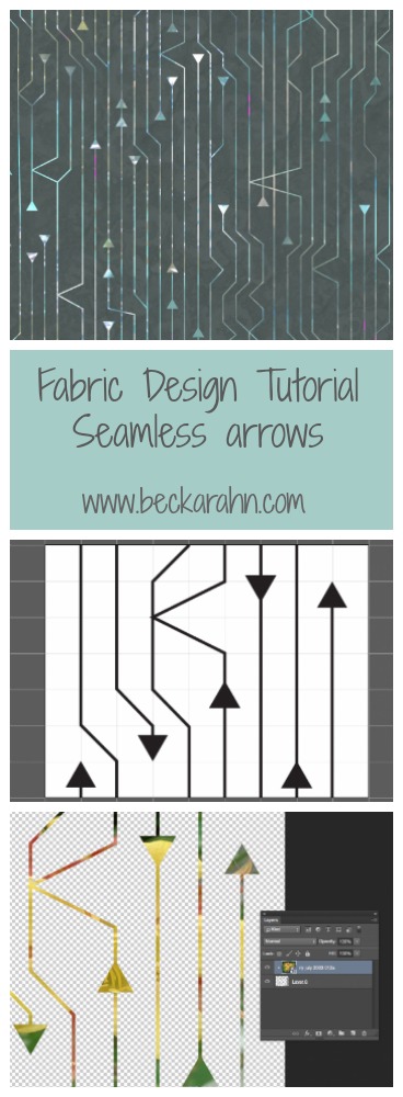
Tutorial: Seamless Arrows Pattern, Part Four
(This is part four of a tutorial for making a seamless arrow pattern. Find Part One and Part Two and Part Three here.)
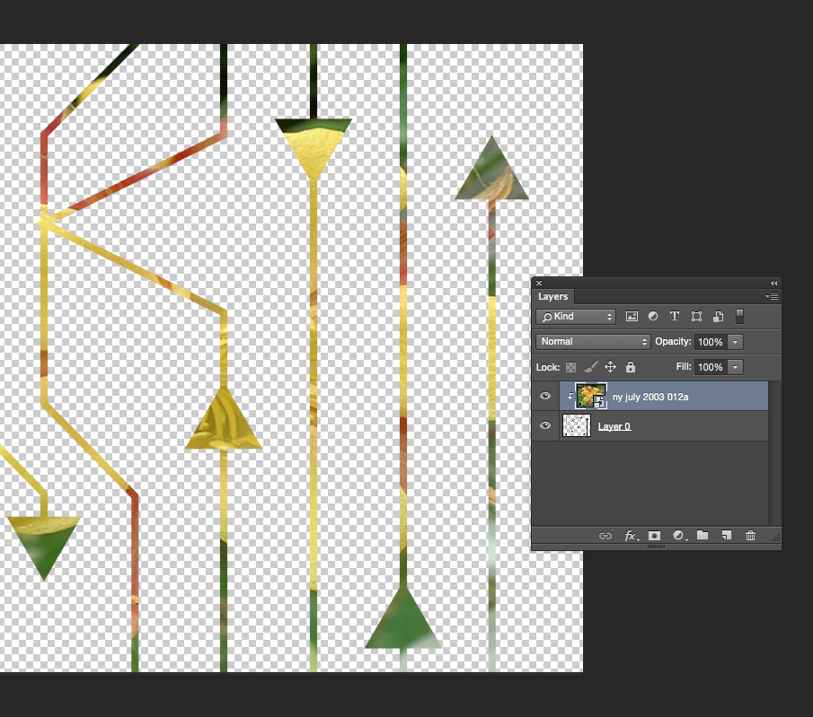
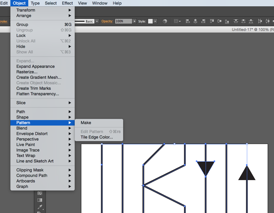
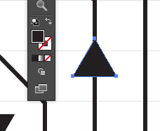
Proofing and touching up the pattern is the finishing step to create the seamless arrow design and I am going to do that with the Photoshop pattern tool. The first thing I do is select the whole design (Edit -> Select All) and create a pattern tile by choosing Edit -> Define Pattern and click OK.
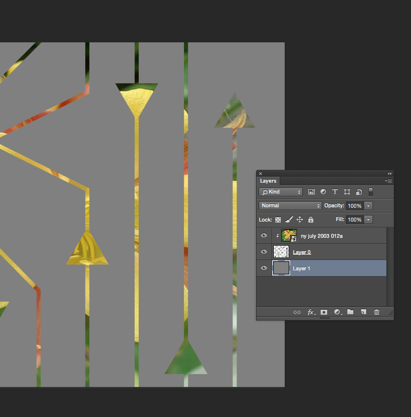
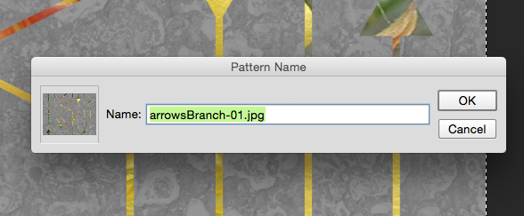 It will look like nothing has happened. That’s ok! The tile that you selected has been saved in the patterns palette, which is kind of hidden.
To proof the design, I create a new blank file that is the size of a yard of fabric. That’s an arbitrary size – I just think it’s nice to look at a large number of repeats.
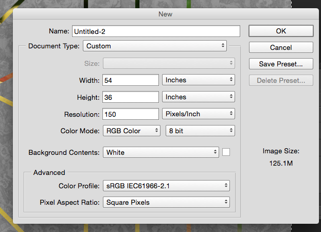
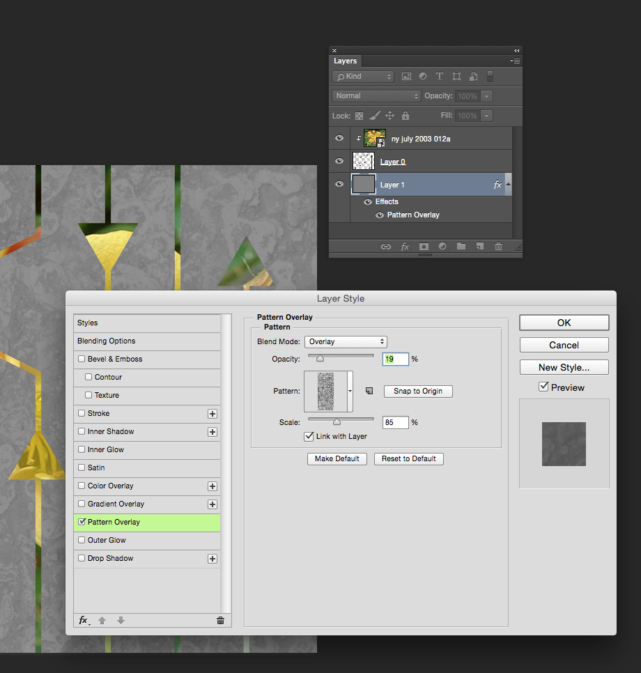
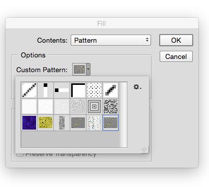
Then I choose Edit -> Fill from the menu. From the pop-up Fill menu, choose Pattern from the contents drop down menu. Just below that in Options there is another drop down and in it, you should find that pattern you just saved. (See what I mean about a little hidden.)
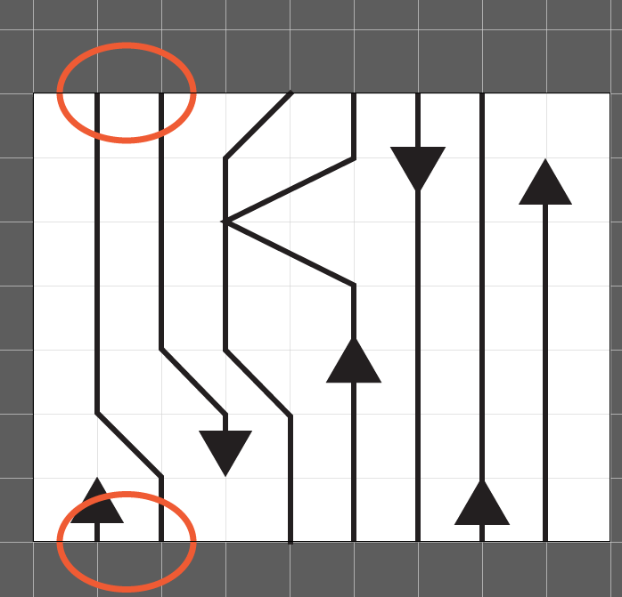
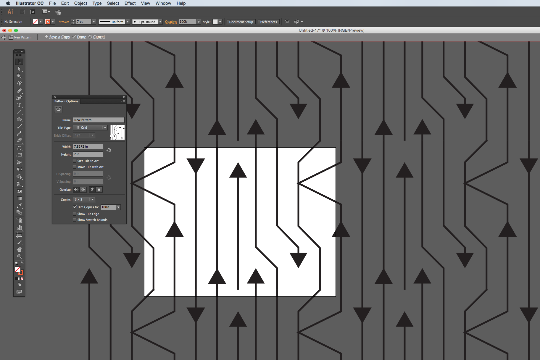
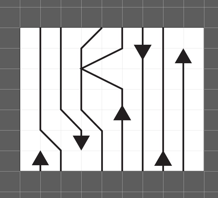
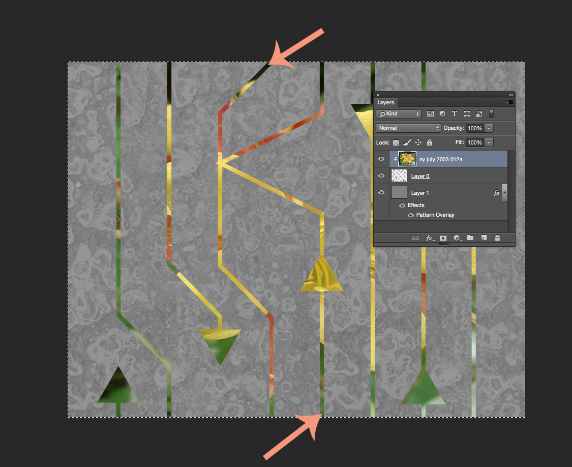
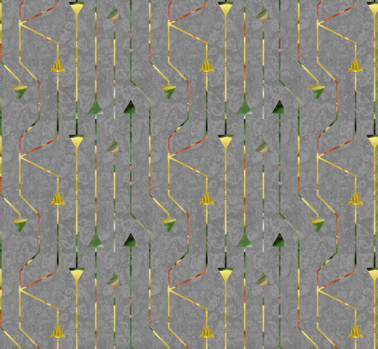
Now you can see what it looks like when the tile is repeating across a whole yard of fabric. And right away a couple of things jump out at me.
![]()
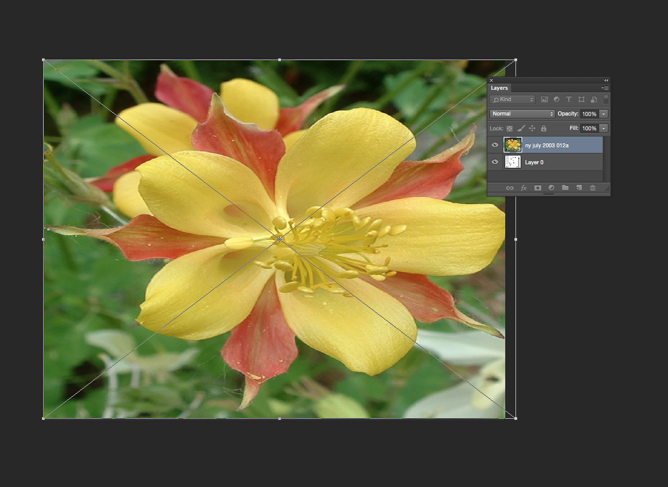
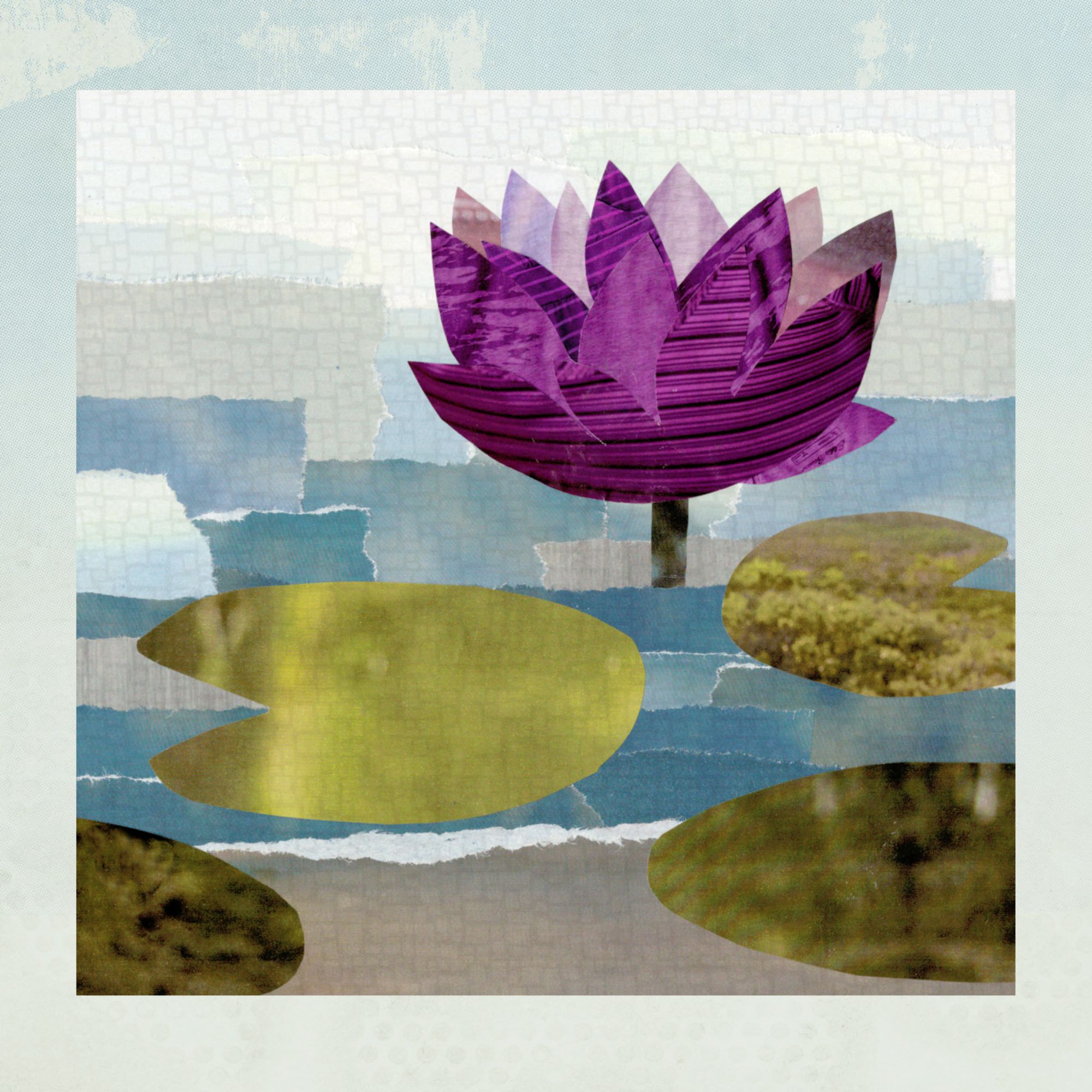
Oops. I didn’t think about the edges and I have a blank space where there aren’t any arrows. I can fix that by cropping out some of the blank space. The other thing that jumps out is a seam where the color changes. The color change is kind of abrupt and it makes a dark line. I can fix that pretty easily by going back a step to my original file. I select the photo layer of that flower because that is where the color is coming from. The easiest way for me to make that contrasting line to go away is to just use a paintbrush to just touch it up. I choose a green color from the bottom of the image and paint some at the top where that really deep green was, hiding that seam line and blending the two together.
After I do those two little edits…
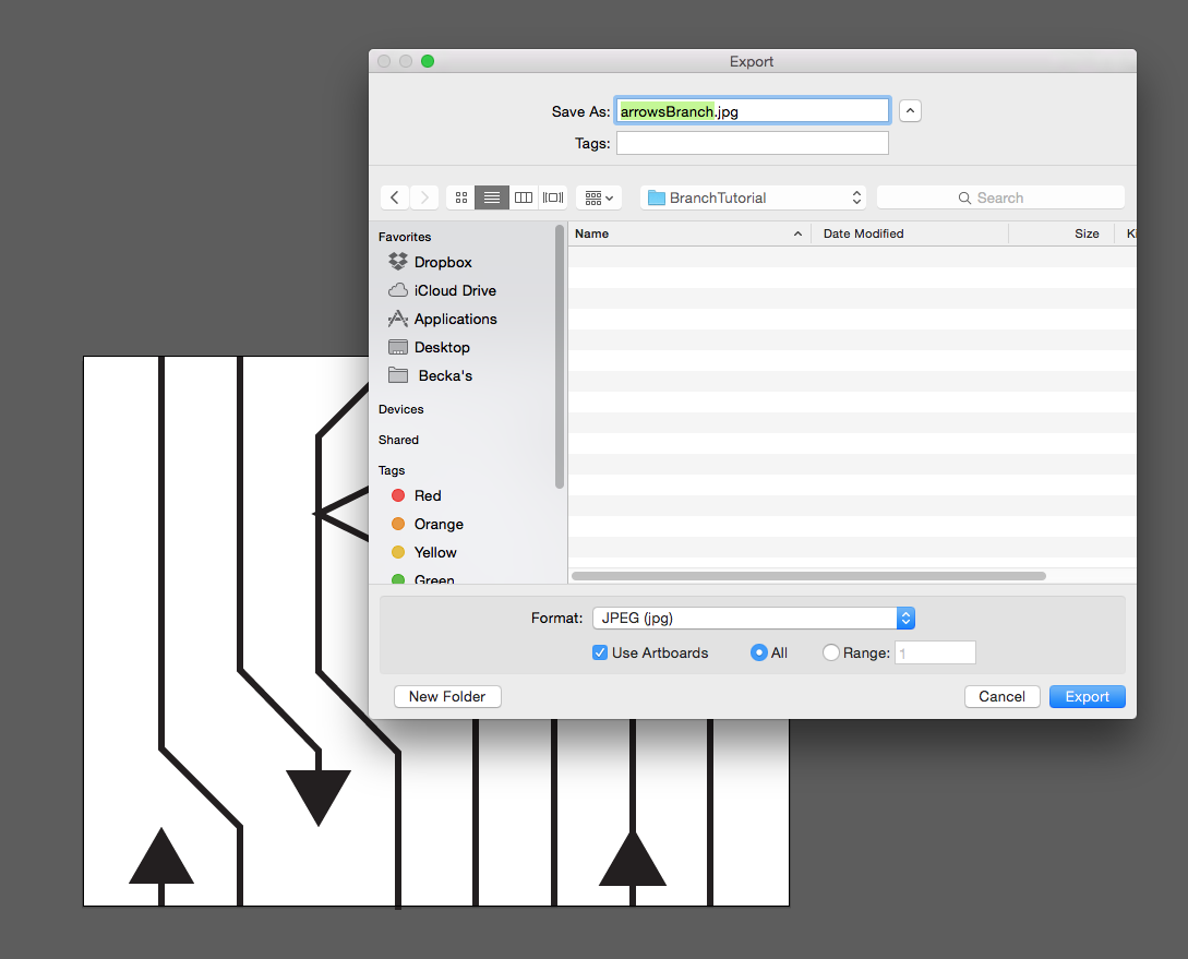
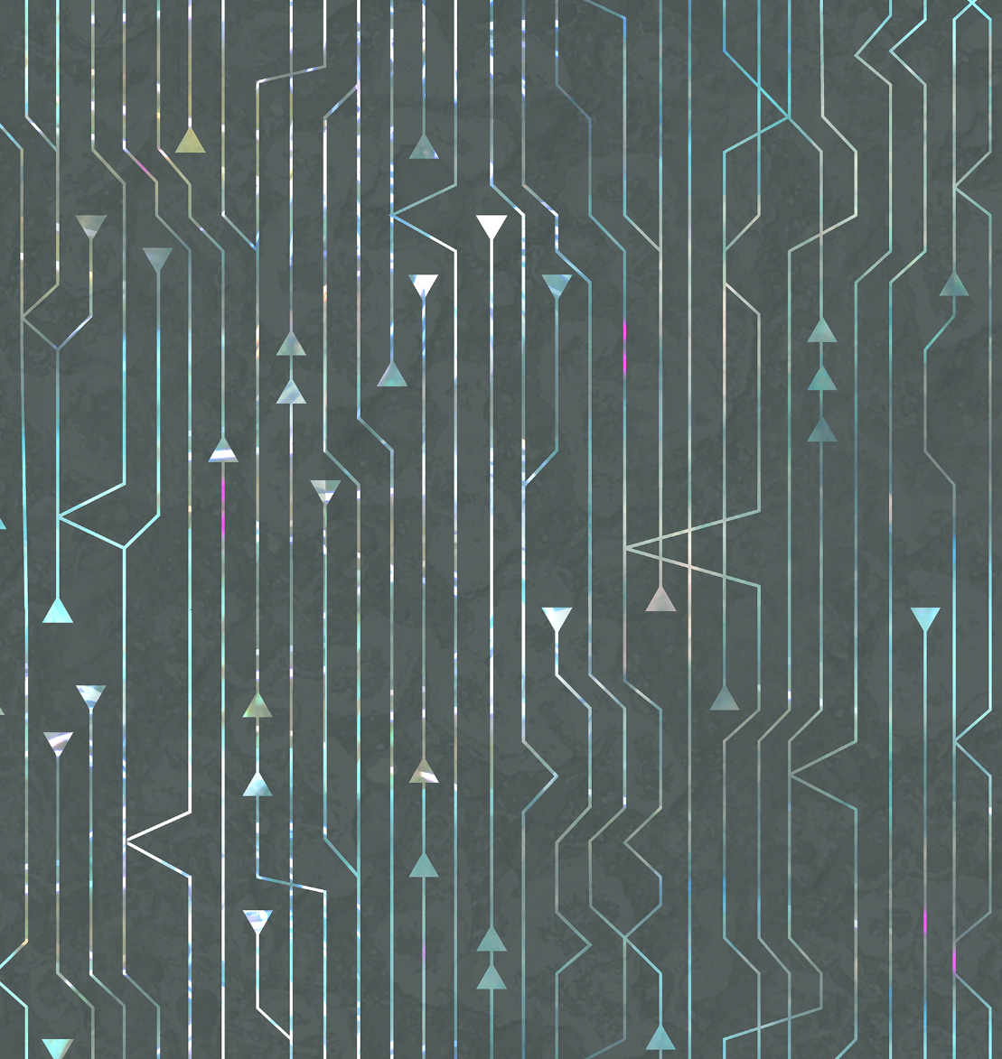
I have a pretty good finished design. I save that tile and that is the repeat that I can upload to Spoonflower and print my fabric. This is the version that I used for my grant project exhibition, which I will post photos of very soon.
More in this series: Part One • Part Two • Part Three • Part Four