4 June, 2015

Collaborating: An artist and two museums

2015-06-04T12:24:16-05:00Gallery Exhibitions, Spoonflower & Fabric Design|Comments Off on Collaborating: An artist and two museums

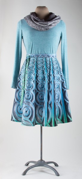
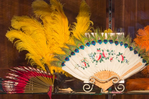
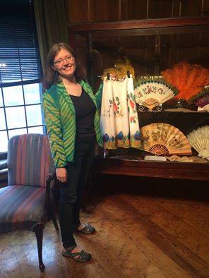
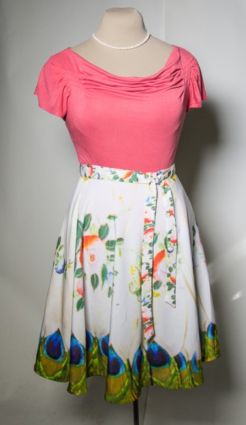
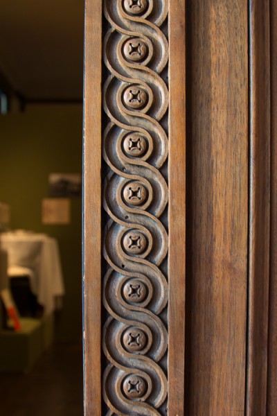
Last night I was the guest artist at a special event for the Hennepin History Museum.  It was an event to thank donors and the museum wanted to have me there to talk about ways that contemporary artists can work with and be inspired by museums.  The curator pulled out the feather fan that I photographed and created a skirt design from.  I also brought this skirt, which is a photograph of a woodwork detail at the museum.

IMG_3326 IMG_3248

This isn’t my only museum collaboration though, and I am thrilled to pieces to be able to show you this one.  I have been keeping it under wraps for a while.

I was approached by a graduate student intern at the Jane Addams Hull-House Museum in Chicago with an inspiring opportunity.  They were trying to find a way to bring some modern relevance to their collection and had invited a group of contemporary artists and community members to create works in response to pieces in their collection.  They would give me photographs of a piece and then I could do anything to respond to it: write, create, curate.  They had a textile piece and wondered if I might like to respond.  YES!

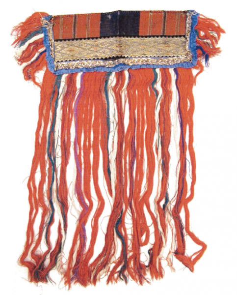
Hull-House Sash

Screen Shot 2015-06-04 at 11.09.40 AM

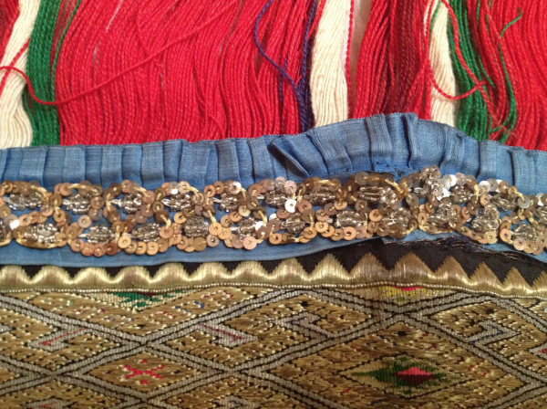
They sent me several photos of the “sash”.  I am not sure what this piece is for sure.  It is woven and beaded and embroidered.  It is about 22 inches wide and 30 long.  In consulting with various textile geeks I know, our best guess is that it was a sampler type project, maybe using small samples or scraps of techniques used in classes and was meant to be decorative, like something to adorn the front of a podium.

My contact at the museum said,

“What is the role of the textile arts in an age of modern textile technology. Why do so many people make / construct their own textile clothing, garments, etc. ? In the early 20th century the HullHouse offered many textile, weaving, and sewing classes that were extremely popular at a time of tremendous factory expansion. The people taking those classes didn’t need to hand-produce their own articles, yet they did. What similarities exist between then and now? “

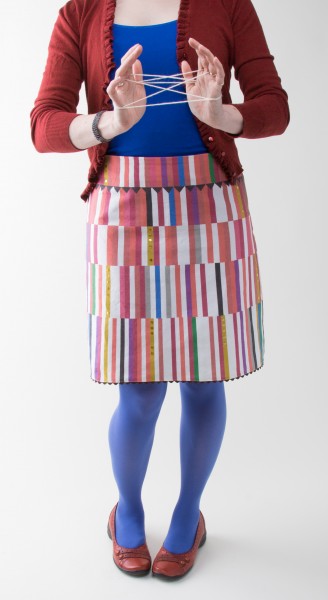
I decided to respond to the piece in two way: by making a contemporary piece and then writing a short essay to talk about the two pieces together.  I decided first to make a textile piece to reflect the parts of the sash I found striking:  the long fringe, the zig-zag trim, the gold sequins, the bold colors.  I wanted something that was modern and fun and wearable, but that had a real tangible connection to my inspiration piece.  I wanted people to look at it and immediately see the connection between the two.  I decided to go modern and make it from digitally printed fabric using an “all digital” design.  I very often work from photographs, but for this I didn’t want to print an adapted photo, but I wanted to use “modern technology” to create the design by drawing it all in a very virtual and non-tactile way, with vector art in Adobe Illustrator.

RahnBecka_Sashay

Screen Shot 2015-06-04 at 11.49.17 AM

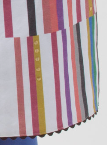
I call this skirt “Sashay”.  I pulled colors out of the photo to create the design.  The zig-zag motif makes a yoke on the skirt and is echoed with a peek of ric-rac trim at the hem.  On each yellow bar on the design, I hand-stitched vintage gold sequins so there are subtle lines of sparkle.  It is digitally printed on to linen/cotton fabric.

The Hull-House Museum has put together a website to feature all of the response pieces for this project called “Look At It This Way”.  You can read my essay about the two pieces by visiting the site and checking out the other responses from musicians, poets and more. I am delighted to have been a part of this project and I had a great time working on it.

31 March, 2015

21 Digital Designs: Fun facts

2015-03-31T11:35:28-05:00Everything Else, Gallery Exhibitions, Spoonflower & Fabric Design|Comments Off on 21 Digital Designs: Fun facts

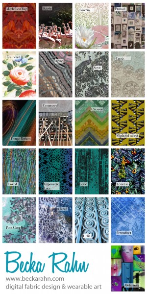
PrintI just created this poster for my display at the ACC show which is coming up in just a little over a week! These are all of the designs I will have at the show in the form of skirts or scarves.  There are a few favorites there that are designs I developed over the last 3 years or so and many many new designs created in these last 6 months of my new art-making focus.

I thought it would be fun to tell you some fun facts about this collection of designs.

  • Three are collaborations with my mom.  She is an awesome photographer and she knows what I love.  She taunts me with these irresistible photo textures and I can’t help but design something. It is super fun to collaborate with her.
  • Five at least are collaborations with my husband.  Also an awesome photographer.  Sometimes he snaps photos and puts them in a folder marked “Textures” and waits for me to find them.  Sometimes we take photos together and I spot things and say “Get that!”.
  • The original photos/scans that were used to create these designs were taken in Mt St Michel and Giverny, France; London,England; San Antonio, TX; Hill City and Rapid City, SD; Minneapolis, MN; Orlando, FL.
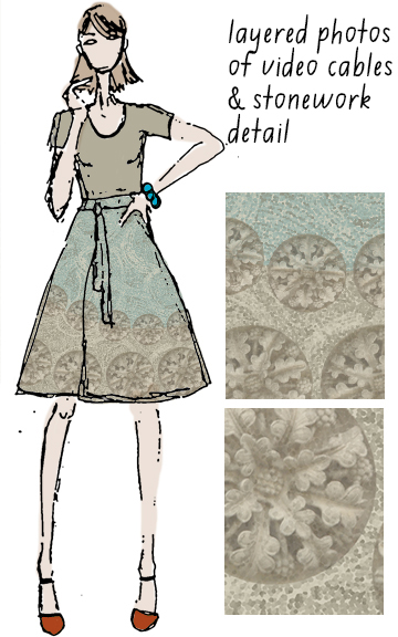
  • There are 2 kinds of lace, 2 kinds of leaves, 2 kinds of ice, 2 hand fans.  Two images were taken at the Hennepin History Museum.  There are two images that are each used in two different designs: a pile of video cables (thanks Jay!) and a collage of painted newspaper.
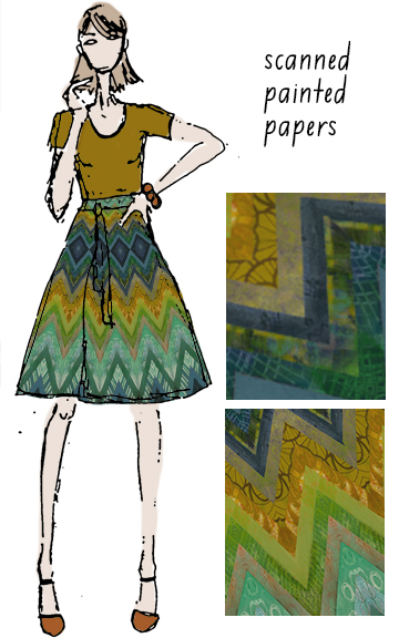
  • There are designs made from junk mail, painted paper and scanned maple leaves.  The painted paper collection has batik made with elmer’s glue and a rubber eraser, painted sheet music, crumpled brown paper and masking tape.

I had these same images printed onto custom playing cards, so I have a card for each design that will be attached to the tag for each piece.  I wanted that to be a part of the piece – the story about where the design came from.  And I got an extra deck of cards for people to just look through.  For me these designs are about wearable art.  I am not a fashion designer or into conceptual fashion.  I love basic pieces that show off the surface design and allow you to wear the art. You get to be a part of it. There’s a great quote by Oscar Wilde: “One should either be a work of art, or wear a work of art.”  Exactly.

24 March, 2015

Hennepin History Museum #MuseumWeek

2015-03-24T10:12:39-05:00Gallery Exhibitions, Sewing & Design, Spoonflower & Fabric Design|1 Comment

hhm

It ‘s #MuseumWeek on Twitter this week and that seemed like a great excuse to talk about my favorite museum in the  Twin Cities: Hennepin History Museum.  Museum Week is a fun celebration of museums behind the scenes.  Yesterday the theme was “behind the scenes secrets” and today the theme is “souvenirs”.  And I have some great souvenirs from HHM!

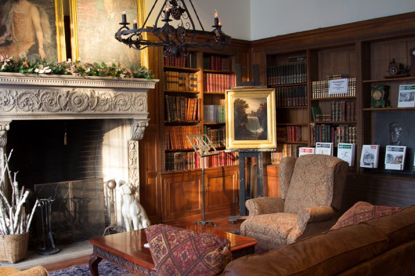
I visited the museum a few weeks ago and brought along my camera.  HHM is housed in a turn-of-the-century mansion that is full of beautiful details.  When I was there taking photos, an exhibition of hand fans had just opened to coincide with a “Fireside Chat“, an afternoon lecture by a local fan collector.  HHM holds these chats every other week and they feature local authors and history experts talking about everything from beekeeping to baseball.

hhm-2

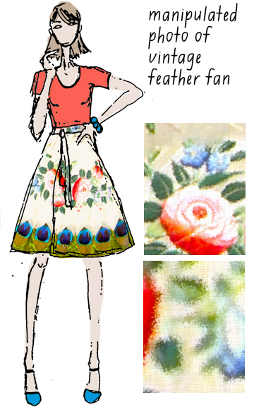
I was really enamoured with this painted feather fan.  It is made from white goose feathers which are painted with a floral spray and tipped with peacock plumes.  Since I have been designing skirts non-stop the last few months, I looked at this and saw a skirt (naturally).  My wrap skirt design is a 3/4 circle, which is a tough shape to work from, but a fan is already a 1/3 circle shape.  It was a natural fit!

BatHHM

IMG_3262I love those peacock feathers around the hem!  The museum staff was so excited that I was making things inspired by the collection that they invited me to have this skirt on display along with the fans.  It was neat for me to see the two side-by-side and you can see them too if you stop by.

I also took some photos of the woodwork details in the Fireside Room.  This helix patterned trim is featured throughout the room.

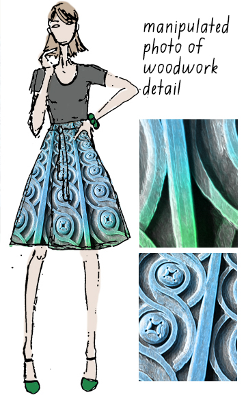
hhm-3And that also inspired a design.  I haven’t stitched up the sample of this one yet, but you can see the sketch.  I used this bit of woodwork trim to make radiating stripes from the waist to hem.  I also designed a basic stripe based on this woodwork pattern, which I will hopefully be printing to make silk scarves for the HHM shop a little later in the spring.

helix


One visit and two pretty awesome designs!  I feel like I found buried treasure.  I can’t wait to go back and see what else I find.

I had never actually heard of Hennepin History Museum before a year or so ago, even though it has been around since the 50s.   My friend Cedar is their new Executive Director and I think she has some pretty awesome ideas and the enthusiasm to bring their knowledge and collections more into the community.  In fact, I joined the Board of Directors in January, so I can help her out with that project. If you are in the Twin Cities area, I hope you will stop by and visit or come for a Fireside Chat.


6 March, 2015

Inspiration from anywhere

2015-03-06T14:15:20-06:00Sewing & Design, Spoonflower & Fabric Design|Comments Off on Inspiration from anywhere

Screen Shot 2015-03-06 at 1.37.46 PM

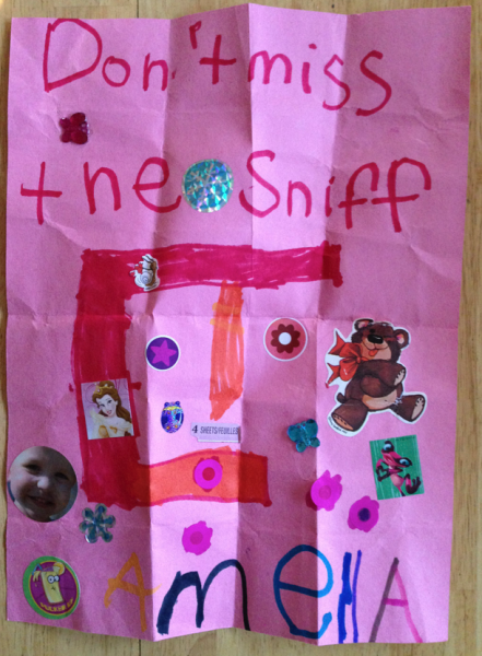
My niece drew this picture of a sewing machine for me.  Her message “Don’t miss the sniff” is to let me know that not only is there a scratch and sniff sticker there, but she drew it using smelly markers.  Important stuff when you are 4.  I am in love with this picture.

“Kid art” is a really hard thing to translate into fabric design.  And honestly, I look at pretty much everything anymore and think “How can I make fabric out of this?”  So I wanted to capture this fabulous drawing in fabric.

via gofugyourself.celebuzz.com

via gofugyourself.com

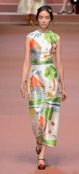
The new fall line for Dolce & Gabbana offers this.  Which I honestly think is hideous.  If you click that photo it will take you to a whole slide show of their runway show, which has a whole collection of “kid art” prints.  They all look like they are printed on shiny satin besides, which also doesn’t make any sense.  Formal crayon wear? Ugh.

So instead of trying to go with a literal interpretation, I decided to use Mia’s drawing as inspiration instead.

Screen Shot 2015-03-06 at 1.55.51 PM

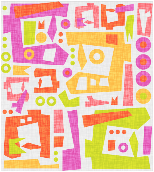
So, I drew the sewing machine and all of the other doo-dads and shapes in Illustrator, making it into a vector design so I could rearrange, resize and so on to make a repeat.  This one is about 18″ because I wanted it to be big and bold.  I wanted some textures to overlay on designs like this, so a few weeks ago, I spent an afternoon making fibery textures.  This one is perfect for this design.  I also used Mia’s drawing for the color inspiration.  I think my version has enough pink in it for her to approve.

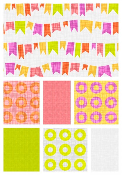
I don’t see this is a clothing fabric (although she would probably wear it) so I decided to think of it like a craft/quilting fabric instead, which meant I wanted to have a collection of coordinating prints to go along with it.  Solids with the same fibery texture, “cheerios” and little banner flags so far.  I think I need one more.  Any ideas?

coordinates


I know it is sewing machines (and you do now too), but I think this also could look like tribal/tiki/monster as I can see a few faces in there.  And that also works for me.


26 February, 2015

Slideshow: Wrap Skirts, Designs in progress

2015-02-26T09:11:25-06:00Everything Else, Spoonflower & Fabric Design|5 Comments

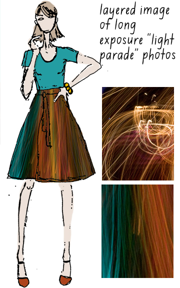
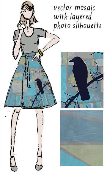
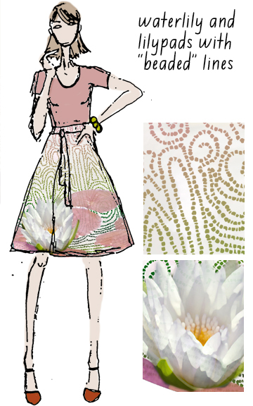
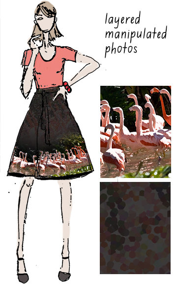
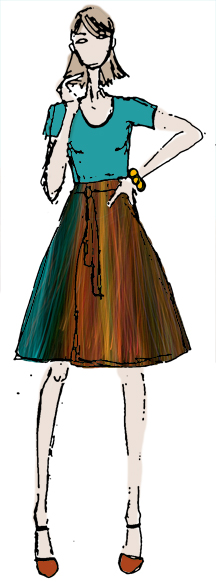
I am so excited about these skirts!  Here is a slideshow of some of the designs I have been working on.  I don’t know if all of them will make the cut but I wanted to share my favorites so far.  Each mockup has a couple of detail “swatches” so you can see a little more about the print and a very brief description of where the print came from.  Which is your favorite?

24 February, 2015

Video: A skirt in 3 minutes

2015-02-24T23:40:45-06:00Sewing & Design, Spoonflower & Fabric Design, Tutorials, Videos|2 Comments

skirtVideoI spend so much of my time behind a computer screen that it is hard to show “behind the scenes” shots of what I do.  And I know that people love to see works in progress.  I do too. So I made this video which shows my process in about 3 minutes. I captured it in 2 sessions and sped it up 1500%.  This is a wrap skirt that I designed that should be one of the ones for sale at the American Craft Council show I am participating in.  I just finished it so I haven’t seen the fabric in person yet.

The video shows the whole process from drafting the skirt in Illustrator to adding the photos in Photoshop.  In this case it is a wrap style skirt and I used 3 photos: long exposure shots from a nighttime “parade of lights” we watched at Disney several years ago.  This is a simple design relatively speaking. The photos are so cool that I didn’t need to do much manipulation to them.  I left in all of the things I tried and rejected. You will see that I thought about a row of polkadots at one point.  It’s tiny – it’s not meant to be a tutorial, but just so you can join along in the process.  Enjoy!

Go to Top