5 February, 2015

Design Tutorial: Creating a layered design

2015-02-05T10:46:57-06:00Classes & Teaching, Spoonflower & Fabric Design, Tutorials|2 Comments

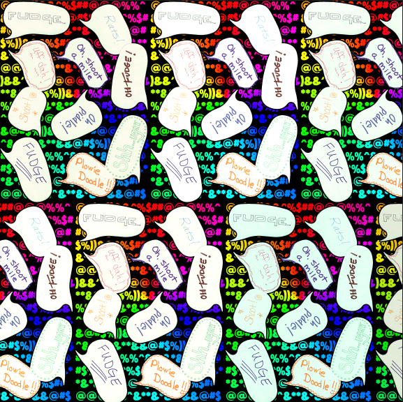
Often when I teach an intro fabric design class, the students and I create a collaborative fabric design during class, which I have printed and mail to them after class.  This most recent class played along with me and made this design using speech bubble shaped post-it-notes and wrote their favorite “clean” swear word.  I thought it would make a funny fabric, especially given the day I had before I got to class.  So I scanned our design and got ready to put it into a repeat and it just seemed sort of blah.  We needed a much more colorful fabric to match our colorful language.  So I added some color and after I sent the swatches, I told my class I would post a tutorial about how I did it so they could check back.  My screenshots for this are in Photoshop, but many other design programs have the same tools you can use.

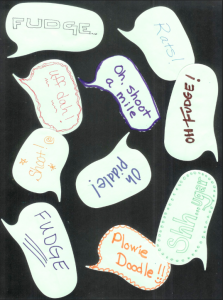
We started with a scanned image of post-it-notes on black paper.  I scanned this at 150 dpi because I wanted to print it at the same size and that is the resolution I need for fabric.
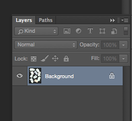
Screen Shot 2015-02-05 at 9.47.06 AMThe first thing I wanted to do was to move the speech bubbles to a layer all by themselves.  This way I could insert something into the background and have them float over top.  When I open the image in Photoshop, it automatically makes it a locked background layer. (See the lock icon?)  When I go to the Layers palette and double click the layer that says Background, it will unlock it and convert it to a regular layer (Layer 0), which is what we need.

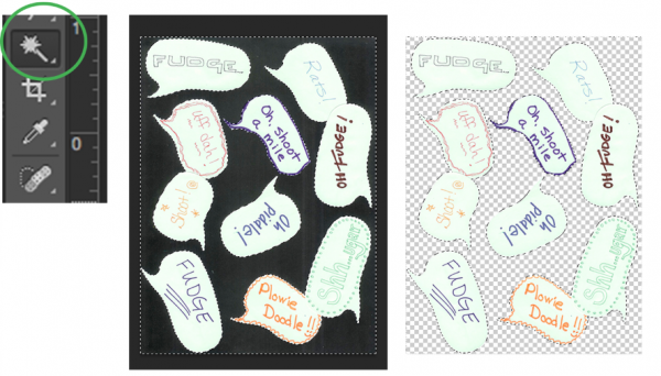
Screen Shot 2015-02-05 at 9.50.26 AMNext I want to remove the black background and leave just the speech bubbles by themselves on this layer.  Choose the Magic Wand tool and click anywhere in that black background.  You can see what’s selected because Photoshop traces around it with dashed lines.  Once you have it selected, hit the delete key.  Your black background will disappear.  The checkered pattern you now see indicates that this part of the design is transparent.  (It won’t show on your finished design.)
Screen Shot 2015-02-05 at 10.15.39 AM

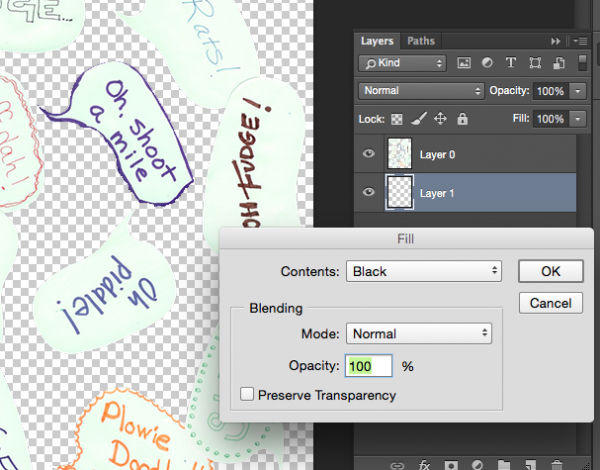
Next I will add a new background layer back in, by choosing the new layer icon (looks like a page with a bent corner) to make Layer 1. Then choose Edit -> Fill from the menu to fill it with black.  You will probably also have to put your layers in the right order by clicking and dragging them in the palette to make sure the bubbles are on top and the black layer on the bottom.
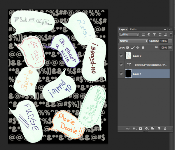
Screen Shot 2015-02-05 at 9.52.10 AMSo it doesn’t actually look like we have done much at this point, but what we have done is split the design into two layers so that we can now insert something in between them.  Next, I am going to add a Text layer, by clicking the text tool and dragging a text box to fill the design space.  Now I can type text into this layer.  I filled it with cartoon style swear words (*&%$!!@) to match our theme.  It doesn’t matter what color they are, we will change that next.  Drag the text layer so it is sandwiched between Layers 0 and 1.
Screen Shot 2015-02-05 at 9.53.05 AM

Now the color!  If you double click the Text layer in the Layers Palette, a window will pop up giving you options for Layer Styles.  We are going to use a Gradient Overlay to add a rainbow to this text.
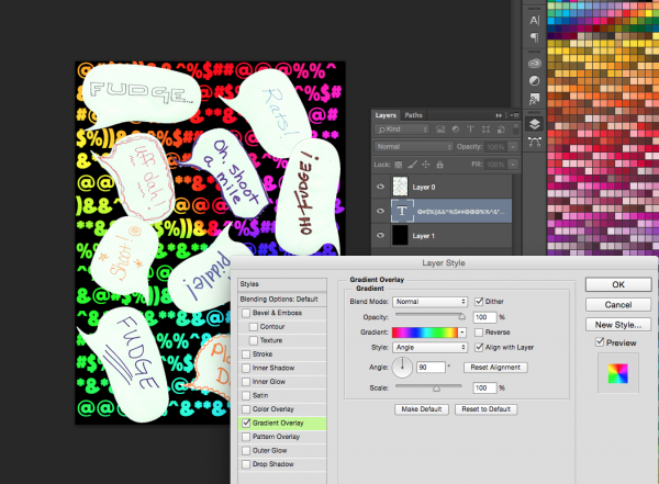
Screen Shot 2015-02-05 at 9.53.47 AM

The last little tweak I made to the design was to add a black outline to our speech bubbles to help make them pop out from the background a little more.  That is easy to do with the same Layer Styles tool.  Double click Layer 0 with the speech bubbles and choose Stroke from the style options.  I added a 3 px border of black.
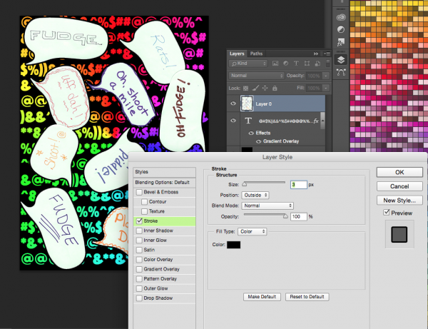
Screen Shot 2015-02-05 at 9.56.48 AM

And this is the finished design.

Screen Shot 2015-02-05 at 9.57.24 AMNow I understand that this is a pretty silly fabric and you aren’t probably going to run right out and order yards of it.  But by using the same steps you learned here, you can create fabrics like these:
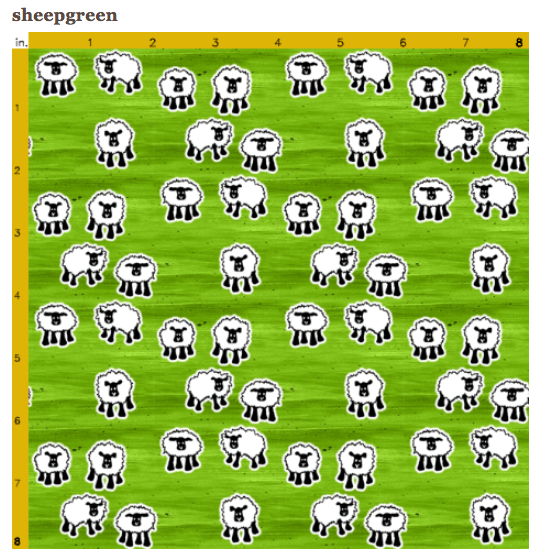
Screen Shot 2015-02-05 at 10.32.00 AM

These sheep are drawn with a fine tip sharpie and scanned.  I cut them out from the background the same way and added a white Stroke to the layer so they have that white outline.  The background for this design instead of text, is a piece of painted paper that I scanned and added a Color Overlay (from the Layer Styles Palette) in green.

Or dancing sheep on a knitted background.
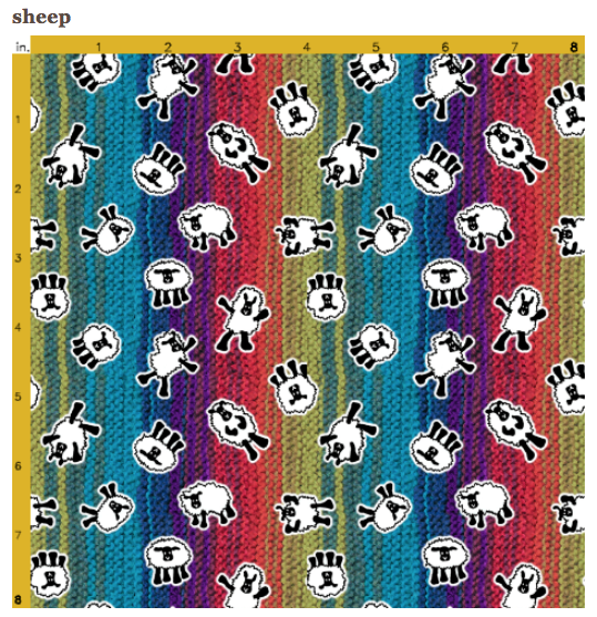
Screen Shot 2015-02-05 at 10.36.59 AM

20 January, 2015

Upcoming Classes: Digitizing Lecture

2015-02-24T23:33:45-06:00Classes & Teaching, Out & About, Spoonflower & Fabric Design|Comments Off on Upcoming Classes: Digitizing Lecture

Screen Shot 2015-01-08 at 4.22.33 PMIt’s the month for classes for me.  Another fun class you can come to is a panel discussion called “Digitizing for Dollars” that I will be participating in on January 29 at 6:30 pm at NE Bank Community Room in Minneapolis.  It is presented by WARM (Women’s Art Resources of MN).  Several panelists will be talking about digitizing your original art and selling it online.  I will be talking about Spoonflower and using your original art to make fabric.  The other panelists will be talking about things like making patterns, digital prints and putting your artwork on objects (totes and coffee mugs).  I have worked with this group before and there is always great discussion and good questions, so I am looking forward to it.  (The event is free for WARM members, $5 if you come as a guest of a WARM member or $10 for the public.)

5 January, 2015

Upcoming Classes: Digital Photo Pillow

2015-02-24T23:41:52-06:00Classes & Teaching, Spoonflower & Fabric Design, UpcomingClasses|Comments Off on Upcoming Classes: Digital Photo Pillow

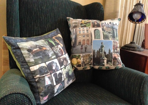
I am delighted to be teaching some digital design classes to start off the new year!  In February, I am going to teach a photo collage pillow class. The class is February 2 & 9 in Minneapolis and all of the details are here.

RahnPhotoPillow

You may not be in to pillows.  I get that.  Pillows aren’t really my thing either, but I love these two I made as samples.  You can use this photo collage for many other fun things once you know how to do it: photo placemats, tote bag, quilts.  There are lots of options.  So don’t let the “pillow” part of the project stop you from signing up.

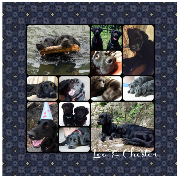
Screen Shot 2015-01-05 at 6.16.16 PMOne collage is “Chester and Leo” themed.  It is all their puppy pictures with a border “kaleidoscope” design made from a photo of someone’s nose.  Their names are on the bottom corner.

Screen Shot 2015-01-05 at 6.16.29 PM

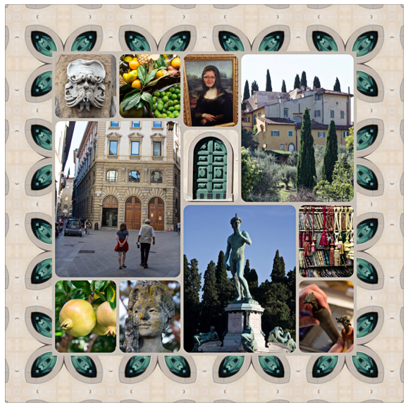
The other sample is photos from my trip to Italy last year.  The border on this one is a detail from a photo of a green door that is tiled so that it makes neat leaf shapes around the outside edge.  I know it sounds complicated, but it’s really easy to do and I will show you how to do both the collage and the border designs.

In class we will talk about collecting your photos, putting together a collage that is balanced and works together.  We will set it up to print exactly the size we need (it fits on a fat quarter), make a coordinating border print and get our collages uploaded and printed at Spoonflower.  I printed mine on super soft faux-suede.  I will also show you how to do the simple sewing steps to finish up the pillow and a few other project variations.  We will meet one more time to “show and tell” and troubleshoot for your next project.  You need a laptop for class but you don’t need to have Photoshop or any other special software. Really!  Just a collection of photos and a web browser.

Share with your friends.  Sign up.  Pass it on.  See more of my upcoming classes here.

1 December, 2014

Infinity Scarves

2014-12-01T16:36:04-06:00Gallery Exhibitions, Sewing & Design, Spoonflower & Fabric Design|2 Comments

infinityscarves

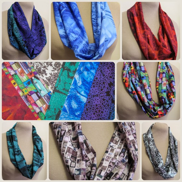
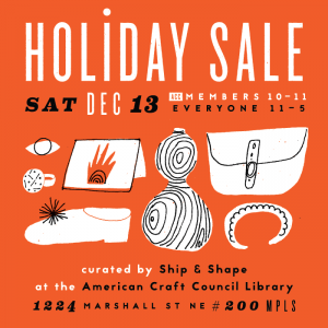
I am getting all kinds of new things ready for the show I am doing at the American Craft Council Library on December 13.  So excited!  This is the first large collection of my digital prints that I will have for sale.  Last week I finished the cowl scarves.  I know that the “giant infinity scarf” is a major trend, but I just don’t think they are that flattering.

(stock photo)

(stock photo)

These are made with a more simple and elegant kind of silhouette.  More like a necklace.  These are all made from polyester crepe, which is soft and lightweight and drapey and the colors are vibrant and gorgeous.  I haven’t used this fabric before and I am in love.  Each design also has a story:

square

15 October, 2014

Faux Batik: The Big Reveal

2016-03-16T09:48:50-05:00Spoonflower & Fabric Design|4 Comments

I got the faux batik samples in the mail yesterday and I am so thrilled.  They look awesome.  These are all printed on the basic cotton which is a nice middle weight basic fabric.  I didn’t wash or press the fabric yet, this is just what it looks like out of the envelope.

Here is the original colorway.

Photo Oct 15, 4 13 07 PM

Photo Oct 15, 4 13 13 PMAnd a couple of alternate colorways…  (The color in these following two isn’t quite right in the photos because the light wasn’t cooperative, but they look good in person.)

Photo Oct 15, 4 14 06 PM

Photo Oct 15, 4 13 38 PM

I also made a set of coordinating prints for each of the colorways.

Photo Oct 15, 4 14 44 PMearthcoolswarmWhat do you think?  Which colorway is your favorite?  Although I love the warm colors I started with, I am also really loving the neutrals and I think that’s the one I might print to make a t-shirt.

More in this series: Part One • Part TwoPart ThreePart FourPart FivePart Six

batikPin

6 October, 2014

Digital Design Tutorial: Part Six

2014-10-06T19:07:43-05:00Spoonflower & Fabric Design, Tutorials|Comments Off on Digital Design Tutorial: Part Six

Part six of our faux batik journey takes us back to Photoshop.

I have all of the motifs for my faux batik laid out, I have my color palette chosen, so now it’s time to put the finishing touches on my design.  This next bit might seem like a little bit of over-the-top, but I want to add a little bit of subtlety to this design, which is why I am going to go back into Photoshop before I add the final colors.

First I hide the colored background layer that I put in to help me lay out my design and I replace it with just basic black in my Illustrator file.  This is going to make it really easy to do the design cleanup next.  I export it, using the edges of my artboard or canvas to crop the design (getting rid of all the bits I left hanging off the edges).  It looks something like this.

Screen Shot 2014-10-06 at 5.58.44 PM

My first task is to make the edges of the design seamless.  Since I have very organic shapes, the lines and shapes at the right side of the tile aren’t going to exactly match up with the things on the left side of the tile.  But I want to make everything match up so there aren’t little flaws in the design when I repeat it.  Photoshop has a tool called “Offset” that will wrap the design around and match up those outside edges so you can do the touchup work.

Screen Shot 2014-10-06 at 6.08.32 PM
Here is one section of that matched up edge. I separated the black background from the other parts of the design and put them on two different layers.  Then, I used a paintbrush and the eraser tool to carefully erase a little bit and redraw these lines to they seem to be one continuous line.  I did this along the sides and top/bottom of the design and now I have a seamlessly repeating tile.

Now I want to add the background colors back in.  I could have used the color blocks that I set up in Illustrator, but I wanted the edges where the colors meet to be a little less like a quilt block with straight lines and have a little more painterly quality.  I also chose 7 colors for my colorway, where my mockup had only 5.  Leaving my white batik shapes as the top layer and the black as the bottom, I added a layer in between for each of the colors in my colorway.  I used a big paintbrush with a little bit of a soft edge to paint in the background colors where I wanted them in my design.  Using a paintbrush allowed me to let things bleed a little outside the lines and to keep the more organic look to match my batik shapes.  By putting each color on it’s own layer, it was easy to tweak the colors if it ended up that I didn’t like one of those colors I chose for my colorway and it will be really easy to make another colorway of this design this way (which I am planning to do!)

Screen Shot 2014-10-06 at 6.12.55 PM

Finally, my white layer had some of those placeholder colors in it that I used to fill in some of the shapes (like the arch shapes above).  To make those fit my colorway, I used a tool called Select Color Range which lets me click on a color and it selects that color anywhere it sees it on the screen all at once.  So I could click the placeholder red and replace it with the red from my colorway.

Here are the finished colors painted in.

Screen Shot 2014-10-06 at 6.19.47 PM

It took a couple of tries to get everything to feel like it was balanced and to make sure that I didn’t have any colors too crowded together.  The next little bit of subtlety I wanted to add was a little bit of a hand-painted or hand-dyed effect, to make the background colors look less flat and even and perfect.  I tried a bunch of different techniques to achieve this: painting with different brushes, playing with opacity and flow, but they were all a little too heavy-handed.  Finally I found the effect I wanted.  I added a layer on top of all of this with a filter called “Clouds” in a contrasty dark and light.

Screen Shot 2014-10-06 at 6.23.36 PMThen I made this clouds layer adjust the luminosity of the design instead of just layering on top. Luminosity is like the light shining through piece of paper, but it gave my just the effect I was going for: areas of lights and darks, without changing the colors of my design and making them muddy grey or washed out.  Here you can see that effect:

Screen Shot 2014-10-06 at 6.27.19 PM


One last effect and my batik is finished.  For the last subtlety to really make this look like a batik, I wanted to add the distinctive crackled look that you get when working with wax.  It took a lot of experimenting, but a photograph of a piece of marble gave me just the right pattern of cracks.  I made this photo into a seamless repeat as well and added it as one more transparent layer on top of the design.

Screen Shot 2014-10-06 at 6.37.11 PM


I have ordered a yard of this fabric to be printed and in a couple of weeks we will revisit the tutorial and see how it turned out!


Go to Top