28 December, 2018

A Year in Review: My 2018 Design Challenge Entries

2018-12-28T18:32:04-06:00Gallery Exhibitions, Spoonflower & Fabric Design|1 Comment

I’ve never really participated in posting “something-a-day” challenges. The commitment of having to do something every single day just isn’t appealing to me I have discovered, especially when it comes to something creative. There’s not enough time to think about it and let it percolate, and it ends up just being a “do something quick so I can have it done”. So when I decided that I would participate in the weekly Spoonflower design challenge, I wasn’t sure I would stick with it. So I didn’t set a goal or make an announcement that I was going to participate. But I did. Every single week.

Wow. That’s a cool thing to have accomplished this year.

I mocked up a swatch of each design and made this slide show. (Note: If you are on the home page, you have to click the “read more” button on the this post for it to show you the video.) In parentheses you can see the design challenge theme for the week and at the very end, I made a collage of the top ten by number of “favorites” and my personal top 10 rankings in the overall pool of entries.

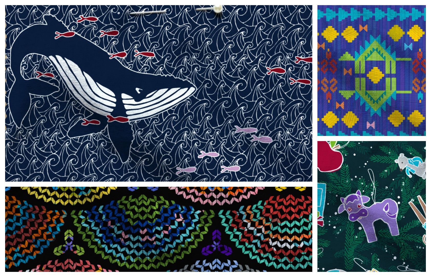
My highest finish was “Brine and Barnacles” at number 22 of 576 entries. (That’s the humpback whales design you see up above in the header to this post.) I didn’t manage to crack the top 10, but I would like to! The design challenge that week was a limited color palette, which I really didn’t like: Navy, orchid pink, maroon and white and/or black. I love navy, but the other two colors were not in my personal favorite palette. So I was feeling unsure about this design (because it was really navy and white with a tiny bit of the others). It was a delightful surprise to see how well it placed.

My lowest ranking design was the one for the Kilim challenge. If you don’t know, a kilim is a kind of rug. I thought my kilim stegosaurus were pretty cute, but I don’t think it came across very well in the challenge voting. (You can also see them in the header of this post.)

What did I love?

Having a weekly challenge was fun. I always had one to think about and I could take the time to think about it. Spoonflower announces them about a month ahead of time, so sometimes I would work ahead. Most of July’s entries I did in one long afternoon.

I loved that I hated some of the challenge themes. “Gender Neutral Nursery Wallpaper” was super boring to me. The color palette for “Holiday Elegance” was awful (eggplant, burgundy, mint green). I wasn’t super excited about tacos or sloths. But I came up with something for every one of them. And it felt good to take something that was not inspiring me at all and to find a way to deal with it.

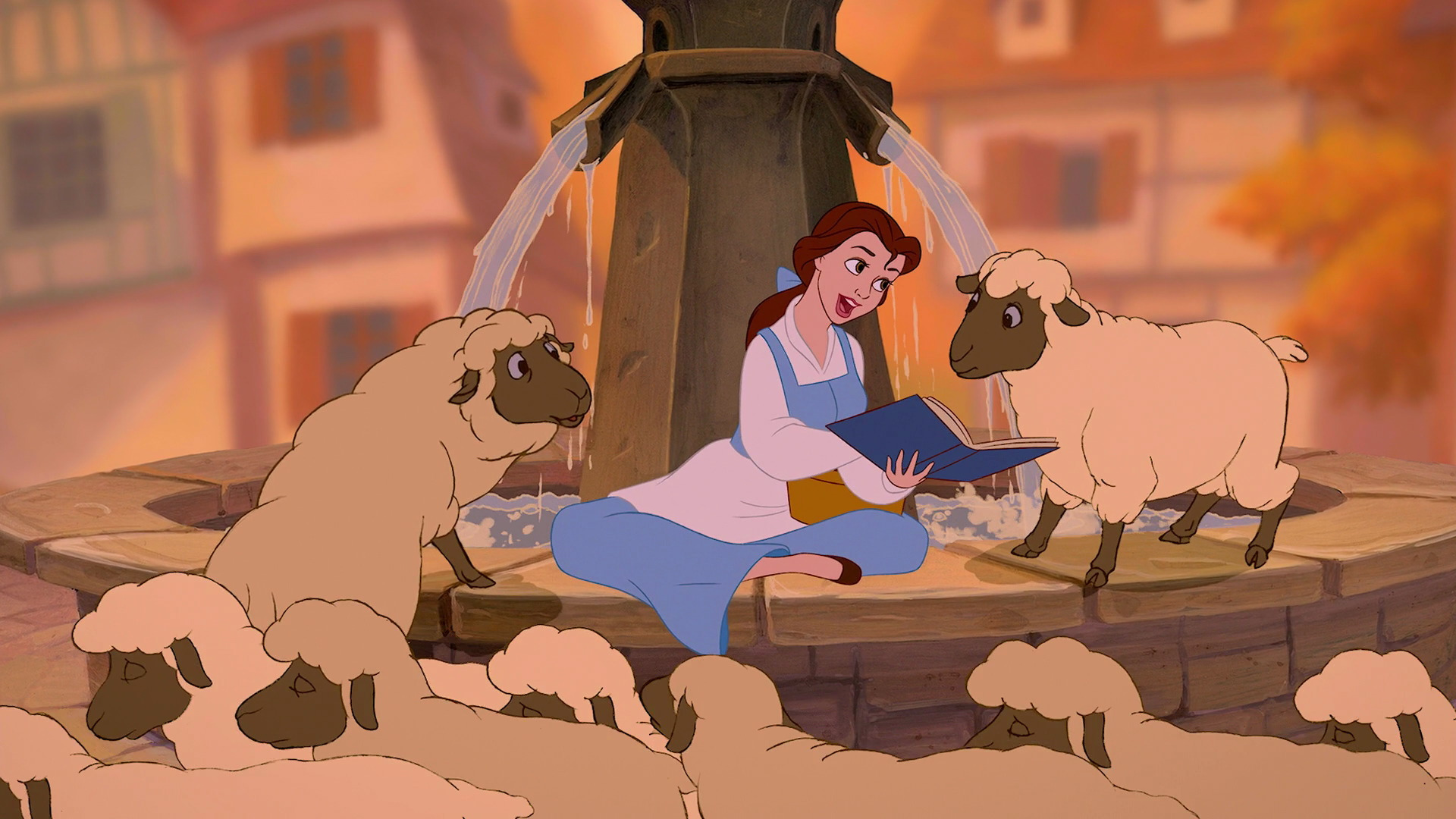
I’ve designed some things I am really proud of. Some because I just love the design (Leafy Sea Dragons). Some because they were really HARD to figure out the technical part of the repeats (Through the Emerald Forest). Some because they have been great sellers (Chasing the Sheep).

What did I not love?
There is a style that always makes the top 10 in the design challenges and I just am not in love with it. It’s not my aesthetic. But it is very popular and I totally can see why it is. So I had to keep reminding myself that I was designing things that made me feel good and that felt like they were true to my style, not things that were popular. The top 10 is about popular designs. And I don’t design to that popular aesthetic. It’s easy to feel discouraged when there is a “contest” involved and scores published. I think I could totally make my designs match that popular aesthetic and maybe boost my rankings, but do I really want to do that? Not really.

One of the quirky things I learned is that the scale that I would actually make a fabric design at and the scale that shows up in the design challenge voting are very different things. The piece of the design that voters get to look at is only about the size of business card on a computer screen, so if you make your repeat too small, it gets lost. I started designing things at much larger scale than I really would ever want them printed, just so they would make a great impression in the contest preview and then I scale them down to a more realistic size for actually making something after the contest is over. Not the most efficient process, but I think it shows off my designs more effectively.

What surprised me?
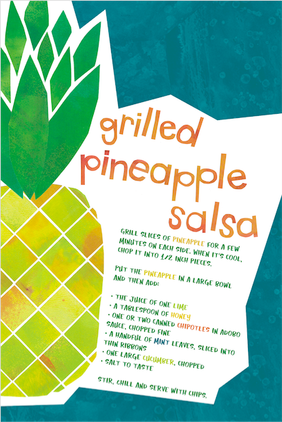
My pineapple salsa entry for the “Recipe Tea Towel” challenge was a total surprise for me. Honestly, I felt like I phoned it in on that design. I didn’t have an inspiration that was really calling to me. I had a busy and kind of stressed out week that week it was due. So I designed the whole thing at very nightowlish hours in about 45 minutes. It was a very quick cut paper design, scanned and assembled, and a recipe I knew off the top of my head. Instead of doing something clever with repeats, I just made one large pineapple to fill one whole side of the tea towel. It ended up being my number 6 finisher and is in the top 10 of my “most favorited” designs for all time at Spoonflower. Who knew?

I also was really surprised at the huge jump in sales/favorites/views/comments that happened because I was participating in the contests. That was an unexpected and much appreciated outcome. I more than doubled the commissions I made this year and I think it was directly traceable to the fact that I was consistently posting new designs every week. I LOVE the comments from people and I have connected with some other great designers and have had some great conversations in comments on IG and FB.

In a year (because of other reasons) that I had not a lot of other content to post to my social media channels, I always had a design challenge design to talk about. It maybe wasn’t the most varied content for my friends/fans/followers, but it was consistent. And I think sometimes that is a bigger challenge. It kept me from getting in to the cycle of not posting and then apologizing for not posting. Because every week I had something to post. Some weeks I could even turn it in to several different posts: I designed two circles designs and couldn’t choose between them or I asked for suggestions for some of the color limited designs.

Will I do it again next year?

I am pretty sure I will. The whole thing just had so many positives for me that I can’t see any reason I wouldn’t want to continue. I have participated off and on in the design challenges for many years, but never in any consistent way. That is fun, but I think the ongoing nature of doing it every week is really a bigger creative kick for me than entering a contest once in a while to see if I can “win”. I’d still love to make the top 10 sometime. A mosaic design I did in 2017 finished at number 11 in that contest. So I think I can get there.

Want to study them some more?

I put all of my 2018 challenge designs in a collection at Spoonflower so you can see them without the video slideshow if you want a little more time to explore or zoom in. I made most of them for sale. I have a few that I think need more work because I didn’t like the proof or something about the print needs a fix, but they are all there to view.

You can also explore all of the design challenge themes and see all of the top ten finishers on Spoonflower’s Design Challenge Page. If you are dreaming about designing fabric, I can’t encourage you enough to jump in and participate. I tell my students that the best way to get better is to DO IT. (It’s just like exercising, you have to do it and not just think about it if you want to see a result.) And finishing a design once a week is a great way to make sure you are doing it. You don’t have to submit it and participate in the contest part, but if you post it on FB or IG and tag me, I will check it out and leave you a comment.

4 December, 2018

Designing inspired by snark: The steampunk squid damask

2018-12-04T14:01:44-06:00Everything Else, Spoonflower & Fabric Design|Comments Off on Designing inspired by snark: The steampunk squid damask

This design always makes me shake my head. It continues to be the most popular design in my Spoonflower shop and it was entirely inspired by snark.

I created it when I was working on the Spoonflower Handbook. One of the projects we wanted to do was a shower curtain and my co-authors and I had managed to convince our editors that the print should be something a little off the wall. We wanted something that wasn’t just Pinterest-worthy, but had a little of the amazing weirdness that can be found among Spoonflower designs. So we settled on octopi, which were a big trend at that time. (They are still pretty popular.)

But we couldn’t find a design that we all agreed on that would fit in to the curriculum in the book. We had a plan for the projects in the book to help you build different skills and teach techniques as you progressed through the book. We needed this design to help teach a particular skill. The trick was to find something that both taught what we needed it to teach and passed the thumbs up of the people in charge of the “look” of the book. (That wasn’t me.)

We tried something made with clip art, but that didn’t fit the design lesson (and licensing was tricky). We tried hand-drawing something inspired by that.

We tried using a vintage illustration from a 1918 encyclopedia.

I cut it out and repeated it, I made many different colorways, we scaled it to different sizes. I made and printed 27 versions of the “octopus design” and nothing could get the thumbs up from everyone who needed to approve it. It was too creepy, too grungy, too dark, too macabre, the wrong color, too weird.

I was frustrated.

So in a fit of snark, I decided I just needed to design something that was as trendy as I could make it. I put in every trend I could think of.

  • Two colors, to make it as modern and clean as I could.
  • A “cute” octopus, almost kawaii style.
  • Damask designs were a huge trend on Spoonflower right then because of a design contest theme. Everything was damask. So I decided to do a damask-like pattern. This was also intended for a home dec project, so damask seemed apropos.
  • Steampunk was also having a little trendy moment and octopi featured prominently in that.

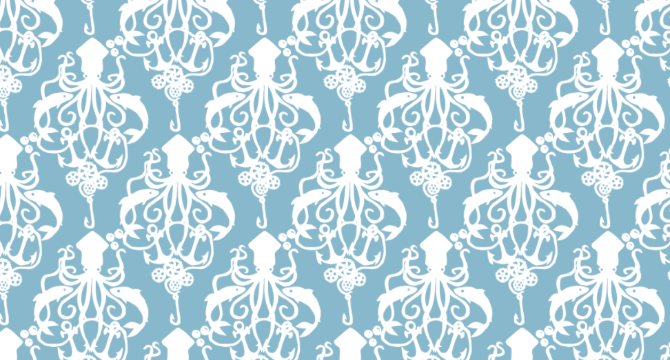
So I drew a Steampunk Squid Damask. The original artwork is not pretty; I cut it out like a paper doll and then traced it with a purple marker on a piece of card stock and then scanned it to trace a vector design. (They asked to feature that original artwork in the book and I said you really don’t want to do that. I made a fake “pretty” original, but I don’t think we ended up using it anywhere.) Because I was feeling snarky, the “steampunk” part of the design was just the addition of some gears to the fishing line. Barely a nod to the theme.

To my complete shock, the whole team loved it at first glance. My original was navy and cream, but we ended up going with a pale blue and white for the finished project. I can’t look at the design without thinking of its 27 predecessors and the convoluted path it took to get to this one. It’s trending again right now on Spoonflower. I just did a couple of new colors and a smaller scale based on requests of some customers and that kicked off its own little trend again. Sometimes inspiration really does strike in the most unexpected of places.

26 October, 2018

Save This Layout and Selling your Spoonflower designs. (I learned something new.)

2018-10-26T11:33:23-05:00Spoonflower & Fabric Design, Tutorials|3 Comments

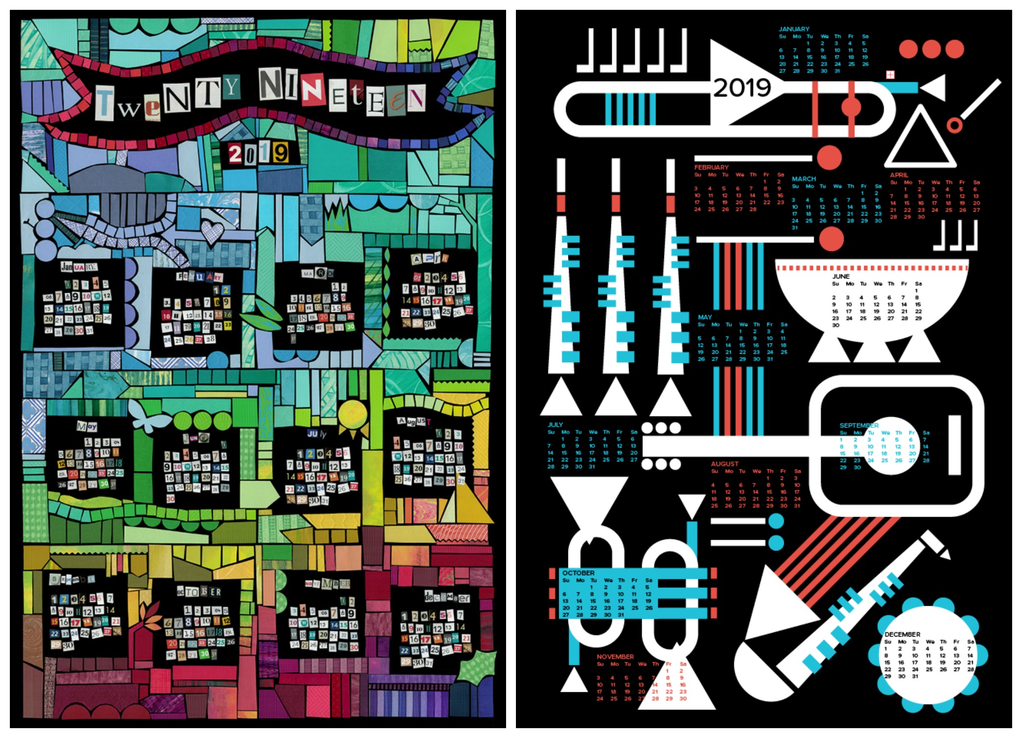
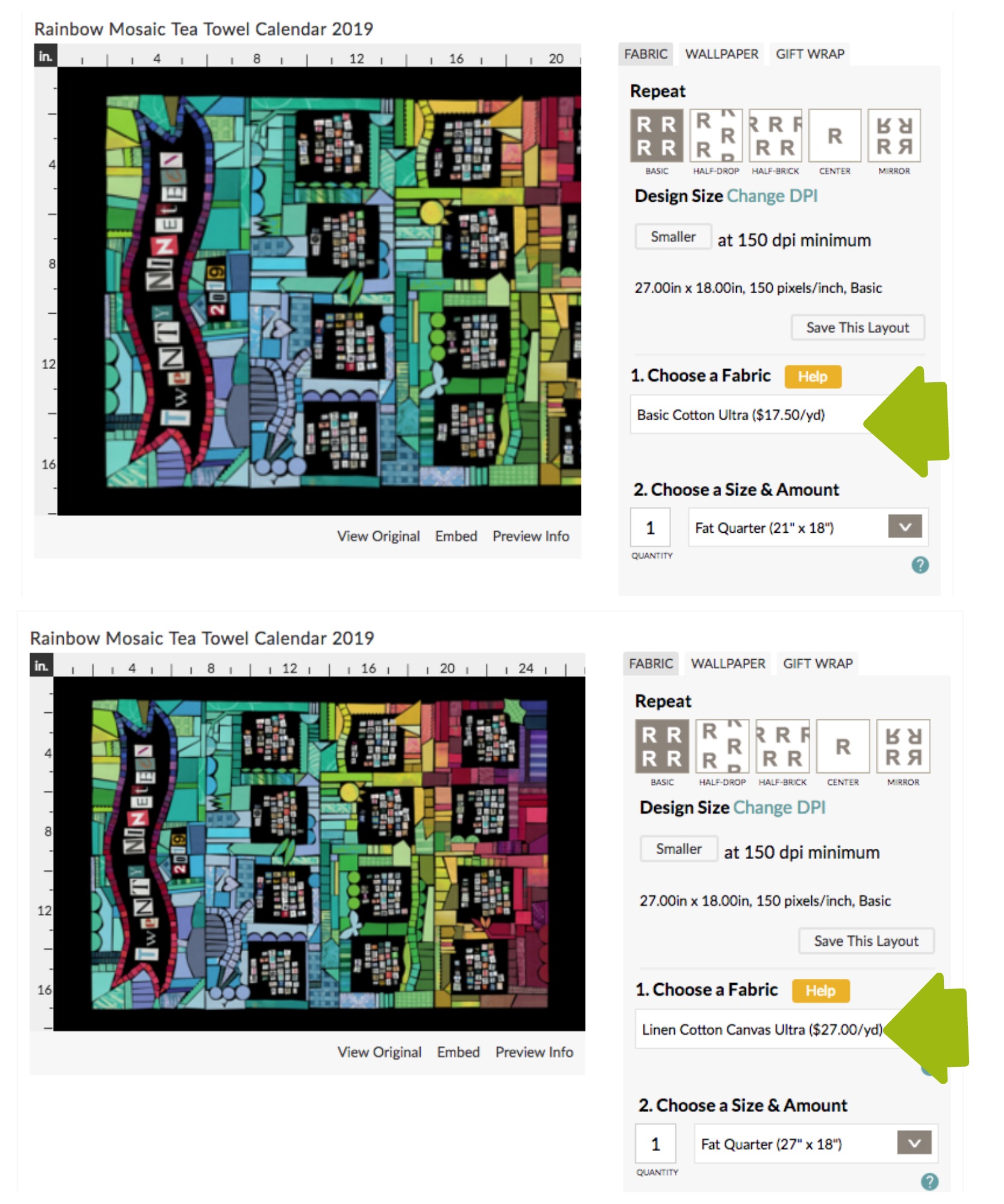
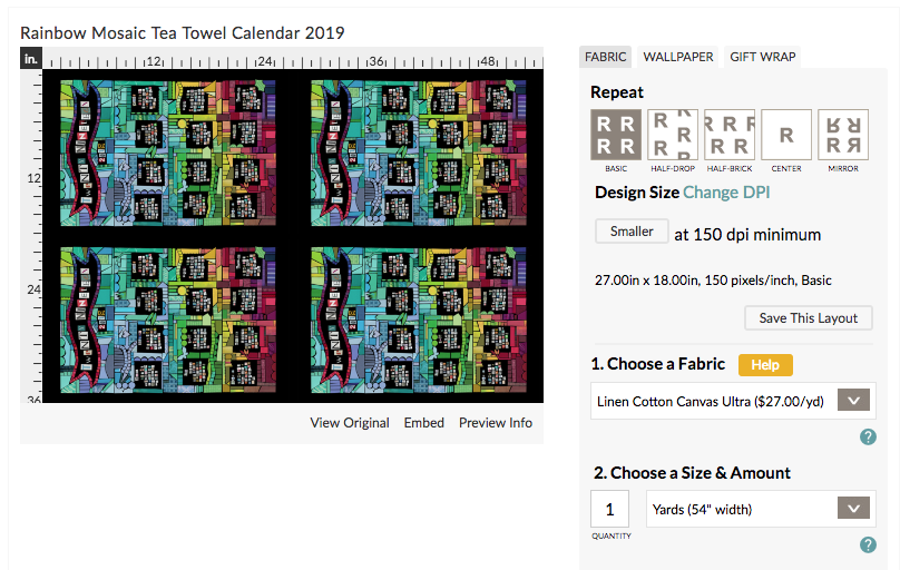
I’ve been designing a bunch of tea towels for my Spoonflower shop lately. The September design challenges were all about tea towels and I did a couple of tea towel calendars too. Those kinds of designs aren’t really made to repeat. Instead you are designing a panel that is set up to be exactly the size of a fat quarter of fabric. For linen-cotton canvas, which is my preferred fabric for those, that means I am designing a rectangle that is 27×18 inches.

I had sold several of the designs to people shopping on Spoonflower, but a couple of those shoppers chose a different fabric than the linen-cotton canvas, which might not seem like a problem, except that different fabrics have different widths and so the size of the fat quarter is different. If you choose basic cotton for example, a fat quarter is only 21 x 18 inches. Which means that you are going to lose 6 inches of my design. The top photo here is showing you what a fat quarter of basic cotton looks like; the bottom shows linen-cotton canvas. If you order this design in basic cotton, a third of the calendar will be missing.

If you haven’t used Spoonflower a lot, you might not realize that what you see is exactly what you get – if that design is cut off in the preview, then that’s what your fabric is going to look like. It’s an easy mistake to make. I caught it when I saw these orders come through and contacted Spoonflower to get in touch with those customers, since I was pretty sure they didn’t actually want to have only 2/3 of the design and everything got fixed up. What I didn’t know is that I actually could do one more thing to help make that less likely to happen to other people.

Save this Layout

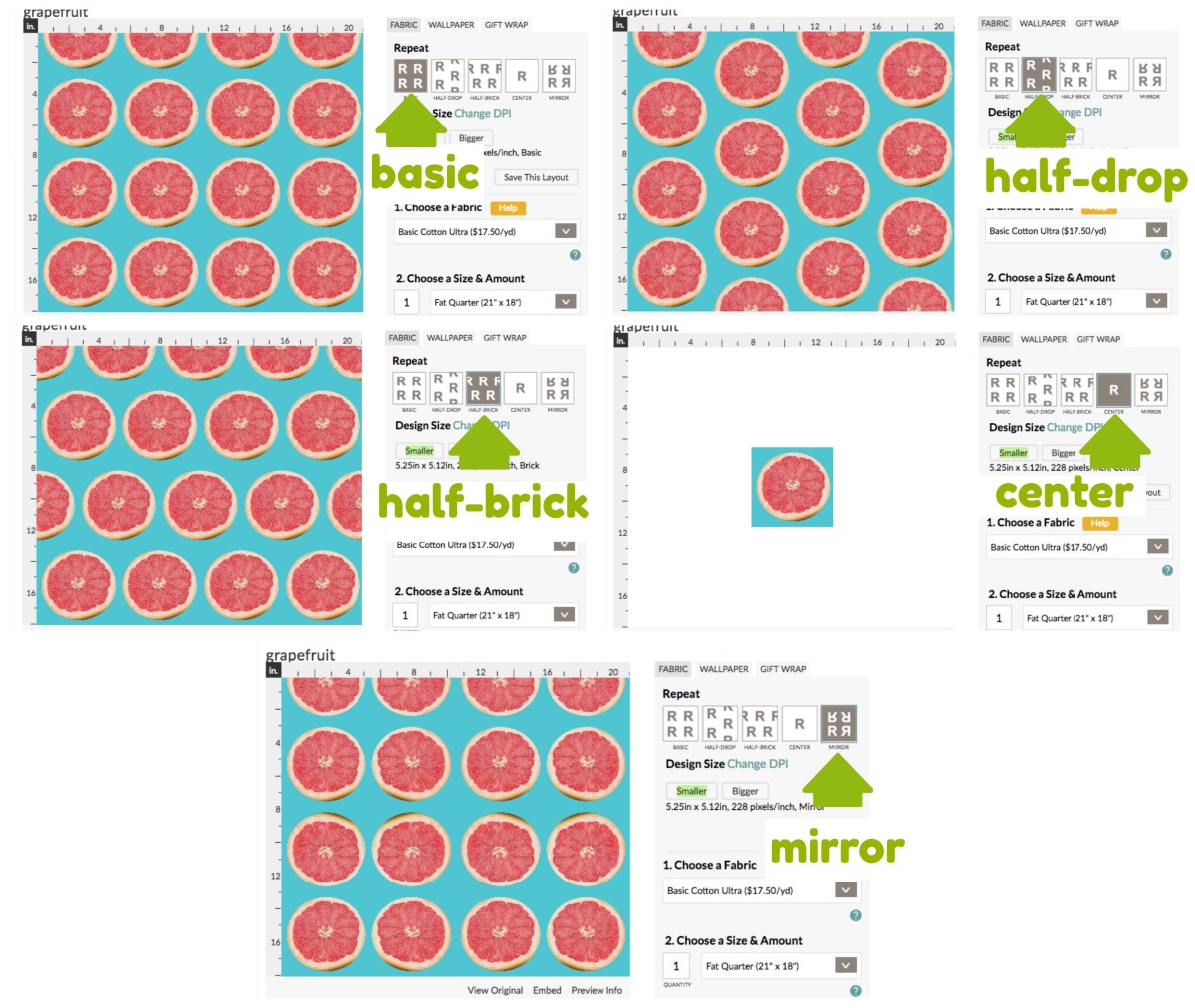
When you upload a design to Spoonflower there are a few things you can change about the way it uses your design to fill the piece of fabric. The first section is the Repeat of your design. By default it is repeated in a basic grid pattern. The design repeats like tiles on a checkerboard and fills the amount of fabric you have selected. There are 5 different ways that you can repeat it. Basic is the default, but you can also choose from half-drop, half-brick, center or mirror. Half-drop and half-brick offset your design by half vertically or horizontally. If you can imagine what the pattern on a brick wall looks like, you get the idea.

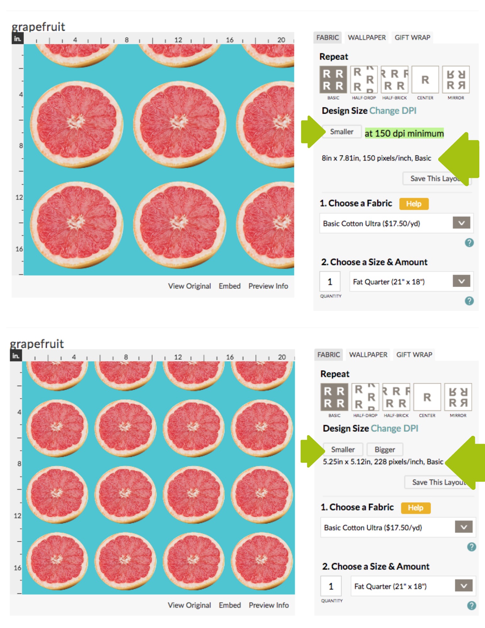
Here is a grapefruit design shown in each of the different repeat patterns; you can see how the pattern changes on the left. You will notice with the “center” option there is only 1 grapefruit. That’s because center takes one of your design and puts it exactly in the center of the fabric. The rest of the fabric is blank. (You might use this if you were printing a photograph of something to make a wall hanging and you didn’t need it to repeat.) The design always starts repeating from the bottom left corner of the fabric. If you look at the basic example, that’s why you see half grapefruits, because the fabric was only large enough for it to fit the repeat 3 1/2 times.

The next thing you can change is Design Size. There are buttons to make the design Smaller or Bigger and it will shift it by increments. The preview will show you exactly what it will look like on the left. You can’t ever make a design bigger than the original that you uploaded (because it can’t invent more pixels than it had originally), but you can scale it smaller just with the click of a button.

Here is the grapefruit at the size I originally uploaded (about 8 inches) and scaled down (about 5 inches).

Both the Repeat and Design Size you can set how you like and save by clicking the Save This Layout button. This does two things: it locks in that layout of repeat and size so that it remembers it the next time you look at this design and if you make it for sale, it locks it in for shoppers. They won’t be able to change anything about your design. (They can message and ask you to make tweaks if they want to have it smaller or a different color) So that way you are sure that it is printing the way you intended it to (and the customer isn’t choosing a repeat style that doesn’t match up).

What I just learned

What I didn’t know until a Spoonflower friend pointed it out to me just recently is that the Save This Layout button ALSO saves a default fabric choice and a default size. How did I not know this? You’d think when you wrote the book on a thing, you would learn all of the tricks. Turns out, there is always something new to learn. Thanks Tina for the heads up!

Why is a default fabric choice important? That takes us back to that tea towel I was talking about earlier in the post. When I set up the layout for that tea towel, I chose Basic for the repeat. Although it isn’t a repeating design necessarily, if you happen to choose to buy a yard of fabric, this design will fit exactly four times on a yard. Four tea towels. Great for gifts.

I didn’t need to change the Design Size so I left that as I uploaded it. Then I clicked Save this Layout. What I didn’t know before is that it ALSO saves the Fabric and Size you have selected (below the Save This Layout button). So I can choose Linen-Cotton Canvas and Fat Quarter and then hit Save This Layout. Now any customer who looks at this design should see it defaulting to the exact fabric/size that the design was made to fit. They can still change those options, but it is much less likely that they might choose something that won’t work because the defaults are now set to the right thing.

I went back through and checked all of my designs that were supposed to be fat quarters (tea towels, cut-and-sew toys) and made sure that I set the default fabrics for those to be a fat quarter of the right size.


If you want to check out my tea towels and tea towel calendars, I have them all in a collection here at Spoonflower.

22 October, 2018

Designing stuffed toys with muslin mockups

2018-10-22T10:53:17-05:00Sewing & Design, Spoonflower & Fabric Design|1 Comment

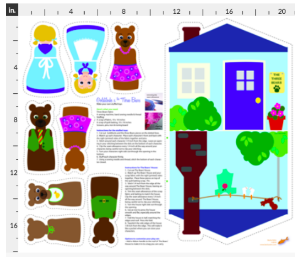
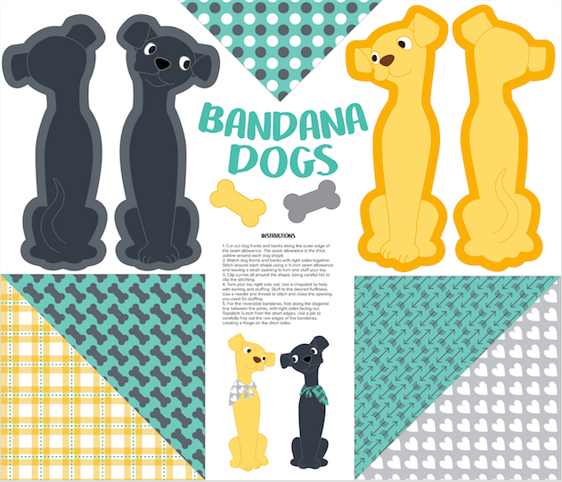
The Spoonflower design challenge this week was a cut-and-sew project that fit on a fat quarter. I love designing these kind of things. Some of my very first Spoonflower designs were sets of stuffed toys (Goldilocks and the 3 Bears, Red Riding Hood) where you could make all of the little characters as dolls or finger puppets and then they had their house which was a bag to store them all in. All of the pieces fit on a fat quarter and you just cut them out and sewed them together. The way this design challenge was set up you could make a cut-and-sew anything. Many people made stuffed animal toys, but you could do things bags, headbands or bibs as long as they fit on that 21×18 inch rectangle.

I struggled with this one a little bit. I was going to re-do a sheep stuffed toy pattern that I had in my Etsy shop years and years ago. I thought it would be easy to convert since I had already pattern tested it. But I just wasn’t excited about it and it’s a little fiddly to sew together.

Then I thought about a conversation I had with my friend Megan, who owns a local yarn and fabric store called Knit & Bolt. For a class I was teaching, I interviewed Megan about trends she saw in fabrics – what sells, what doesn’t sell, what do people come in looking for. One of the things that came up was cut-and-sew panels like these. They are popular at her shop, but one of the things she noticed about them is that although they seem like a really great beginner project for new stitchers, often the actual sewing parts are really difficult. She had an example of a cute cowboy doll, but the neck and arms were very skinny, which made it hard to turn right side out and stuff. The way that other parts attached to the body was complex. The shapes that you needed to sew were tight curves, which can be challenging for a beginner.

So I decided that I wanted to design something that was actually a beginner sewing project. Of course I came up with this pretty close to the deadline for the challenge (because don’t you always do your best work on a deadline?) So I thought about it and decided to rework some artwork I had already drawn.

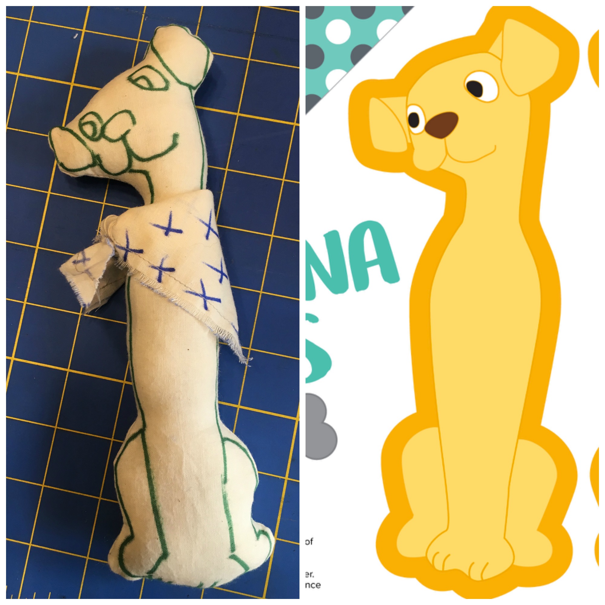
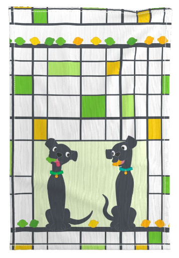
I drew these labradors for another design challenge entry for tea towels. They were inspired by a photo of a pair of mid-century ceramic statues of little black and white dogs. I thought they were really cute and it would be fun to rework them for a different kind of cut-and-sew design.

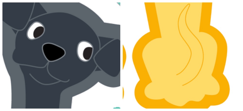
The best part is that they are really simple shapes, so they would be easy to stitch. I removed their tails and redrew them so that they were part of the artwork on the back of the dog. No skinny bits to stuff and sew. I added a wide seam allowance around each piece. The instructions say to sew with a 1/4 inch seam allowance, but I made my border a bit wider than that so there was a little room for wobbles in the sewing line. By making the seam allowance in the same color as all of the outlines in the art, you won’t see a white “gap” at the edges if your sewing isn’t quite perfect – the color will go all the way into the seam. There are still a few curves around the ears but they should be accomplishable for a novice stitcher. Then because I think that it’s always fun for your stuffed toys to be able to do something, I used the rest of the fat quarter to make reversible bandanas for the dogs, which you just fold in half, stitch the edge and then fray it out to make a fringe.

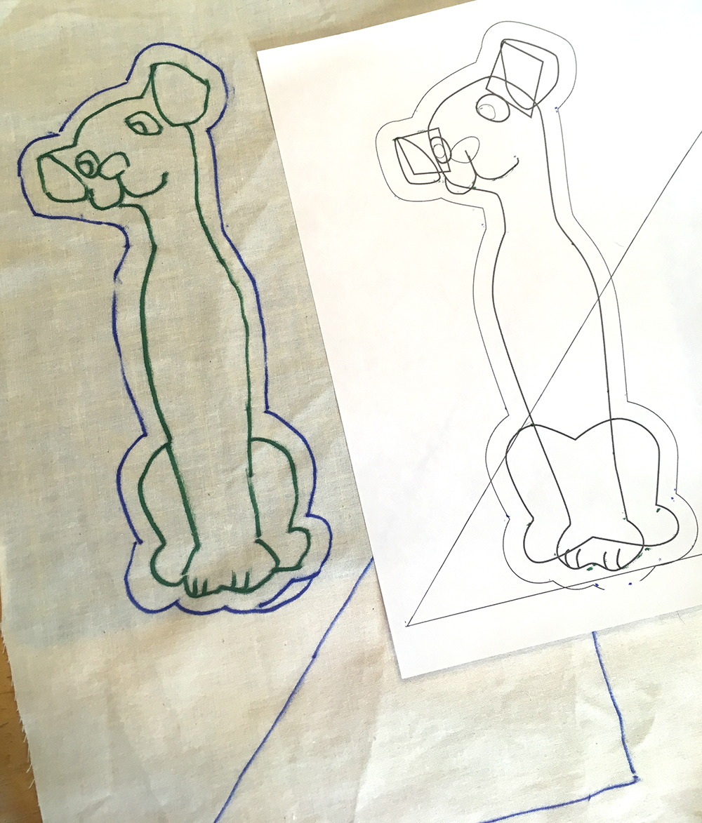
I didn’t have time to actually get these guys printed and tested before I had to turn in my design challenge entry, but I didn’t want to post something that was completely untested. So I made a muslin mockup. Because I drew this original design in Illustrator, I just converted my shapes into a line drawing and printed it out.

I taped the line drawing up to a bright window and traced my lines on to a piece of muslin with a sharpie. Then I could cut and sew a sample to scale and make sure everything worked out just right. Super fast prototyping! I can’t wait to get the finished printed sample so I can make up some with the final design, but this was enough for me to make sure everything worked and fit together.

16 October, 2018

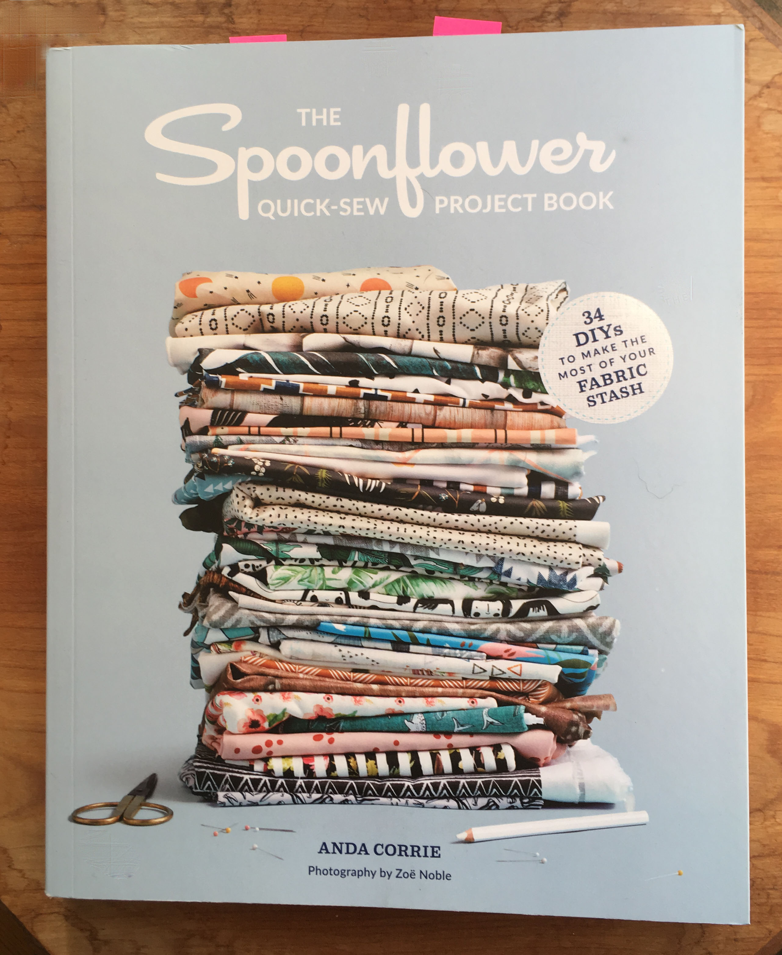
Book Review: The NEW Spoonflower Quick Sew Project Book

2018-10-16T13:40:56-05:00Sewing & Design, Spoonflower & Fabric Design|Comments Off on Book Review: The NEW Spoonflower Quick Sew Project Book

Just last week, Spoonflower released their second book, The Spoonflower Quick Sew Project Book. You might know that I worked on the first book, The Spoonflower Handbook and we get a little shout out in the intro for this new book.

The author for the Quick Sew book is my friend Anda Corrie. I have known Anda for a long time, although we only met in person in 2016. Anda worked at Etsy for many years and I asked her to be a juror for a grant program that I administrated when I still worked in the arts admin world. She also was a contributor to the first Spoonflower book. She has a project (pg 85) and she did the illustrations for the book. I love the aesthetic of her fabric designs: colorful, whimsical, and simple, but in a way that has so much character.

I wanted to tell you about this new book and a little about what I think is great about it. (This isn’t a sponsored post or anything like that. Everything I say here is my own thoughts and impressions.)

The book in a nutshell

It’s a sewing book. Where the Spoonflower Handbook focused on teaching you ways to create your own design, the main focus of this book is sewing. It has a great variety of projects that use different amounts of fabric from swatch to several yards. Although there are several projects that show you how to design something that is personalized, that isn’t the main goal. In some ways, I feel like this one is the prequel to the other. The Quick Sew book teaches you how to sew some great basic things with designs you get in the Marketplace, the Handbook takes it one step further to showing you how to then design your own fabrics. They are great companions.

Sewing skills needed for these projects vary. Some are great beginner projects for those who are just learning to sew. Some are a little trickier or demand a little patience. I tried one of the trickier projects, which I will show you later in the post.

Projects I love

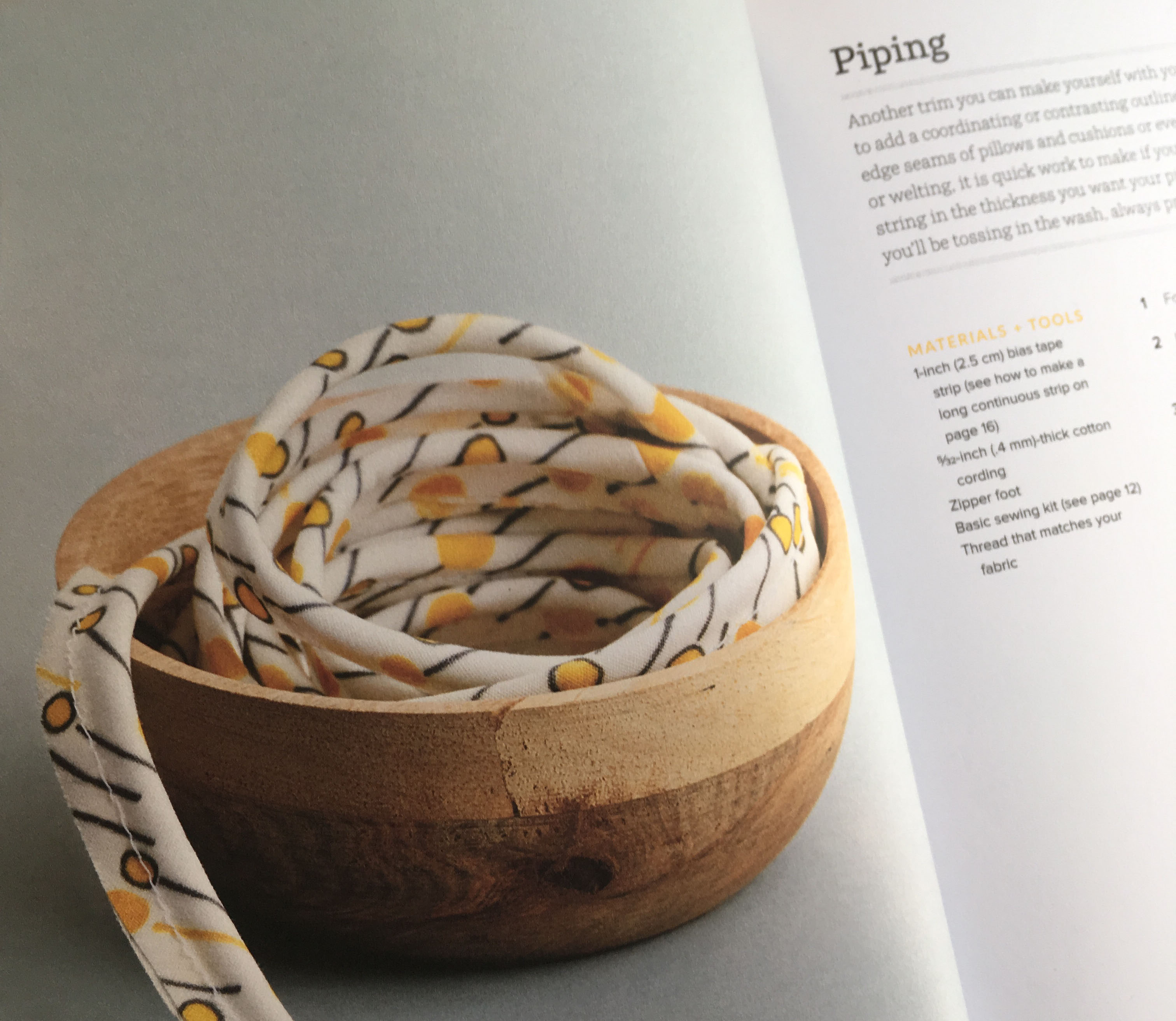
I picked out three different projects which I wanted to highlight. My favorite section might honestly be the Notions & Trims section of the book.

I have looked at a lot of beginner sewing books and I have never actually seen a section that breaks down and shows you how to make bias binding, piping, and covered buttons. I use these things all the time and I always make my own because I have a certain way I want them to look or a color I need to match and the premade things that are available are pretty limited. The piping is my favorite from this section. I figured it out by a lot of trial and error, which was not always successful. Did you even know you could make your own piping?

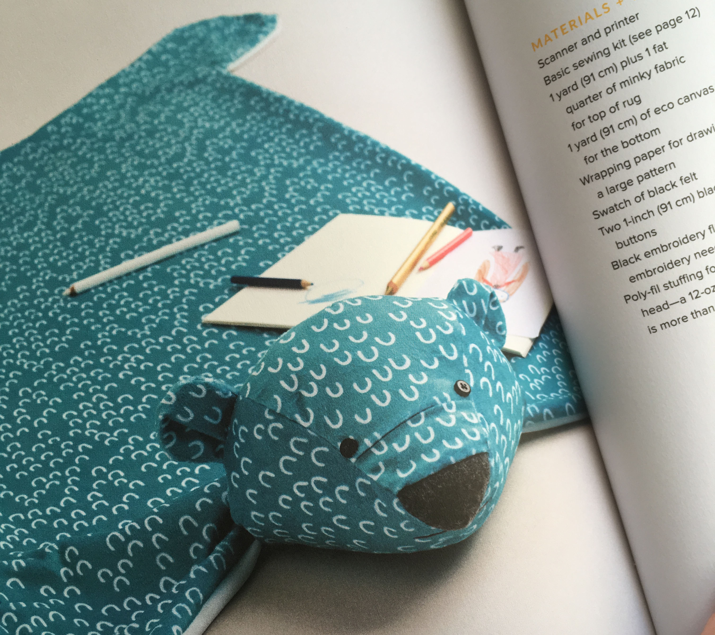
Next, I love this bear rug from the Multi Yard Projects section. He made me smile when I first saw the photo and I can imagine this would make for super cute baby photo props. He’s made from minky, so super soft and cuddly and I think the fabric design choice for this one was perfect. It’s “officially” a rug, but I can see it being so much more. I know my youngest niece and nephew would have dragged this around to watch tv with and pretend the bear was like a flying magic carpet so they could fly across the living room (because you know the floor is always lava.)

Here’s what I made

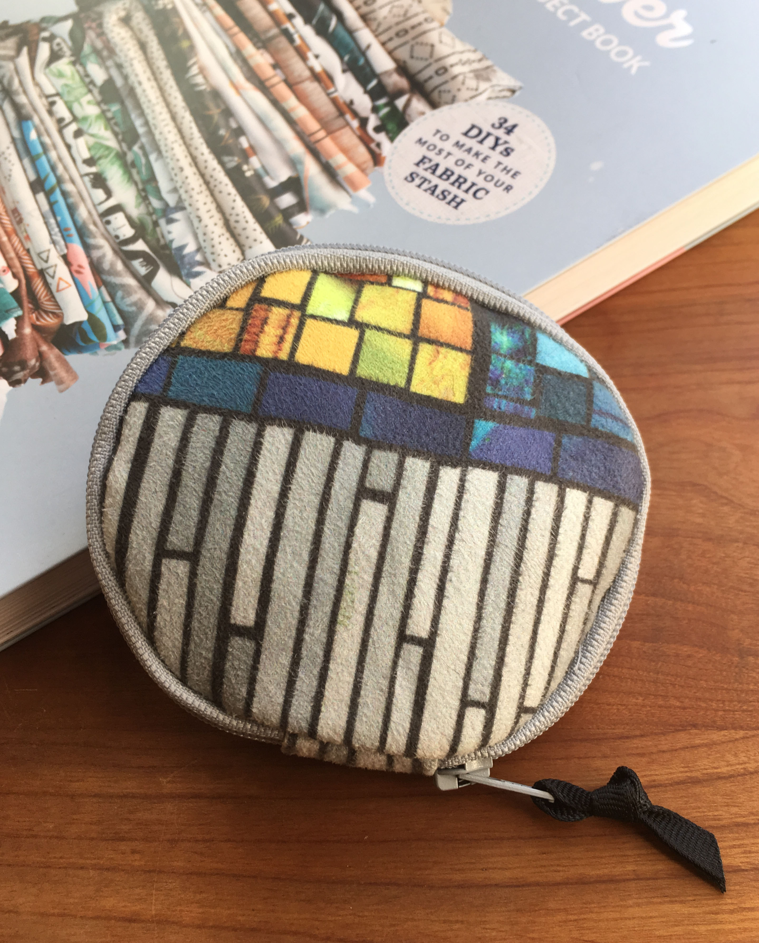
I decided that I needed to make something if I was going to do a proper review, so I decided to make the Tiny Circle Purse, which is one of the projects in the Swatch projects section. I had some scraps of faux suede left over from one of my own projects, so I used those scraps instead of a swatch to make my little bag.

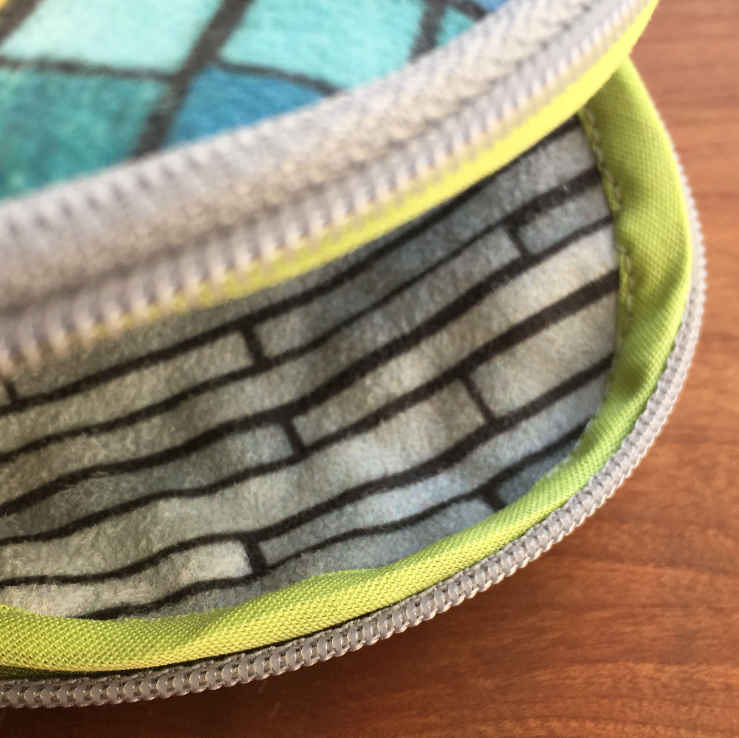
I have to admit that I cheated a little bit. I didn’t have a 10″ zipper that the pattern called for, so I shortened a 12″ one. I also didn’t have extra wide bias binding, which is used to finish and connect the ends of the zipper, so I just used a couple of scraps of fabric and turned under the edges to make it work like bias tape. To draw 4″ circles, I traced around the lid to a container which just happened to be the right size.

The raw edges of the fabric and the zipper on the inside are contained inside bias binding, which is tricky to sew in a little tiny circle, but looks pretty cool. I had some premade in neon green, so that’s what I used for this step. Because bending that zipper around in a tiny circle is challenging to sew without wobbles, if I were doing it again, I would just hand baste the zipper in first and then sew the seam, zipper and bias binding all in one step. It’s a cute little pouch and I think I am going to use it to keep bandaids and such contained in my purse. A fun project; a great use for a swatch or two.

What didn’t I love?

I don’t think it’s an honest review if I only write about the things that I love about the book and didn’t tell you anything else. So here are things that I noticed that bothered me. The fabrics featured in the book are beautiful and there are some great designers featured, but I would have loved to see more of the wonderful weirdness that makes up Spoonflower. I had exactly the same feeling about the designs featured in book I worked on. For me, part of the reason I love Spoonflower is that there is EVERYTHING there that you could ever want to find on a fabric. Corgis with sushi, oboes, vintage calculators, or steampunk robot whales. As Kermit says at the end of the Muppets Take Manhattan:

That’s it! That’s what’s been missing from the show! That’s what we need! More frogs and dogs and bears and chickens and… and whatever!

I get so very tired of everything looking like a perfectly photographed, exquisitely vanilla Pinterest or Instagram feed. Snore. But that’s a pretty personal thing and it’s just not my style. That being said, there are some really great simple modern and geometrics featured throughout the book. If that’s your vibe, you will see some things there you love and you won’t have a hard time finding similar fabrics to make your own versions of the projects.

You can get both books at Spoonflower or on Amazon. If you try something from the book or even just spot it in the wild, post a photo on Instagram and tag @andacorrie so she can see it (and me too, I always love to see your projects!) After working so hard on a project like a book, just a little note saying that you’ve seen it is like giving the author a chocolate cupcake. It seems like just a little but it means a lot.

4 October, 2018

Faking It.

2018-10-07T22:36:03-05:00An Artist's Life, Gallery Exhibitions, Out & About, Spoonflower & Fabric Design|4 Comments

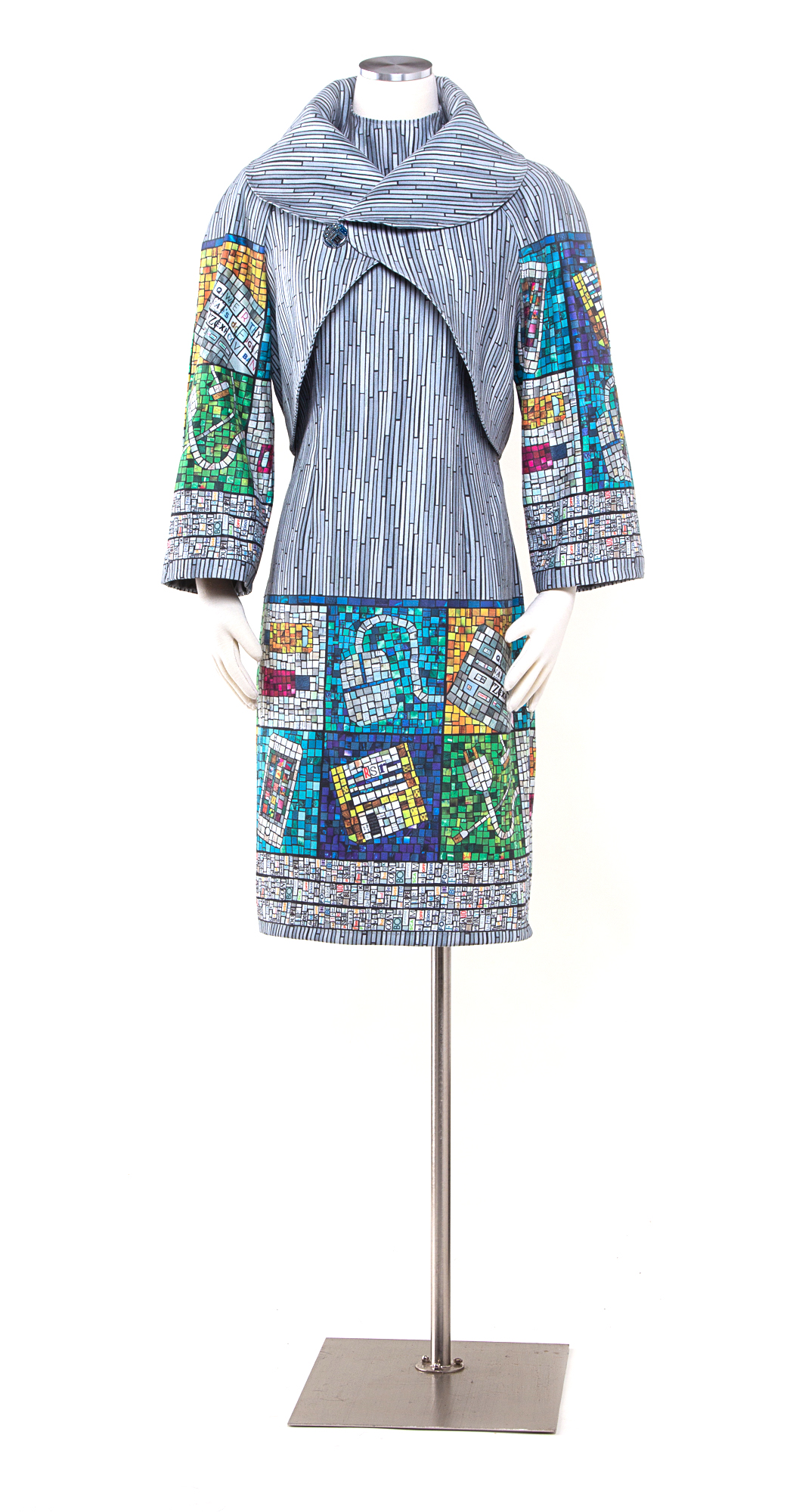
I was invited to show three pieces in an exhibition called Fiber Art in the Digital Age at the WI Museum of Quilts and Fiber Arts. The theme of the show is fiber art that incorporates innovations of the “digital age”. I created three pieces that include digitally printed fabrics and laser cut wood and acrylic. This is the first in a series of posts talking about those pieces.

Faking It
Sometimes a comment about your work sticks with you for years. One of the first digitally printed fabric garments I made was a dress that I wore to an art gallery opening. Two visitors came up to me and struck up a conversation about the dress, asking if the fabric was made using batik. When I explained with excitement that it was actually digitally printed photographs of ice, they looked at me and said “Digitally printed? That’s cheating!”

I have discovered that the relationship between fiber art and computers is often misunderstood. There is an assumption that if you use a computer, that it does all of the work; you just press a key and Photoshop magically creates art. Because I used a computer to create part of my piece these commenters, and several others throughout the years, decided that it wasn’t real art.

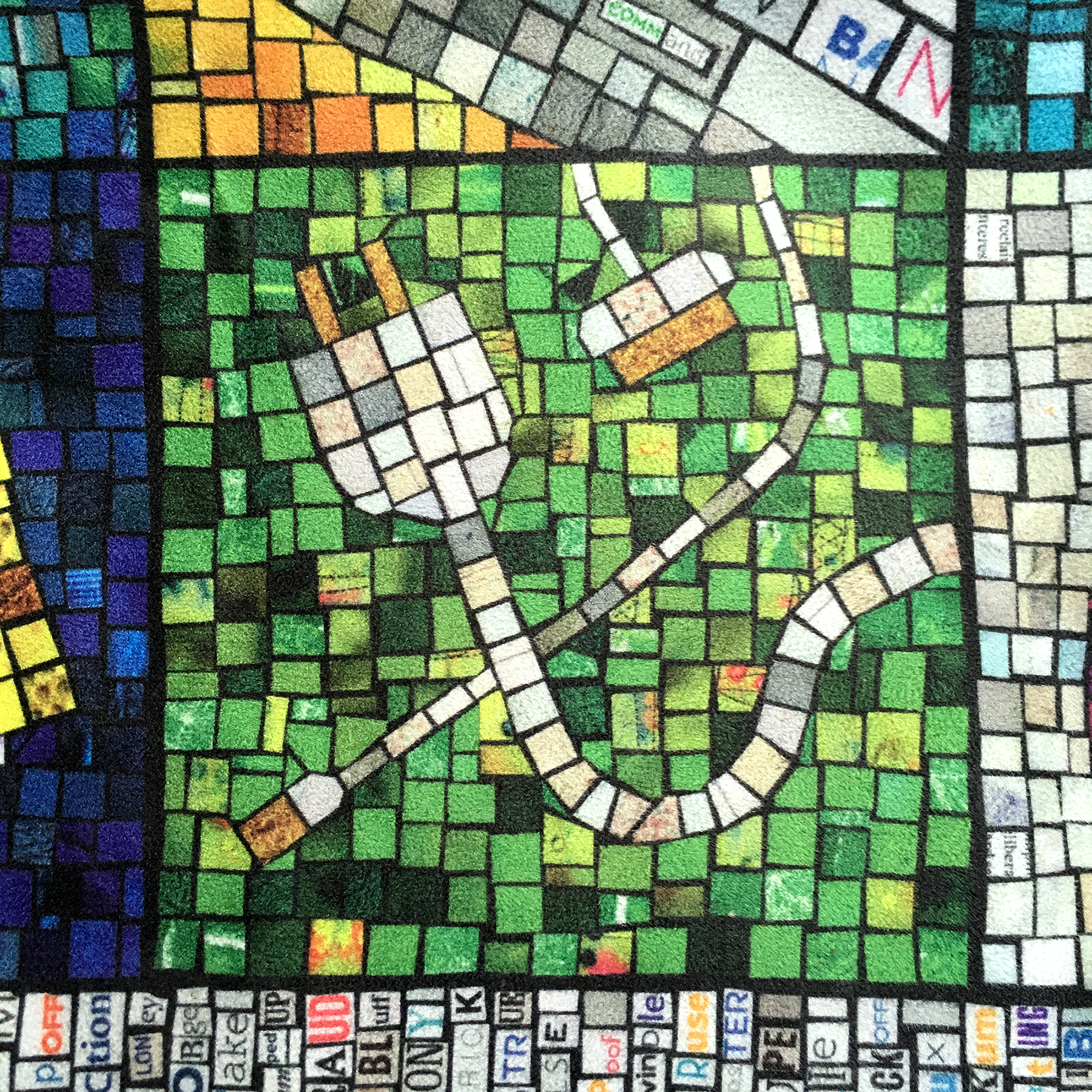
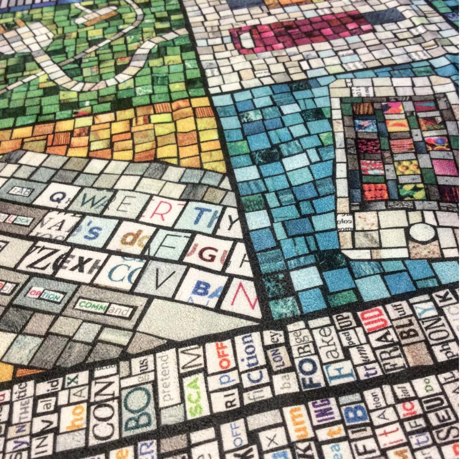
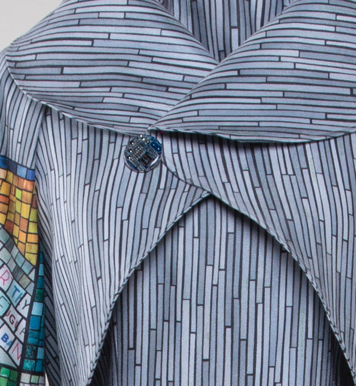
So, I decided to make Faking It a celebration of “fake” art made by computers. I started by creating imitation mosaics from recycled magazine paper with images of computers and technology: an iPhone, charging cables and even a vintage floppy disk signed with my initials. I surrounded the mosaic tiles with a border of ransom note style words that all are synonyms for fake: false, swindle, hoax, hokum, spoof, flim flam, bogus and so on. The background is made from tiny strips of paint chips in colors titled “pixel white” and “high speed access”. I scanned all of this paper art and the design was then printed on to polyester faux suede fabric. The button on the coat is a costume jewel made from a recycled circuit board embedded in resin. And finally, the dress and coat were made using a commercial knock-off pattern of a couture designer dress worn by Melania Trump at the 2018 presidential inauguration.

Digitally printed faux suede.


Here are some detail shots of the fabric design. Each one is made from pages of magazines and catalogues. You can see a video about how I made one of the mosaics for this piece in this post.

Many thanks to my friends and fans on Facebook who helped me come up with the “fake” word list that makes one of the borders on this print. I posted something asking for help thinking of alternate words for “fake” and they came up with awesome suggestions.

The button on the coat was made for me by Amanda at Circuit Breaker Labs. This isn’t a super sharp picture of it because I forgot to take detail shots before I shipped this piece off for the exhibition, but check out her Etsy shop to see how cool these are. (She made this one for me as a custom request, usually she offers them as pendants, earrings, keychains and more.) It was the perfect addition to this piece.

A little secret that you can’t tell by looking at this piece. There is actually an extra seam on the back of the jacket because I ran out of fabric. Spoonflower discontinued this faux suede just days after I ordered the fabric for this dress. When I realized that I needed a little more, I went back and they were sold out. Even though I knew it was going to be discontinued soon, I really wanted to use the faux suede in keeping with my fake theme, so this dress really is one of a kind and almost zero waste. I used every scrap I could.

I love this piece. I worked on it for months and I really enjoyed every bit of it. All three of the pieces I made for this exhibition have good stories – things I wanted to talk about, things I had been thinking about and conversations that I wanted to have with people. It felt really good to make pieces that weren’t just about pretty or fun or design challenges, but pieces that were talking about something.

Do you have a comment about your work that has stuck with you? Something that people often misunderstand about what you do? Have you ever been accused of “cheating”? Tell me your stories!

Go to Top