19 June, 2017

Sunday & Seurat: A Collaboration

2017-06-29T12:03:10-05:00Gallery Exhibitions, Spoonflower & Fabric Design|Comments Off on Sunday & Seurat: A Collaboration

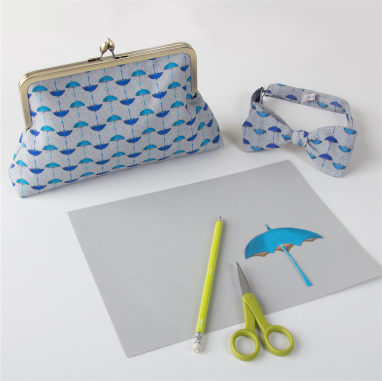
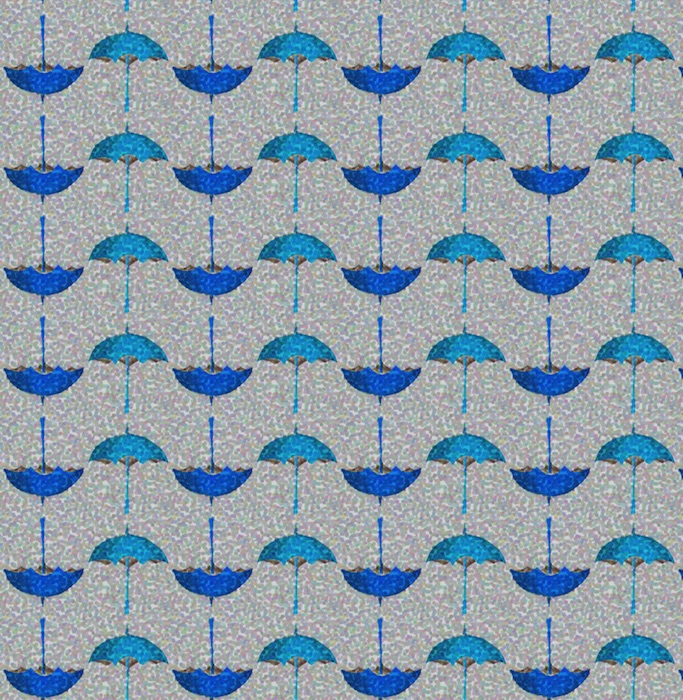
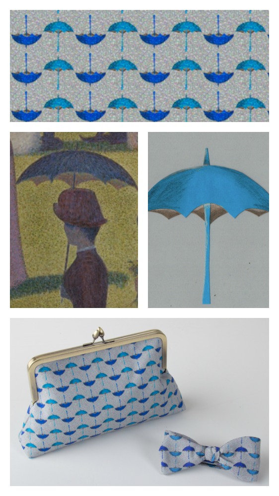
I am so excited to finally be able to talk about my collaboration with the Guthrie Theater Store. In February, I was approached by the manager of the gift shop for the Guthrie Theater. Their summer musical was Sunday in the Park with George and she wondered if I would like to work with them to make some exclusive pieces for the shop that were inspired by the show.

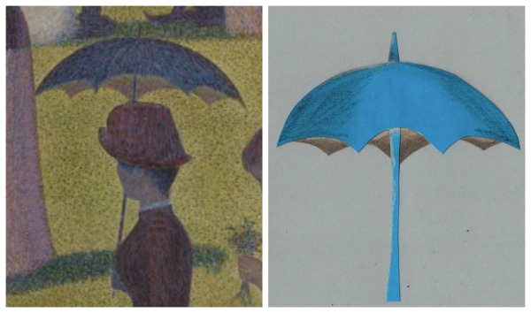
Sunday in the Park with George is loosely based on the life of Georges Seurat and his painting Sunday on the Isle of la Grande Jatte. I first saw the show about 15 years ago and soon after that we visited the Art Institute in Chicago and were able to see the painting. It was the first time that I can remember seeing a painting and literally gasping. I came around a corner and there it was. Part of the beautiful visual story of the show is that the actors recreate the painting on stage and the characters move in and out of that scene.

Image courtesy of Art Institute of Chicago

The show is a love note to artists. Seurat struggles with getting the image that he sees in his head on to the page and the struggle filling up the blank canvas. He is famous for the pointillist style, where the image is made up of dots of colors that your eye blends together. When I thought about what to design, I thought of the song “Color and Light” from the show, where Georges repeats the names of colors in a rhythmic pattern like his dots on the page. So that was one of the first designs I created.

Red Yellow Blue

Making the design Red Yellow Blue

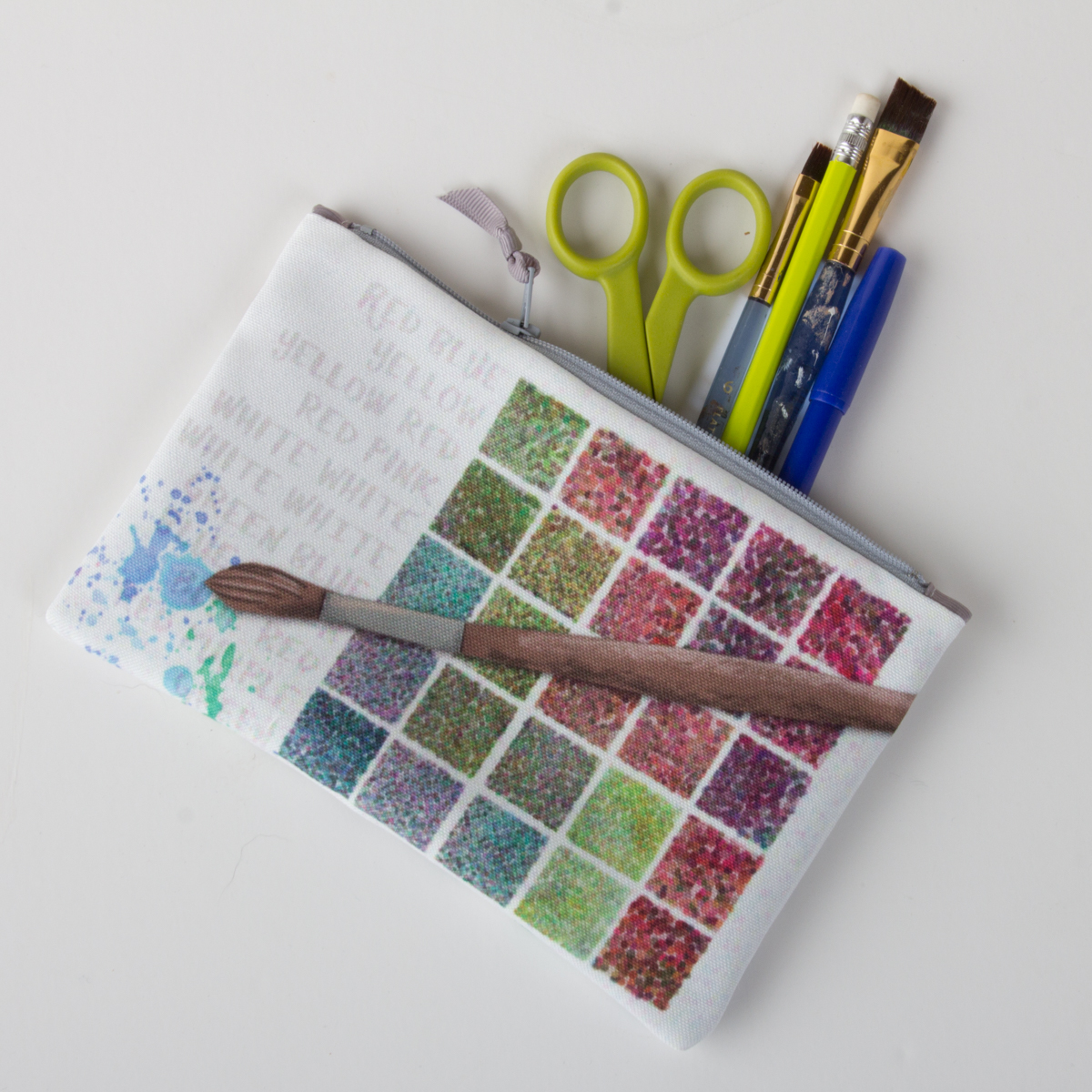
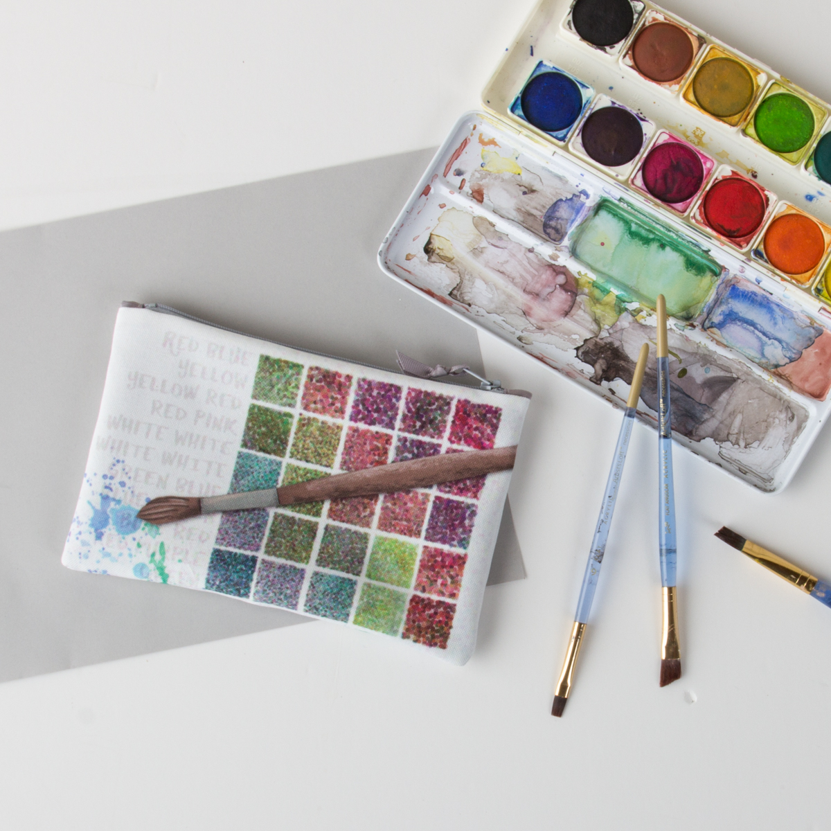
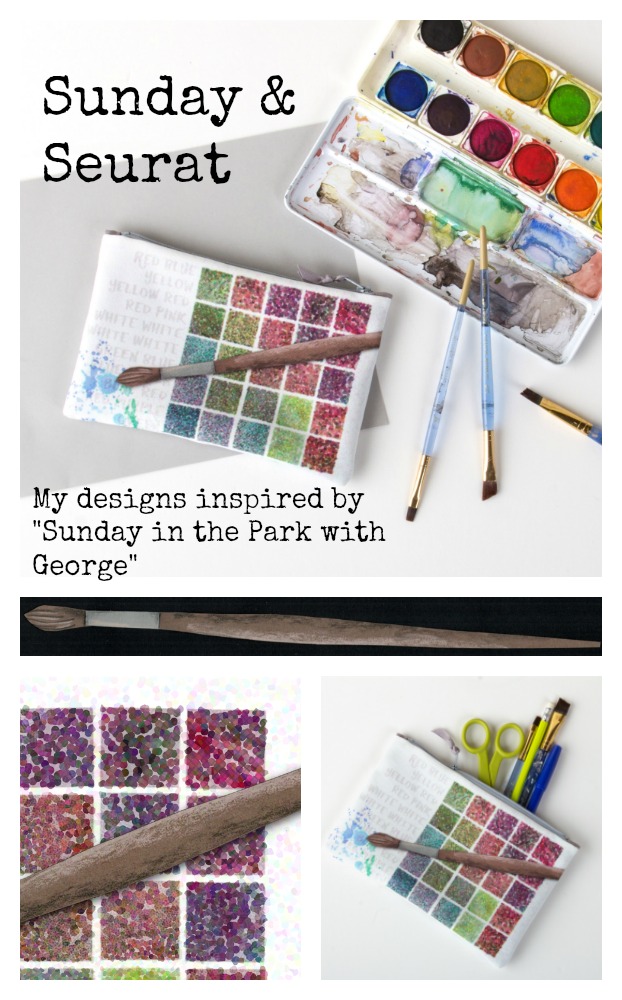
I started many of the designs in this collection from paper. The grid (representing a paint palette) and the paint brush are both illustrations made from cut paper; the paint splatters were watercolor. The paintbrush was shaded with colored pencils to add some texture. I scanned all of those pieces so that I could manipulate them digitally but preserve the texture and hand-cut or hand-painted quality of them.

There is a filter in Photoshop called “pointillism”, which seemed like a logical choice to make the design look Seurat-like, but it didn’t give me the effect I wanted at all. So I read a little more about Seurat’s painting and that gave me some ideas.

The artist worked on the painting in several campaigns, beginning in 1884 with a layer of small horizontal brushstrokes of complementary colors. He later added small dots, also in complementary colors, that appear as solid and luminous forms when seen from a distance.

I built up my design the same way with transparent and opaque layers, some with dots and some without and I digitally played with the luminosity in different ways. It took a lot of experimenting to get something that felt just right. It ended up being about four or five layers in total.

This design was intended to be a zipper bag, so I created the design to scale and not as a repeating pattern, which is more typical for fabric designs. It is printed on eco-canvas, which is made from 45% recycled polyester. The finished bag is about 5×8″, which is just the right size for your favorite pencils and art supplies.

Red Yellow Blue.


This is the first in a series of posts about the making of these Sunday & Seurat designs. I wanted to have the chance to talk a little more about the inspiration and process of making each one. They can be found for sale at the Guthrie Theater Store and you can see the whole collection in this virtual gallery.

20 April, 2017

Using Adobe Capture for Fabric Design

2017-04-20T09:04:42-05:00Everything Else, Spoonflower & Fabric Design, Tutorials|3 Comments

This tutorial comes to you via an email I received. This seemed like the kind of question that would make a great tutorial.

I love the patterns that I’ve created using Adobe Capture and I can see them in my library when I use Photoshop.  What I’m having problems with is making the Adobe Capture patterns into a seamless repeat to upload into Spoonflower. I have been able to upload my image into Spoonflower and it looks good as a swatch, a quarter yard; however, the full yard you can see that the pattern is not seamless.   I can’t find any video or blog info on how to do a step by step to make these beautiful Adobe Capture patterns into fabric.  — Shirley

What’s Capture?

Adobe Capture is an app for your phone or tablet. You can “capture” colorways or patterns in the app using your device’s camera and they are loaded directly into Adobe Photoshop or Illustrator in the Libraries tab. Once they are in the Libraries, you can use them in your Photoshop or Illustrator designs. Here is a great tutorial & description from Adobe for a little more about how Libraries work.

For this tutorial, I am going to talk specifically about the workflow of taking a Pattern that you create in Adobe Capture and how to upload it to Spoonflower to make a fabric design.

Create the pattern

First, you need to create a pattern in Adobe Capture and save it to your Library.

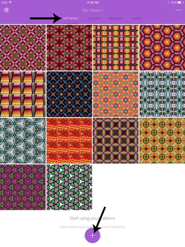
Launch Adobe Capture and make sure you are signed in to your Adobe account. Choose the Patterns tab at the top of the screen. Then tap the + button at the bottom to add a new Pattern.

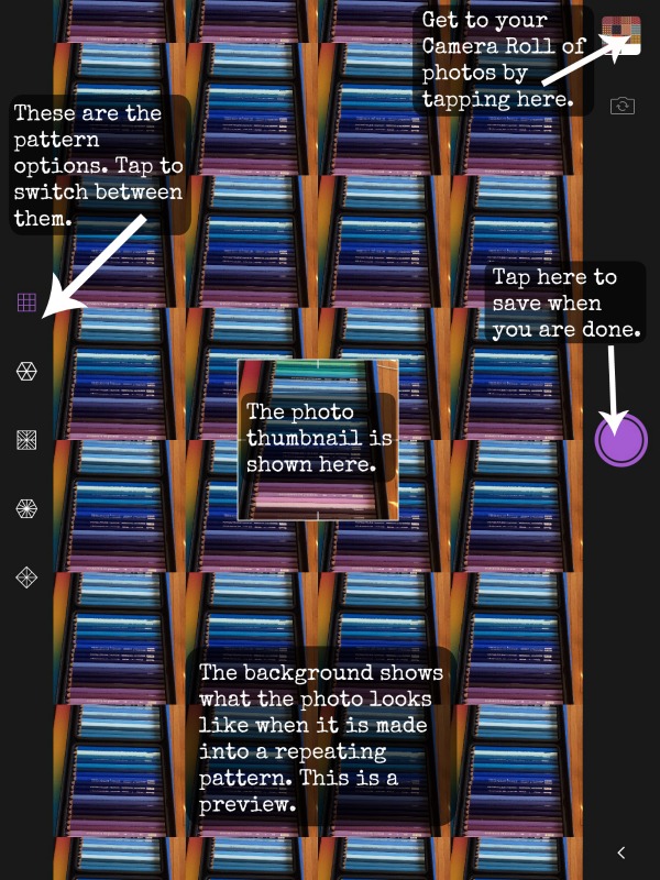
Use the built in camera to capture an image or you can choose something you have saved to your Camera Roll by tapping the thumbnail in the top right. Along the left side of this screen, you see the different pattern repeat types you can choose. Each one crops out a section of the image and repeats it by mirroring and rotating it. When you have the pattern you like, then save it by tapping the purple button.

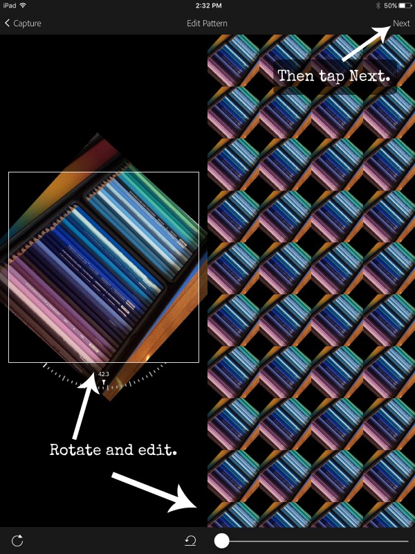
Next you will come to the Edit Pattern screen. You can change the angle and some blending on your photo. Once you are happy, tap the Next button at the top right.

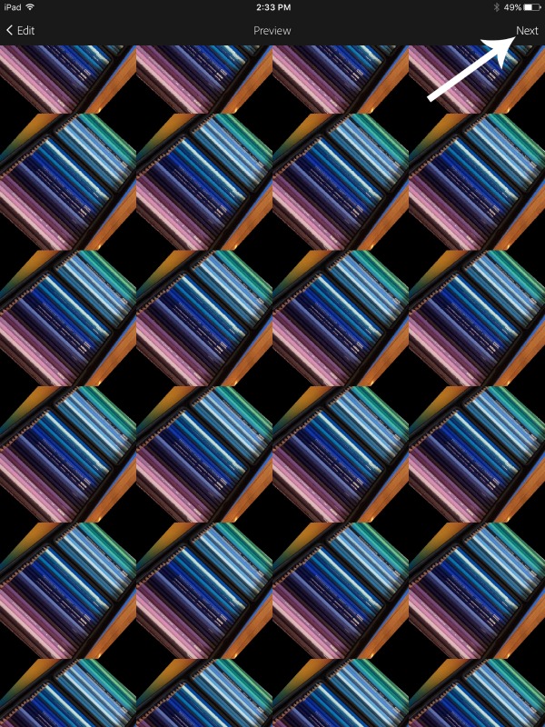
Then you will get a Preview screen so you can see what your pattern would look like filling up the whole screen. Cool. Tap Next at the top right.

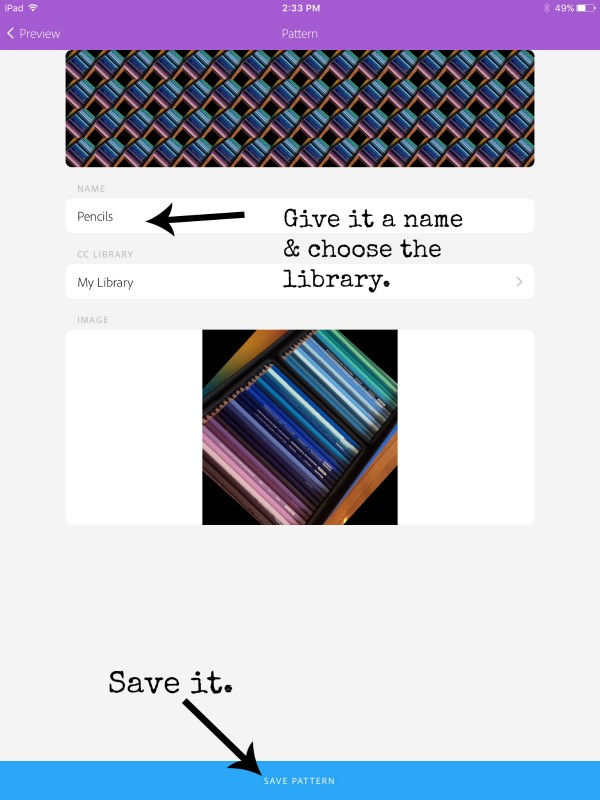
Finally save it to your Libraries. You can give it a new name and choose the Library you want to save it into in the dropdown. Then tap Save Pattern.

Finding your Pattern in Photoshop

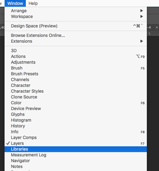
Here’s the cool part. When I open Photoshop, this pattern is going to pop up there automatically. Look for a palette that is called Libraries. It is often not open by default, so you will need to go under the Window menu and find Libraries to open it up.

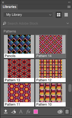
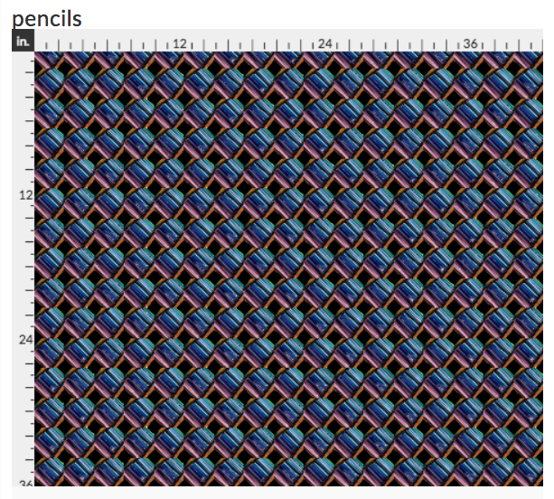
Within that Libraries palette, scroll down until you see Patterns and there you will see the Pencils pattern I just made. (Sometimes they take a few seconds to pop over there depending on your wifi speed. Be patient.)

So why do we have to go to Photoshop? Can’t we just upload that pattern from Capture somehow? The pattern isn’t actually a file you can upload directly to Spoonflower, although that would be really handy. It only exists in the Pattern palette until we fill a canvas and turn it into a .jpg. Think of it like a knitting pattern. Until you take the pattern and knit a sweater from it, you can’t wear the sweater. Until you apply the Pattern to something, you can’t use it at Spoonflower.

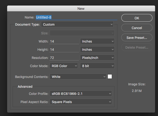
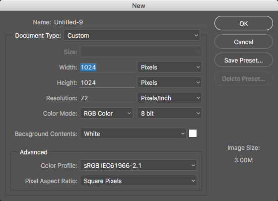
Make a new blank file by choosing File -> New. I made mine 14×14 inches at 72 ppi. I will explain why I chose that size in a minute. Then I click the pattern in the Libraries palette and it will fill the canvas with that pattern.

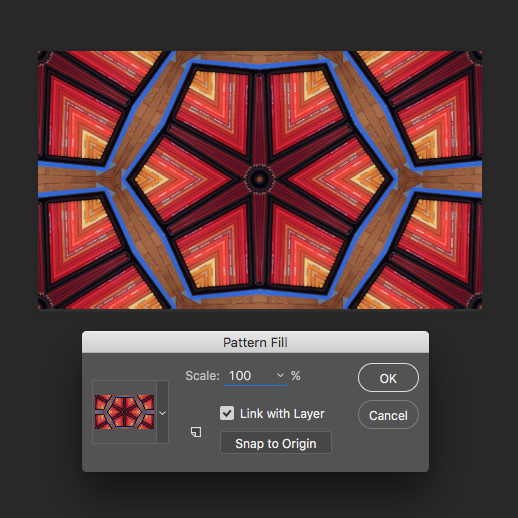
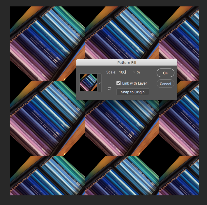
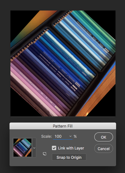
A Pattern Fill dialogue box will pop up asking what scale you want to fill your canvas. Enter 100% in the scale box and click OK. Why 100%? Because I want to make this the largest it can possibly get. It’s super easy to scale it down in Spoonflower, but I want to save it the biggest I can get it so I have the most options for using it. Now that we’ve filled something with the pattern, we can save this and upload it to Spoonflower.

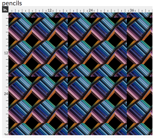
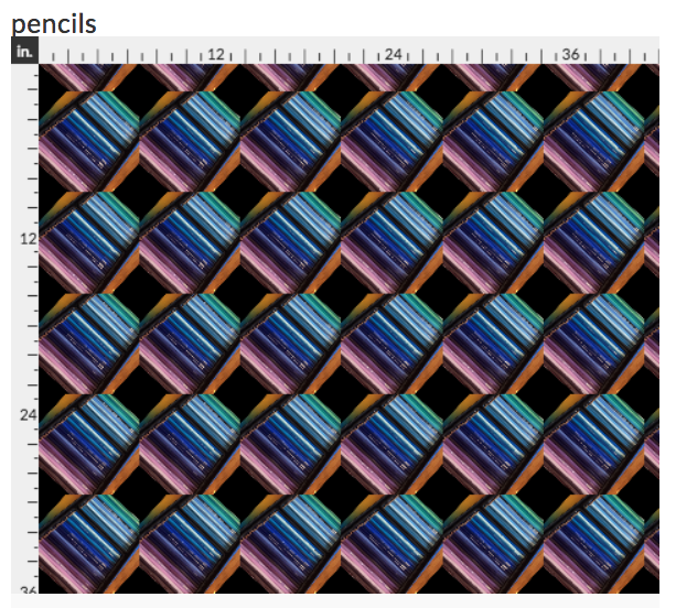
But first, I want you to take a look at this image. I think, based on Shirley’s email that we saw at the top of the post, this was the step that is tripping her up. If I upload this right now to Spoonflower, it’s not going to be seamless. You are going to see a flaw. If you look at the left and right sides of the image, you can see that they wouldn’t match up. There is a half an image on the right side, but no half image on the left to match it to. Here’s what it would look like if I uploaded it right now.

That’s not the same thing we saw on the Preview screen up above. Why? The repeating pattern tile that Adobe Capture creates is a set size and that size is not 14×14 inches. Photoshop filled the 14 inch canvas exactly as we asked, but to fill it, it used about 2 1/2 repeats by 2 1/2 repeats of our tile. I picked a 14 inch canvas so I could show you this example, but there is a better size to make your canvas.

Making One Repeat

To make it seamless on Spoonflower, we need to upload one repeat, not 2 1/2 repeats like we made in that example file.

So how do you make it so you have just one repeat? That took me a little sleuthing and I couldn’t find this spec published anywhere so I had to go in to Photoshop and figure it out. (ie Lots of trial and error and zooming in looking at pixels. You can imagine this step.) Disclaimer: I couldn’t find this information actually published anywhere, so this is the results of my experiments. I may be off by a pixel or so but I think this is accurate.

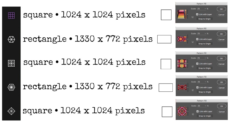
For each of the different repeat styles you can choose in Adobe Capture, it creates a pattern tile that is an exact size. I made the chart (shown above) that tells you what those sizes are. For some of the patterns, the tile is square and for some it is a rectangle. The size you see on the chart represents the size of one repeat at 100% scale.

Making one repeat is pretty straightforward once you know the size. Create a new file by going to File -> New and fill in the size of a single repeat from the chart.

If you don’t remember what repeat style you chose, there isn’t a really good way to tell which is which. A good rule of thumb is that if you can see hexagons in your design anywhere, it was very likely one of the rectangle (1330×772) designs.

Now choose the Pattern by clicking on it from the Libraries palette and set it to fill at 100% scale. Now I have one repeat.

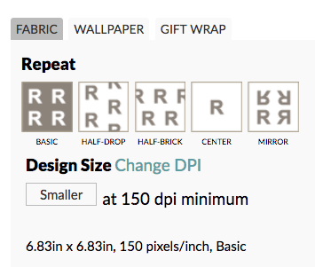
Save this file as a .jpg and upload it to Spoonflower. Choose the basic repeat style. Now the uploaded design at Spoonflower looks just like the Preview we saw on the iPad screen.

The preview we are looking at in the image above is 1 yard of fabric, which means this repeating element is pretty big (almost 7 inches). If you want to scale it down, just click the smaller button under the Design Size section until you like the scale.

I clicked the “smaller” button a bunch of times and this shows a repeat size of about 2.5 inches on a yard of fabric. Perfect!


Thanks, Shirley, for a great question! If you have a question you’d like me to write a tutorial about, just ask! I love getting ideas from you.

14 March, 2017

More art making! This time I will be in NC!

2017-03-13T21:28:53-05:00Out & About, Spoonflower & Fabric Design|Comments Off on More art making! This time I will be in NC!

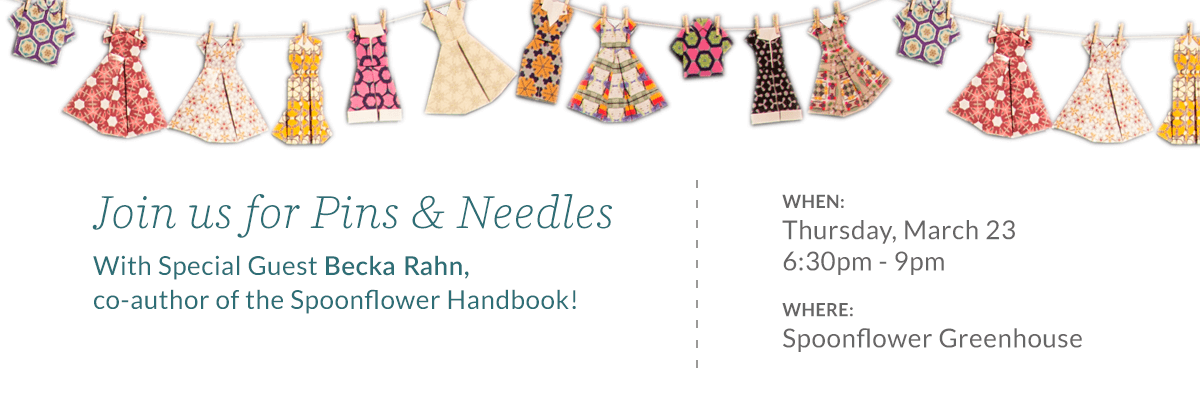
Please join us in the Spoonflower Greenhouse for a knitting, crocheting, and sewing social with special guest, Becka Rahn, co-author of the Spoonflower Handbook!  Bring your project of choice or learn how to make your own mini origami paper dress with step-by-step instruction from Becka. You can find all of the event details and register here.

I am coming out a day early for my master class so I can spend an evening in the Greenhouse making some art. If you are in the Raleigh/Durham area, please stop by.

3 February, 2017

Three Minute Tutorial: Clipping Mask in Illustrator

2017-02-03T15:12:28-06:00Spoonflower & Fabric Design, Tutorials|Comments Off on Three Minute Tutorial: Clipping Mask in Illustrator

In my previous post, I talked about cutting out the armadillo armor shape from a paint texture and I wanted to dig in a little bit to how that actually works because it is a really neat technique. It uses a tool called Clipping Mask. I am going to show it to you in Illustrator, but you can do it in Photoshop too.

Screen Shot 2017-02-03 at 2.28.49 PMStart with the shape you want to cut out. For the armadillos it was a cloud shape that was their armor. For this example, I drew two simple fishy shapes.

If you have more than one shape, like these two fish, you need to create a “compound shape” from them so you can cut them all out at once. Choose the black arrow Select tool and shift-click to select both shapes. Then go to Object -> Compound Path -> Make.

Screen Shot 2017-02-03 at 2.31.42 PM

Next you need to add the texture you want to cut things out of. We do that by Placing it in the file. Go to Edit -> Place and select the texture you want. Any .jpg will work. Choose a photo or a scan that you have. I placed the bubble wrap texture that I scanned because I think it also looks a little like fish scales. Once you have placed it, it will show up as another object on your canvas. You might need to resize it; you can do that by clicking the toggles on the corners and dragging it bigger or smaller.

Screen Shot 2017-02-03 at 2.28.19 PM

We need the texture object to be behind the fish, so select the texture and choose Object -> Arrange -> Send to Back. Now move the texture and the fish around so that the fish are covering up the part of the design you want to cut out.Screen Shot 2017-02-03 at 2.48.10 PM

Screen Shot 2017-02-03 at 2.31.55 PM

The last step is creating the Clipping Mask. Select all of the objects (fish and texture) and then choose Object -> Clipping Mask -> Make. (You can also right-click once you have them selected and a menu will pop up right where you clicked. Choose Clipping Mask.)

Now you have fish cut out of bubble wrap texture. You can do the same things to cut words out of a photo or make a valentine heart from your dogs’ faces.

Screen Shot 2017-02-03 at 2.35.03 PM

Screen Shot 2017-02-03 at 3.02.02 PM

2 February, 2017

Screaming Hairy Armadillos (or armadillos as the road to inspiration)

2017-02-02T17:55:37-06:00An Artist's Life, Spoonflower & Fabric Design|2 Comments

There is a lot going on in the world right now that makes some of us want to scream. I get it. But I think we need a little break from that to talk about a different kind of screaming.

Let me introduce you to Amber.

She’s a screaming hairy armadillo from the Smithsonian National Zoo. They tweeted about her last week. And my mom and I both saw it and were curious. Why was she called a “screaming” hairy armadillo? I get the parts about hairy and armadillo, but screaming?

So we Googled it.

And then we got the giggles. My dogs are now in love with Amber’s cousin-in-the-video and come running in the room when I play the sound. I told my mom “I think I need to design something with screaming hairy armadillos on it”. This might be the first fabric I have ever designed inspired by a sound. :)

So I thought about that for a couple of days. I have been working non-stop on grant/exhibition projects and I needed a day to goof off and design something fun. And I thought it would also be fun to talk a little about that process.

First I studied a bunch of armadillo photos and thought about how to make that great armor texture they have. Cut paper bits? Something photographic? Lace? Then I saw something pop up in my Facebook feed about making a paint texture with bubble wrap.

Screen Shot 2017-02-02 at 4.48.30 PM

So I grabbed a piece of bubble wrap and some double-sided tape and made myself a roller around an empty soda can. I squirted out some paint on the tin foil, rolled some on the roller and painted some sheets of black card stock.

Screen Shot 2017-02-02 at 4.50.27 PM

Messy, but perfect! Then I started drawing some armadillos. I did a quick pencil sketch and then drew over them with a fine sharpie pen.

Screen Shot 2017-02-02 at 4.52.40 PM

I thought I would just fill in their backs with the paint texture and have them be hand drawn. Turns out that they are perfectly cute little guys, but not very successful as fabric. I played with colors and fills and I just couldn’t get them to balance. The bubble wrap texture was so bold and dark and the lines here too delicate. Bleh. So I walked away for a bit.

Then I tried re-drawing them using layered shapes in Illustrator. That worked a lot better. The big blocks of solid color were much more balanced with the bubble wrap texture. I am kind of in love with them.

Screen Shot 2017-02-02 at 5.03.04 PM

The bubble wrap also got a little tweaking. I changed the transparency of that layer to be about 45% and put it over the same base color of the armadillo (turquoise in this example). The black in the bubble wrap print darkened the color up so that I got a nice related shade and you can still see some of the rainbow colors in the paint.

Then, we all know they are screaming armadillos, so they needed to say something. Only I couldn’t make up my mind what they needed to say, so I actually did two versions of the design: one with blank speech bubbles and one with “just do it” sort of positive messages: read it, think, love, believe, speak up, try, make good art.

I thought it would be fun to have options. Want your armadillos to scream Happy Birthday? or Congrats? Or Happy Retirement? Then you can fill it in with fabric markers, paint, embroidery, or sharpies. A friend sent me a list of “g-rated” swear words yesterday. She remembered that I talked about a collaborative print I did in a class with phrases like “oh piddle” and “son of a biscuit” and I now think it would be super funny to do a version with the armadillos politely swearing up a blue streak. But that’s another day.

bluearmadillos

So I started with a blue and green colorway and did two color variations, one with bright earthy colors and another with pinks and purples. The background of the armadillos is a photo of peeling paint from a utility box. Sometimes amazing textures come from weird places. But it goes nicely with the other paint textures. I took the same bubble wrap scan and made a seamless texture out of it too. So you can also get coordinating “polkadots” that match the armadillo armor.

versions

bubbles

I named them “Activist Armadillos” and I have uploaded all 16 designs to Spoonflower as fabric or wrapping paper designs. I have ordered swatches of all of the versions and I will post an update when I get them and decide if I need to make any tweaks to the design. I can’t wait to see them.

I think the screaming armadillos would make an awesome tote bag with a lining of armor polkadots. I might have to make that for me.

Go to Top