

How do I repost in Instagram? A tutorial
I have had an Instagram account for a while, but I just wasn’t using it. One of my goals for this spring was to dust off that account and start finding ways to use it and see if Instagram was a good social media match for me. I have been trying to post from art shows that I am at and take more behind the scenes photos while I am working on pieces. (And I post photos of my cute dogs, naturally.)
I realized that there were also some cool things I wanted to be able to “re-gram” or share from other Instagram friends, but I couldn’t figure out how to do that, so I asked my friend Google. It turns out that sharing is a little bit complicated. There isn’t a “share” button in Instagram. I read a bunch of articles and help docs and this is what I decided is my favorite solution. Keep in mind that Instagram is basically only for phone and tablets, so all of these screenshots in the tutorial are from my iPhone.
I downloaded an app called Repost. It’s a free app and my favorite part about it is that it adds a sticker to the photo you are reposting, so it is really apparent that you are sharing something from another person. That’s important to me.
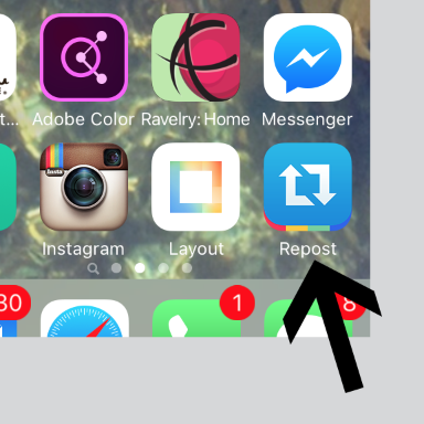
Connect Repost to your Instagram account and you are ready to go. Choose the photo you want to repost from your Instagram feed. You can also choose to repost things from your likes or favorites by choosing those tabs at the top. Choose the photo and tap “Repost”.
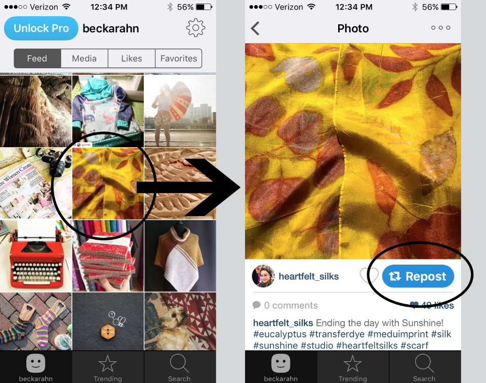
The next screen lets you set where Repost puts that photo credit. The buttons at the bottom of the screen let you place the credit on different sides of the photo and give it a light or dark background. Then tap Repost again.
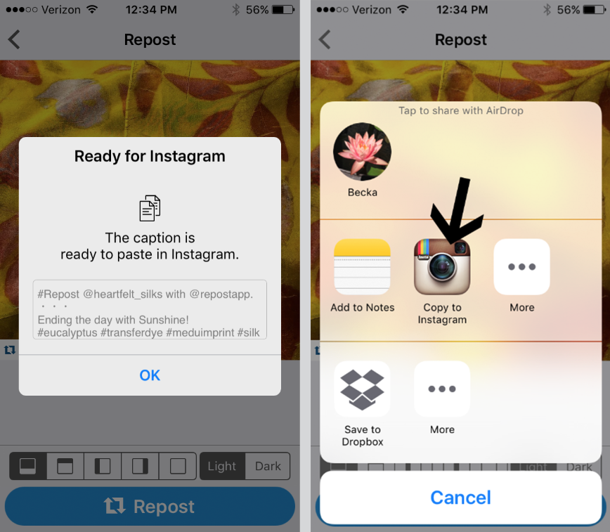
A pop up will let you know that it has copied the original caption from the photo to your clipboard. (I don’t need to remember the caption – that’s pretty great too!) Just tap OK. Next it will ask you where you want to Repost this photo. Tap the Instagram icon.
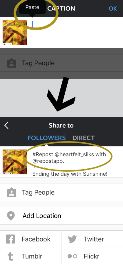
Finally, you now have the photo moved over to Instagram. When you first pop in to Instagram, the caption is blank. Tap and hold inside the caption text box. When you release your tap, a bubble will pop up that says “Paste”. Remember when we said OK to copying the caption? This is how you get to it. Tap “Paste” in the bubble and it will add the original caption and a little extra text which says: #Repost @username with @repostapp. This tags the person who posted the original photo, so they will know you reposted it, and your followers can see whose photo you are sharing. You can also add your own text and tags to the caption.
Then go ahead and post it. Here’s what a repost looks like in my feed.  There are lots of other ways to do this, but like I said, this was my favorite solution. I like the way that I can easily re-post the caption as well as the photo and I like the “sticker” on the photo that identifies the original author. Thanks to my friend Robbin for having such a lovely photo for me to share.
Do you have a different app or method that you use to repost? I’d love to know what’s your favorite.


