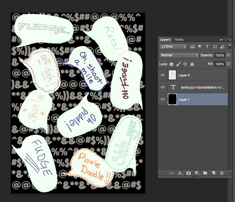
Tutorial: Seamless Arrows Print – Part Two
(This is Part Two of a tutorial for creating a seamless arrows print. See Part 1 here.)
Part two of the tutorial is all about making the design seamless. What does that mean? I want these arrows to look like they are traveling all over the fabric without having a a start and stop. Even though I only made a small section of the design, I want it to look like I designed something bigger and disguise the edges of the repeating element.
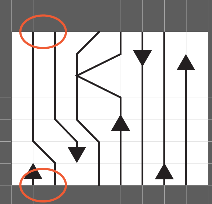
Check and adjust your lines.
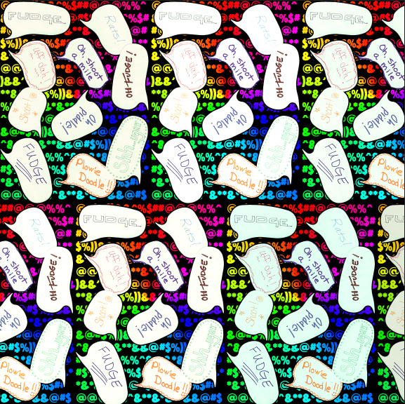
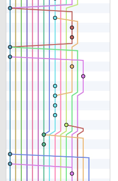
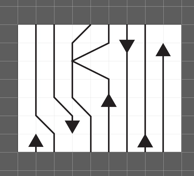
With this design, one way to make it look seamless is to make sure that any line that extends off the edge of the drawing, joins up with the design again. In orange I circled two lines, which go off the edge at the top of the repeat, and then show up again at the bottom. When I make this tile repeat and put two identical tiles next to each other, those lines will match up and look like they are one continuous line. I should also say, you don’t have to always work in a repeat, in fact I don’t make repeats very often, but for this particular project I just needed some yardage and not a specific shape. So a repeat was the easy way to go. Make sense?
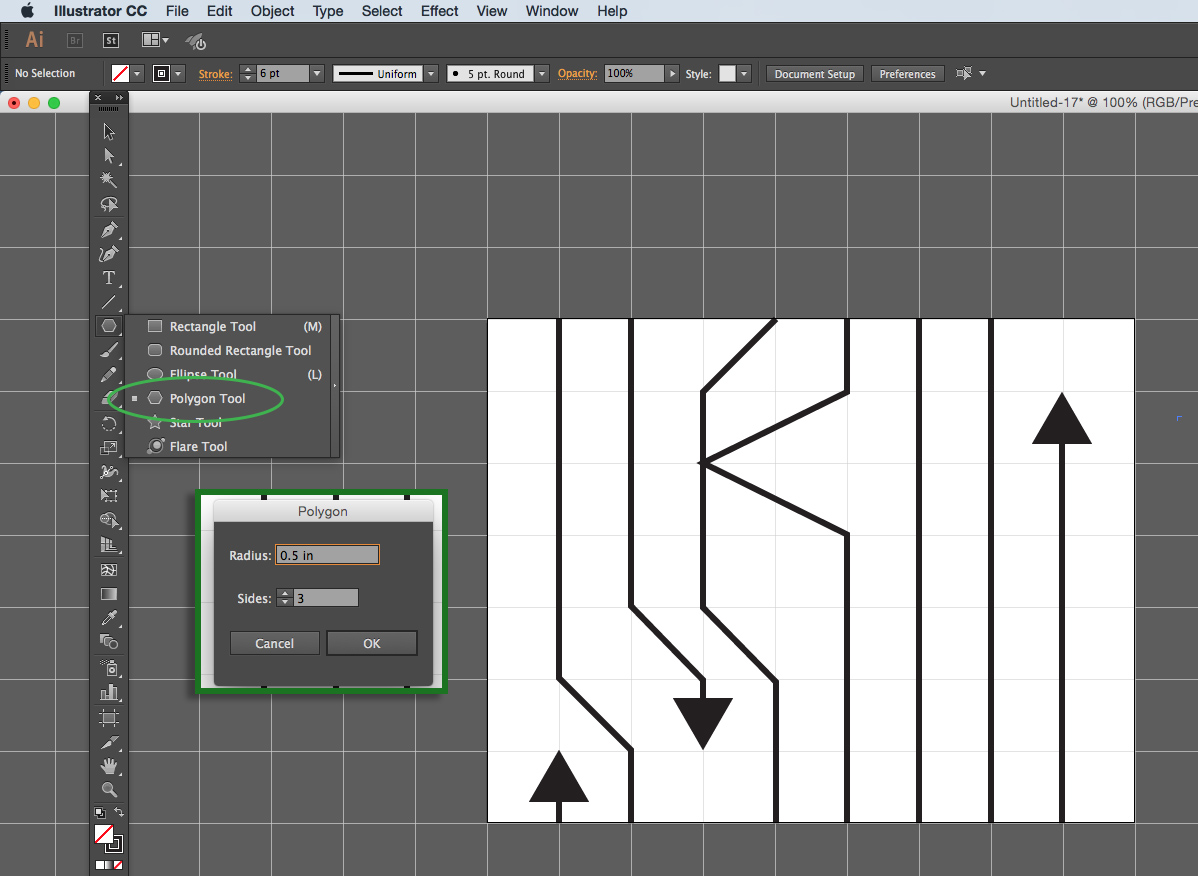
Try the Pattern Tool.
Illustrator also has a Pattern Tool which you can use to get a preview of what that repeating element will look like. Select all of the elements in your design and then go to Object -> Pattern -> Make.
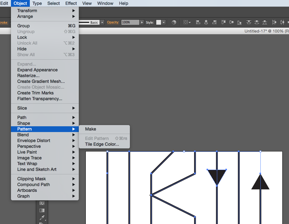
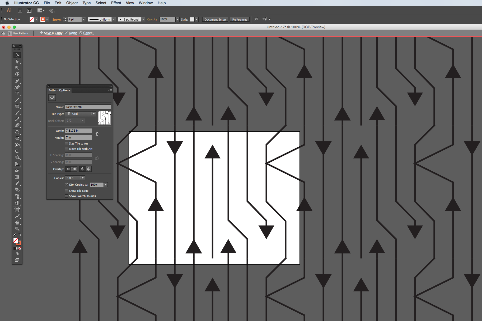 The pattern tool has lots of options for the kind of repeat style and the spacing, which you can play with. I am using the tool in this screenshot to just show me what it looks like if I were to see 3×3 tiles. And I can see when I have everything repeated that there are a couple of edits that I would make.
What do I look for? Think about how your eye travels around the design. My eye keeps going to and stopping at two arrowheads that are lined up side by side. I think I need to move one of those around and break that up. I also look for negative space – is there somewhere that is blank or has a gap that looks out of place? Then look for things that are unique – there is only one line that stops (it’s between those 2 parallel arrowheads). That might be a quirk that I want to leave in, or it might be distracting.
So my next step is to make all of those adjustments and then save this tile.
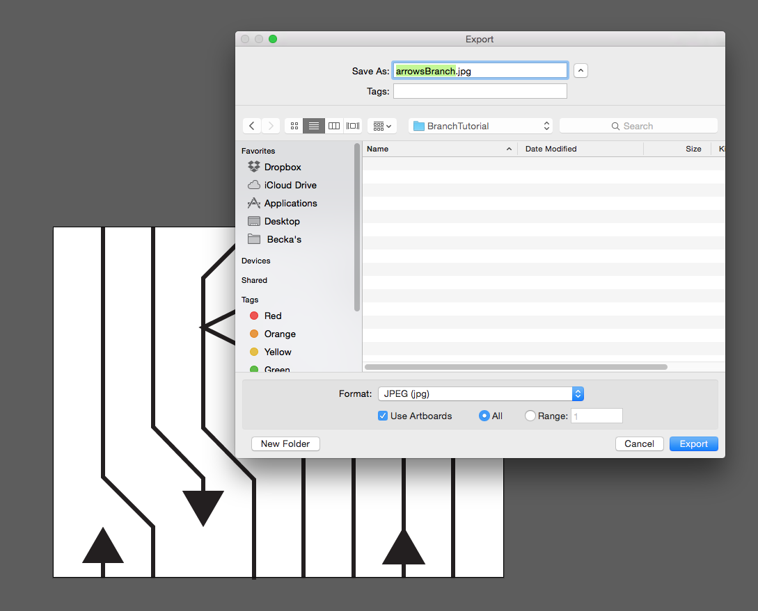
I am going to save it as a .jpg and check the box that says “Use Artboards” which will crop it to fit the tile (in case I have anything that hangs over the edge.)
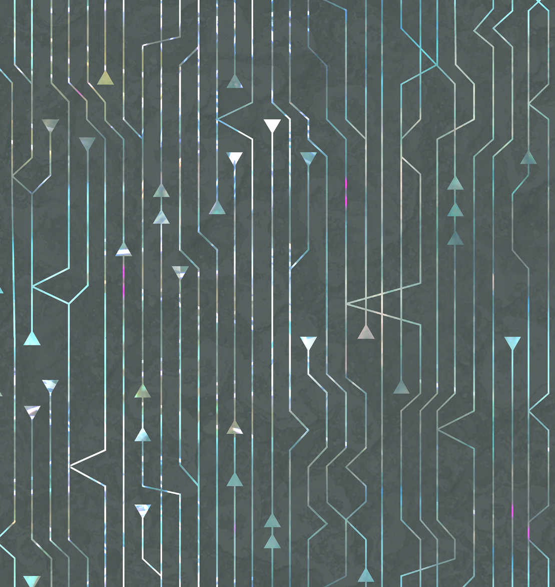
In Part Three, we move to Photoshop to add color and texture to the design.
More in this series: Part One • Part Two • Part Three • Part Four
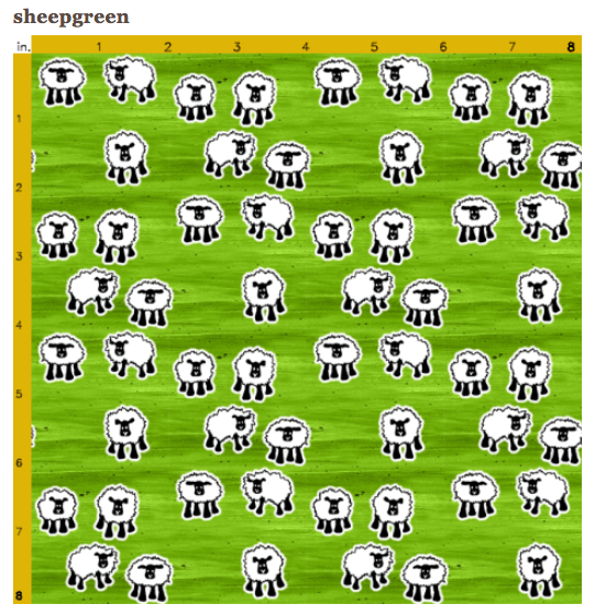
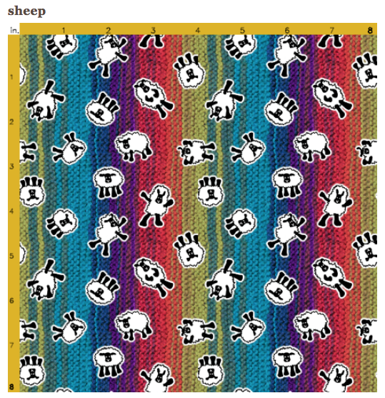
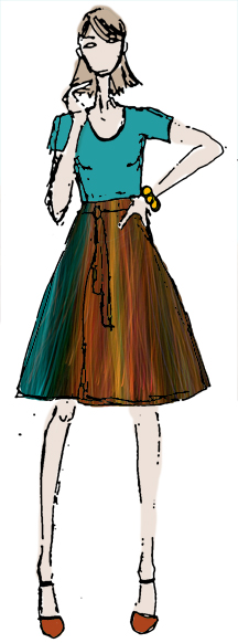 I spend so much of my time behind a computer screen that it is hard to show “behind the scenes” shots of what I do. And I know that people love to see works in progress. I do too. So I made this video which shows my process in about 3 minutes. I captured it in 2 sessions and sped it up 1500%. This is a wrap skirt that I designed that should be one of the ones for sale at the American Craft Council show I am participating in. I just finished it so I haven’t seen the fabric in person yet.