I thought it might be really appropriate to start off with a “How it started; How it’s going” kind of meme to talk about photography. When I first started making my art to sell or to show at gallery exhibitions about 20 years ago, the first and worst stumbling block was getting good photos. I had a camera, but I had no experience in what it took to get great photos of objects and I absolutely couldn’t afford to hire someone to take photos for me. So I needed to learn how to do it myself. This was before Etsy was really around, so there weren’t a bunch of tutorials to help you or recommend photo white boxes that were easy to find. (Wow, I am making myself feel old!) So everything I learned was by trial and error and I mean LOTS of trial and error.
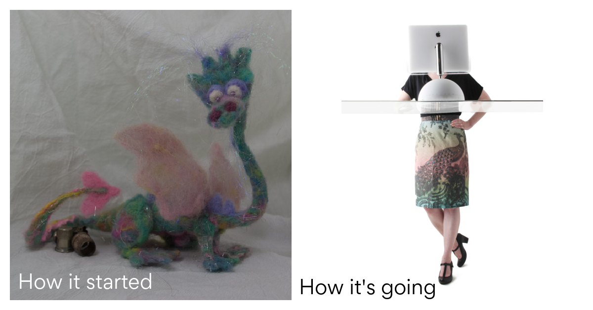
The felted dragon shown up above was one of the first photos of my art that I found when I went digging through my photo archives. This is the photo straight off my camera. You can barely see the little guy because the image is so dark. I thought a plain background would be best, so I draped some white fabric behind it but it’s really wrinkly and not really professional looking at all.
Things I learned: You always need more light.
LIGHT. Light is the answer to nearly every photo dilemma. This is absolutely the one thing that made the most difference to my photos. My very first photo setup was to put objects on a table in my guestroom and masking tape a piece of white muslin up behind them. I had four utility shop lights that I got from Home Depot and I put the brightest bulbs in them that they were rated for. I clipped them on the back of a folding chair so I could aim them at whatever I was photographing. The photos still looked a little dark, but I could usually fix them in Photoshop to make them a little better. They weren’t amazing photos, but they were pretty good and it worked for me for a long while. It was a struggle to photograph some things, so I started to look for something that would help.
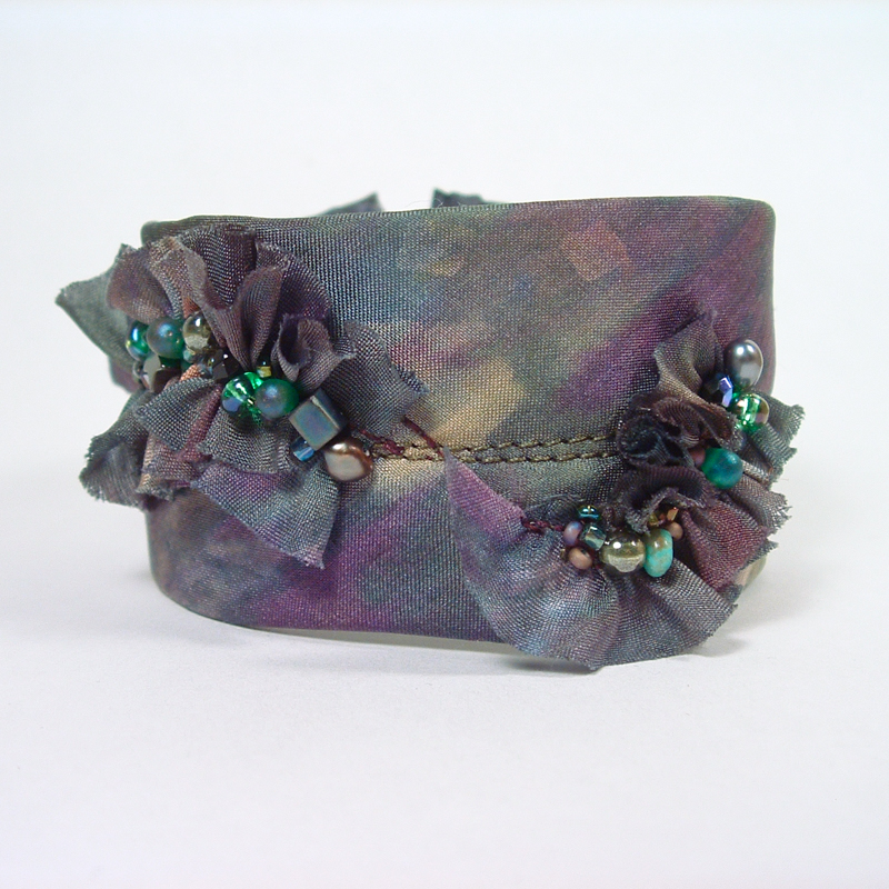
I did a lot of searching around for a light box because that was something people were recommending on Etsy. I found a folding plastic white box called a “Foldio” with a strip of LED lights that were attached to the top edge of it. It ran off of a 9V battery. It was brand new, just off a Kickstarter campaign. The Foldio has gotten much fancier and more powerful than the one I had; some of the new ones look awesome. But that original basic model really gave my photos a serious upgrade. The bracelet above is a beaded silk cuff and these were best sellers in my Etsy shop for a while. That photo is also straight off the camera without any edits.
Things I learned: Ditch the fabric.
One of the things I learned when I had the Foldio is that a sheet of white posterboard or craft foam is 100 times better than a piece of fabric as a background. Paper doesn’t have wrinkles and no matter how many times I would iron that piece of fabric, you still saw wrinkles and folds. Now I have both large sheets of white foam core and a big roll of white paper that I use as the background for everything in my studio. The bonus of using white versus another color as a background is that white reflects light. So effectively it’s like adding more light to your scene and more light is always helpful.
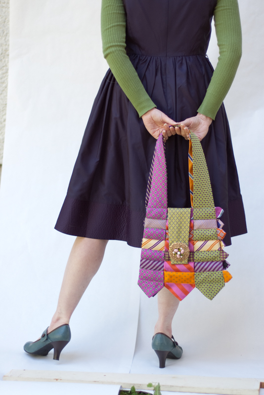
The problem with the white box was that I really couldn’t photograph anything larger than a loaf of bread because it wouldn’t fit into the box. And I started to make larger pieces that needed much more light again. One solution was to take things outside. If I could get a bright overcast day, photographing pieces against a piece of white paper taped up to my house worked great. This bag (made by my friend Pat Grady) was something we needed an image of for a postcard at the art center I worked at. So I took it home, dressed up in this cute ensemble, and my husband helped me take this photo using natural light. You can see we had to do some Photoshopping still to make it work, erasing the seam in the paper and so on.
Things I learned: Use a reflector.
For bigger items it helps a lot to have a big white surface to reflect extra light back on to the scene. For this shot, we had a big sheet of white foam core that we propped up on a chair to help get more light on the bottom of the scene where it was a little shadowy. You don’t see the effect with your eyes very well, but the camera can totally see the difference.
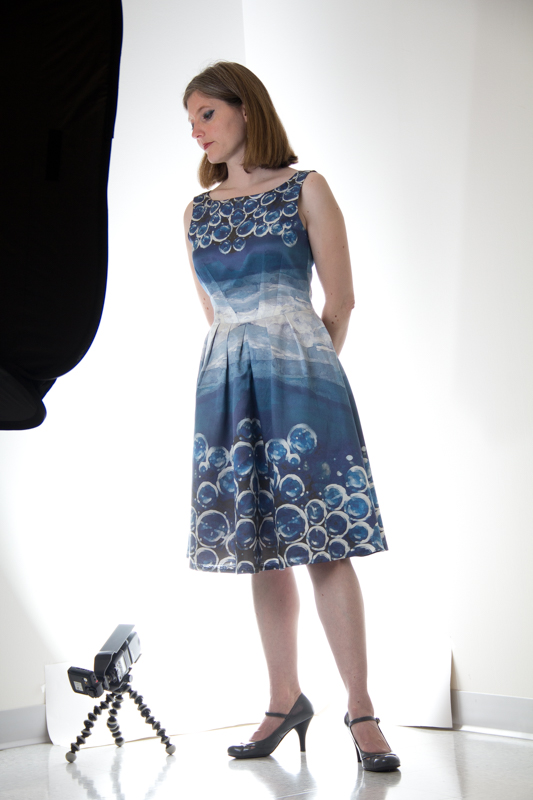
Natural light works amazingly well, but let’s be realistic. I live in MN and there is about one day in every month that has the right combination of bright, overcast, no snow, and not windy to be able to take photos. And especially with an Etsy shop, I can’t be limited to hoping I can take photos once a month. So, we borrowed some lights from a co-worker to get this shot (above). We set it up in the corner of an office, taped up a piece of white paper and had a couple of really bright lights and one big light with an umbrella on it to light up the whole scene. We thought we’d try out his set up and see if maybe we needed to buy some lights like this. You can see there is still some Photoshopping that had to happen, but this turned into a pretty great photo.
What I learned: The larger the item, the more light you need.
Getting a whole person lit up evenly from head to toe takes a lot of light. I realized that if I wanted to continue to photograph my garments, I was going to need to invest in some photo lights. We started looking at the free-standing umbrella style lights that you could buy as a kit on Amazon. We talked about painting a corner of our unfinished basement bright white to use as a giant sized white box.
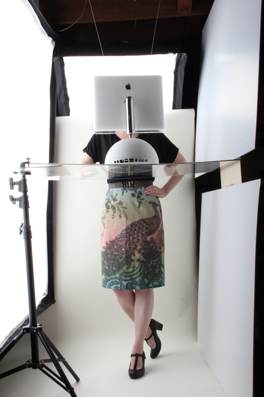
Here’s the part where we got lucky. A friend of ours who is an artist and photographer decided to downsize his studio and gave us some hand-me down equipment in exchange for us helping him with his website. Best trade ever. Instead of reflector lights, these are strobes inside big fabric boxes which are like a giant camera flash. We have two and you can see them in this photo. The large one is to the left and the smaller one is behind me. On the right hand side you can see sheets of white foam core that we are using to reflect light to that other side. This was a photo that we staged for an event at the art center where I worked where they were giving me an award and needed a photo of me for the invitation. I wanted to show off the skirt without it being a photo of my face and so we came up with the idea of doing a parody on the Magritte “Son of Man” painting. You can see the final photo up at the very top of this post.
Our setup is a Speedotron kit similar to these. (You can also find them used like we have.) It’s amazing. I photograph nearly everything in my basement studio with these lights. I say nearly everything because for things that I post on social media, that’s still a piece of white posterboard next to a window with the camera on my phone. Because that also works amazingly well. And using this pro equipment is a little bit of a process. I have a checklist taped to the wall downstairs so I turn on everything in the right order. And I never remember the settings on the camera so I have a cheat sheet for that too.
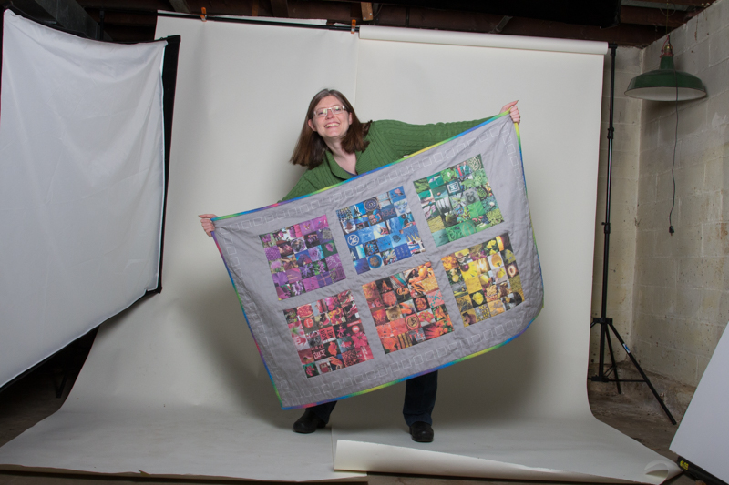
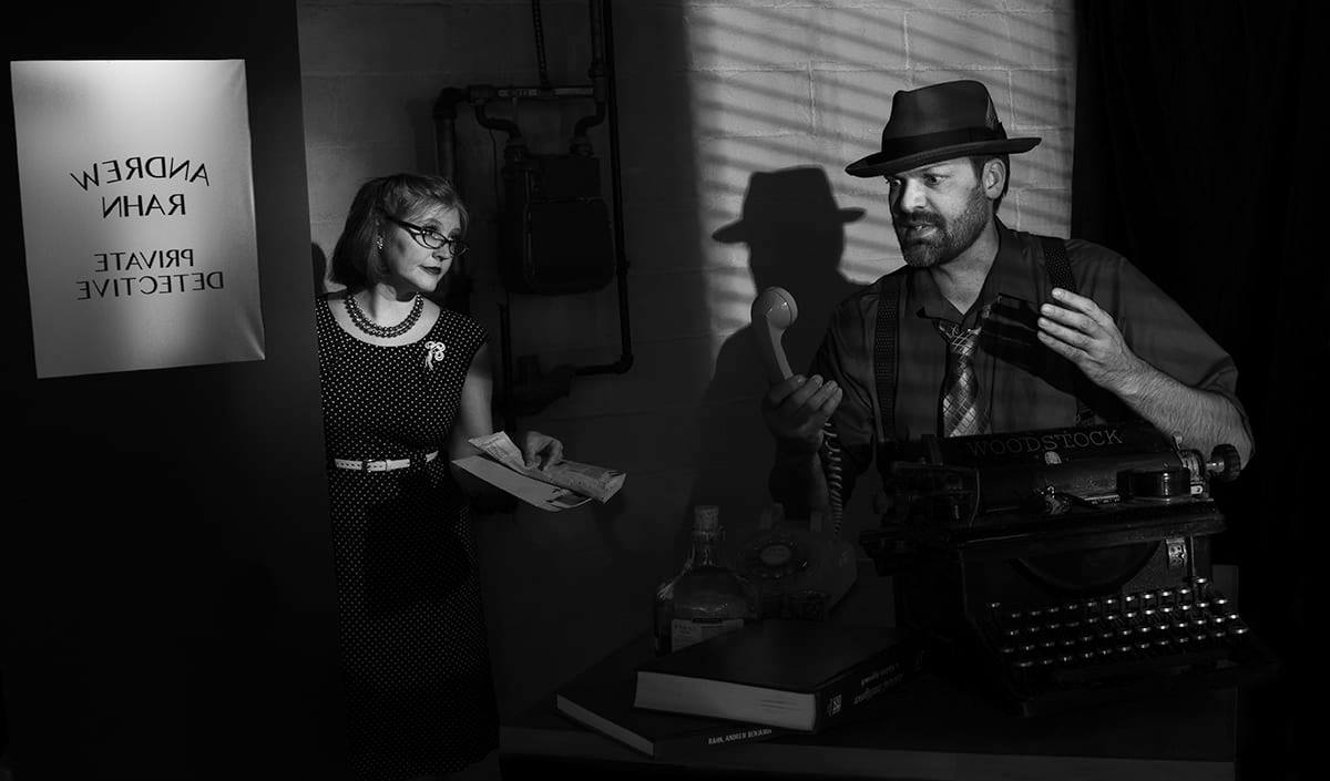
Other than the lights, our studio isn’t fancy. We have an unfinished basement (which I LOVE) and we have about a quarter of the space dedicated to photo equipment, mostly because I use it often enough that it’s nice to not have to get it out and put it away all the time. The backdrop is a roll of white paper that we roll up when it’s not needed. I’ve upgraded to wider paper since this photo was taken so I don’t have to Photoshop out that seam all the time. We have a shelf that holds all of the clips, clamps, dress forms and props that I use for photos and a stack of large sheets of foam core to act as backgrounds and reflectors. This is where we take most of our annual Halloween photos as well. This one took a lot of creativity to get this mood lighting just right.
You’ll notice that I haven’t even mentioned the kind of camera I have. That’s because having an expensive or super fancy camera isn’t necessary for great photos. I take a lot of photos for things like social media and all of the instruction sheets for my Etsy kits with my iPhone because it’s small and convenient and does a great job. When I shoot things in the studio, I have a Canon 60D which we got in about 2010 and it still works super well. We got a couple of upgraded/specialized lenses that are for specific tasks like shots for my Etsy shop (24mm pancake lens).
I’ve also talked a lot about Photoshopping, but really you don’t need to have Photoshop either. I did when I first started out because I couldn’t quite get the photos I wanted. My goal with photos now is to get it right in the camera so I never even have to open it in Photoshop. That saves so much time! It took me a long time and a lot of learning to get to that point, but I can now do an entire photoshoot of new designs without anything but minor touchups. It’s not hard to learn, but you have to be willing to take a lot of photos and try new things until you get something you like. There’s no one cookbook recipe for how you need to photograph your work; everyone has different items with different challenges. I still get it wrong sometimes and have to go back and move lights around and try things set up in different ways.
I wrote this post because I friend said “You should write something about your photo setup; you always have great photos of your work.” and I wanted to show that there’s a lot of behind the scenes work to make it look that way. Hopefully this will give you an idea of where to start if you want to try learning how to photograph your own work too.


I’ve now read this twice and its so helpful! Thank you so much for sharing all your tips and tricks.