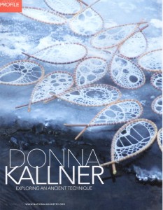
The three projects for my Jerome Grant exhibition are all duets with other artists. I chose three people as partners who I thought had something to teach me about art and design. The original idea was to work on things digitally and have the focus be about the ways we all use digital design tools, but as we started to talk, each duet turned into something a little different. The first partner I worked with was my dear friend Donna Kallner. Donna is the fiber artist of the three and although her particular passions are ancient art forms, she is one of the most self-taught “techhie” artists I know.
Donna and I decided to play a game called “Photoshop Tennis”. The idea is that you pass a digital image back and forth and each make an edit. I do something and lob it back to her and vice versa. We gave ourselves a pool of images to work from with a shared DropBox folder. We set down some ground rules (choose at least 2 photos to combine) and a general aesthetic (organic, earth tones.) We had wet dogs, fungus, brick, bittersweet, weathered tables and agates among the images in that folder.
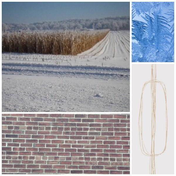
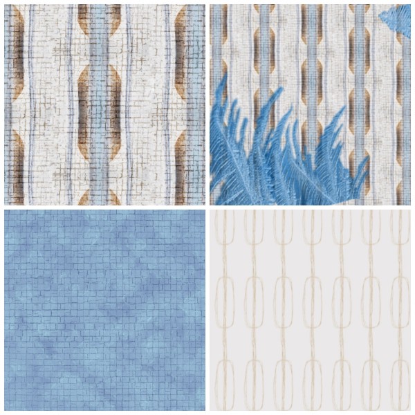
We had several versions of designs going, but this set of photos ended up being the final fabrics. A brick wall, a snowy cornfield, frost on a window and a line drawing that I scanned. These were layered with different opacity, repeated, mirrored, inverted. We did a lot to them, but I think they still read in the final fabrics amazingly well.
I love that we created a geometric print from an organic shape. That is one of my favorite parts of this design. I can’t tell you who did what because it evolved very organically. I was completely skeptical at first because I had never created a design from a large landscape image. My photo choices tend towards close up macro shots, at the other end of the spectrum. One of the “new” ideas I think I learned was the use of repeating layers. The brick pattern was layered several times by itself and rotated – transforming the brick into a more irregular cross-hatch pattern, which is a fantastic texture. We left our files “in progress” when we passed them back and forth, so I could dig right into the layers and see how everything fit together. I think we get into habits as designers of going to your “go to” tools and this was a really interesting exploration for me to dig into Donna’s work and say “what did she do there”. It was a way for me to watch her work and see a new process.
The ensemble that these fabrics go in to is two major pieces: a sheath dress made from the blue brick print and a coat made from the geometrics. Both pieces have the frost image layered on top in very specific places. It makes a “collar” on the dress and is layered at the hem and cuffs of the coat at very large scale. The hand-drawn print is the coat lining. The dress and coat are made from cotton sateen, the coat lining is satin. (The coat is interlined with a heavy cotton twill to give it some weight and structure.) Both pieces are based on 1950’s vintage patterns.
I have titled it “You Can Take the Girl Out of the Country”. I do know that I am taunting you, but I won’t show the finished pieces until after the show has opened. Hopefully you can use your imagination a little bit until then.


