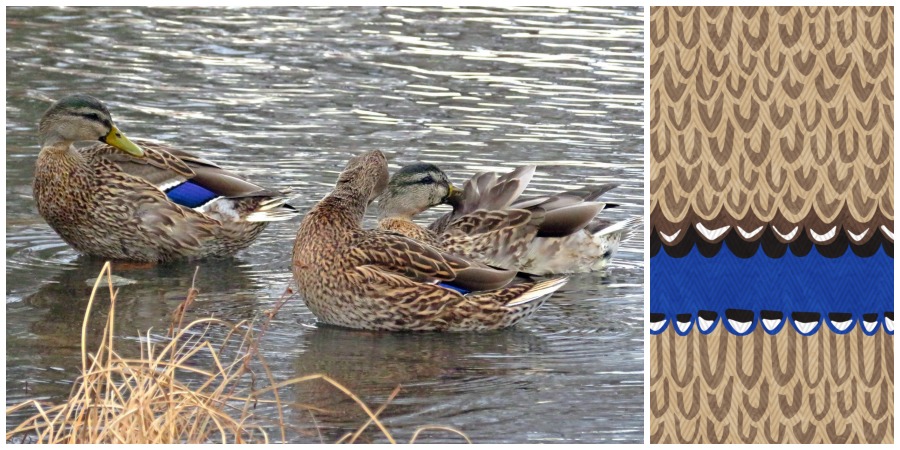
Animal prints are not my cup of tea, but I get why they are appealing; I do love bold graphic patterns. Instead of going with a leopard or zebra print for my design challenge entry, I wanted to pick something that was a little less obvious. So I decided to go with ducks. Female mallards are pretty well camouflaged with their brown feathers, except for the bright blue, black and white bars on their wings. You almost don’t see them at all when they are sitting quietly, but as soon as they take off there is a flash of that blue. (Thanks to my mom for the mallard photo above.)
I drew a vector illustration for this design, layering the feathers so I could make a repeating pattern. I felt like the design was a little flat. I often feel this way about vector designs, I often feel like they need a little more texture. So I layered it first with a watercolor pattern to give it some light/dark/grunge. Then I added a chevron stripe to mimic the “grain” of feathers.
The overall pattern makes a stripe which I think would be fun for couch pillows or tote bags.
You can check out more animal prints at the design challenge page.


