In 2018, I participated in every one of the Spoonflower Weekly Design Challenges. Every week there is a topic posted and artists are challenged to design something to match the theme. Themes range from art elements (large scale black and white) to color limits (navy, orchid, maroon, white) to topics you can interpret anyway you like (sloths, four wheels, astrology). I wrote about how 2018 was for me and what I learned in a previous post and I realized that although I had shared all of those designs on all of my other social media channels, I talked about very few of them here. So for 2019, I am going to remedy that.
The theme for the first week of January was “Be My Valentine”. One of my strategies for coming up with a challenge design is to challenge myself. I first think about the immediate image that comes to mind when I look at the theme (red hearts, arrows, roses) and I throw that out. I try to never design the first thing I think of because often that’s the cliché. And for me, I like to think about what I want a design to be and what I want it not to be. When I was thinking about my Astrology theme design, I knew I wanted it to be fish (for Pisces), but not starry sky.
There is a legend in my family of the Valentine card that my dad made for my mom way back when they were 20somethings. My dad wrote her an irreverent poem and drew her a picture of a heart. A “real” anatomical heart. It wasn’t exactly what she was expecting at the time but it is one of my favorite stories of the two of them.
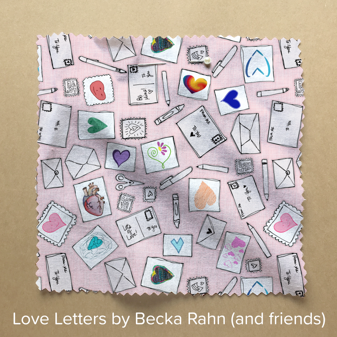
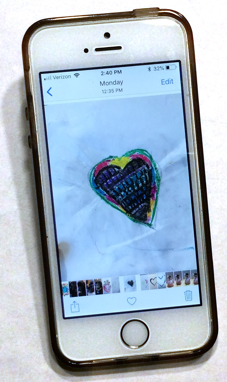
When I was thinking about my design challenge, I was thinking about how valentines are always a “you” and a “me” and I wanted to put that idea into the design. So I sent a text to my family and a few friends and said “Draw me a heart. Take a photo. Text it back to me.” And I didn’t explain anything else or give them any other rules about what I wanted. My family is pretty easy to talk in to playing along with things like this, so as the afternoon went on, my phone chirped with images of hearts. To my surprise, my brothers-in-law were talked in to participating. My niece and nephew added their artwork. Some gave me 2 or three ideas. (If you’ve been paying attention while reading this post, you will be able to spot my dad’s contribution to the finished design.)
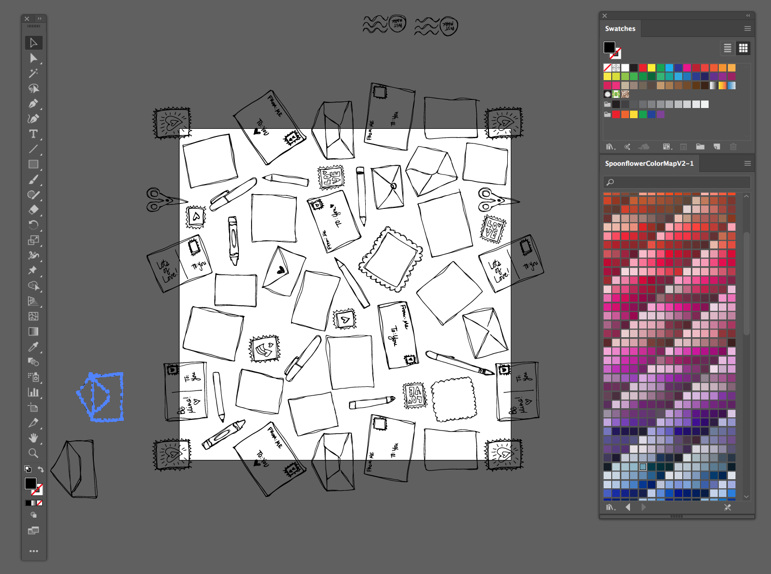
I didn’t know what they were going to send and in my head, I had a whole other way of putting it together originally. I thought about it for a little bit and then I sat down and drew a whole bunch of blank cards, envelopes, postage stamps and pens. I scanned and put those together into a large repeating pattern.
Then I added the hearts they had texted me, one for each card I had drawn. I edited their art as little as I needed to. I added a little color to some black and white versions because I wanted those hearts to be the main colors on the page and I made everything else a pale shade of pink/grey.
The finished design has 14 different artists who contributed to it. One of the friends who contributed commented when I posted the design “She also dreams up and does stuff that fosters creativity and community. That’s art, folks!” Exactly! I am going to talk about this design in a class I am teaching later today. Art is fun when you can share the art making. But more than that, the finished fabric isn’t just something “pretty” but it’s something with a story and the story makes it something you can connect with.
(If you love the design and want to vote in the contest, you can see all of the designs that were submitted for this week’s theme and vote here. I love the votes, of course, but I am more interested in the challenge than in the “winning the contest” part.)


That is a beautiful design and a great story of collaboration to share with it. I’ve voted on these challenges but haven’t participated in making a design.