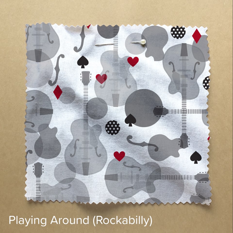
This design challenge theme was the cause of a big discussion among my family about what “rockabilly” really was and how you could represent it. Spoonflower’s design spec said “Originally from the 1950s, the iconic genre has a strong following that has withstood the test of time. As you create your entry this week, channel the rockabilly style with themes centered around vintage tattoos, pin-up girls, polka dots and even skulls.” My parents (who remember the original rockabilly trend) said they thought of it more as Elvis and ice cream sodas. We had a good time going through the contest entries and seeing how everyone interpreted the design. (Lots of cherries. Lots of skulls.)

The 33 you see on the swatch of the design above is the place I finished in the design contest. 33 of 325, which is my third highest finish ever in a contest (I have ranked #11 and #22.) THANK YOU if you voted for my design. You can find it here on Spoonflower.

