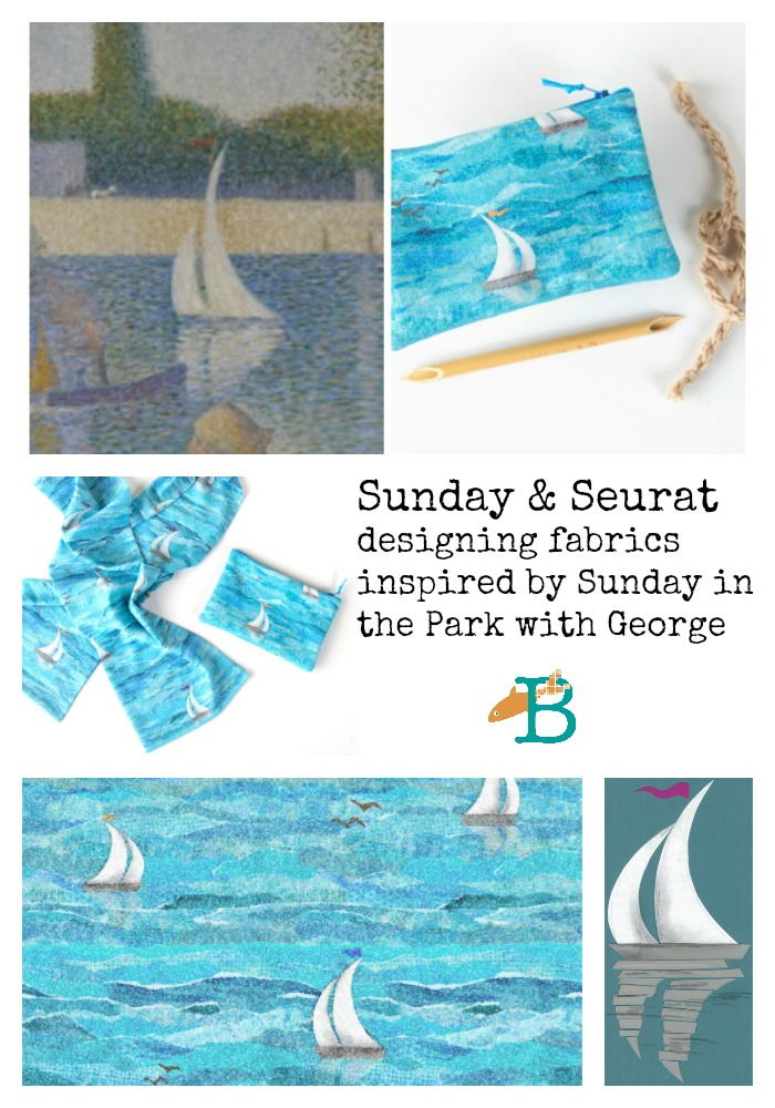
This is part of a series of “behind the scenes” posts about my Sunday & Seurat designs for the Guthrie Store. Click here to see all of the posts in this series or see a gallery of the collection.
Another detail I noticed in the Sunday on the Isle painting was the sailboats in the distance. Since Minnesota is nicknamed the “Land of 10,000 Lakes”, I knew that a print with boats would probably be something people here would love.
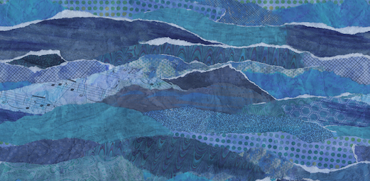
I started this print by creating the water. I collected about 15 different patterned and colored papers, everything from newsprint to sheet music to scrapbooking paper. I laid them all out on my table and gave them all a wash of blue paint. I wanted to obscure some of the patterns a little bit, but I also wanted to give it a cohesive color palette. By giving everything a wash of the same blue, they suddenly all become variations on a theme, rather than 15 separate colors.
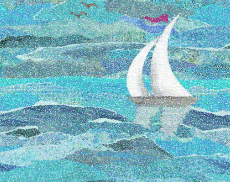
I tore the papers into long strips and started layering them together to look like waves. I deliberately tore them a little unevenly to get the “foam” of white paper showing on the tops of some. I glued this all together as a paper collage. My scanner can only scan a piece 9×12, so I needed to carefully adjust and mask the edges of that rectangle so that I could make a seamlessly repeating pattern that could fill any amount of fabric. There is no magic formula to making something like this appear seamless, just lots of time zoomed in and manipulating pixels one by one to disguise the edges of the tile. Totally tedious; totally worth it. Many hours later, I had made a seamless water pattern out of it, which I saved as is, because I reuse patterns like this all the time once I have the hard work done.
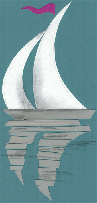
Next I created a cut paper illustration of the sailboats and scanned it. One of the things I loved about the sailboats in the painting was the reflection in the water. I thought that was such a lovely detail. So my illustration had a reflection as well.
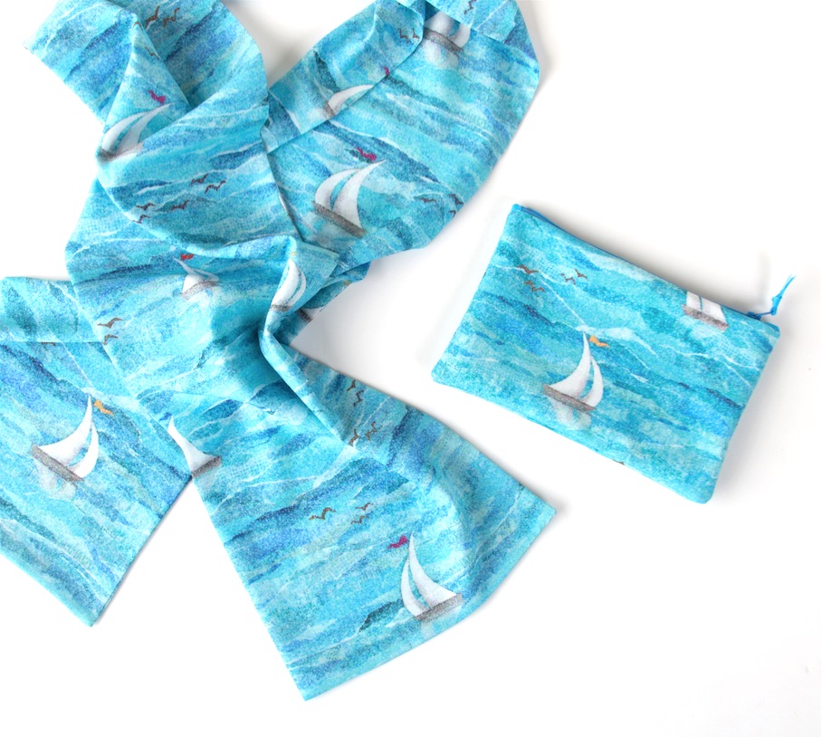
I made several different sailboats and added those in a layer on top of the water. I was careful to place them on the waves so they looked like they were sailing along and not just plopped down. Finally, I added a flock of birds. I originally 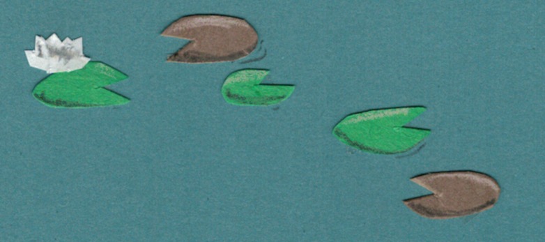
You’ll notice that the color of my water and the color that it is on the finished fabric aren’t the same thing. When I looked at my finished design, I realized that it looked a little somber. Although the colors matched the painting pretty well, it didn’t have that summer sailing kind of feeling that I wanted. So I went back in and brightened up the water and shifted it to look a little more turquoise, a color that made me think more of sunshine on the water. I also tweaked the tiny flag at the top of the mast so there were pink and yellow flags just for a little sparkle of color.
The final layer, of course, was my Seurat-inspired pointillism texture added in layers. You can still see a tiny bit of the polkadots in some of the patterned papers, but I love the complexity that gives to the design. I love this one and I hope lots of you love it too.


Love this one Becka!
LOVE!!! Absolutely brilliant.
I love it, too! that is why I bought a lovely scarf, beautifully made!
This is just beautiful. I love the behind-the-scenes stories!